During my research I watch a few interviews with the creator of the mobile phone, the first brick phone, Martin Cooper. During his interviews he always brings up very interesting things or answers interesting questions from a creator’s perspective rather then a user’s perspective. I noticed that he never had in mind the amount of personalization of the cell phone that occurs today. Which led me to think about how inventions are made to be useful. In fact, the most popular inventions seem to be created in order to be useful and over time, as they become popular they begin to be personalized and changed to suit its users even if its not the most useful manner.
I thought this was very interesting. When looking to the past through artifacts, we try and interpret their meanings very deeply in order to better understand the past times. For example, the teapot. A teapot found can say a lot about its time and its times advancement. A few teapot’s might help show the difference between classes and the amount of abundance or poverty of those times.
As I studied the cell phone I constantly wondered what the cell phone would say about us if it is ever found thousands of years from now. What would it say about us? There are so many models and so uniquely personalized that it will hopefully show the technology leaps we have been making in the last 20 yrs with it. It might also say something of our economic state over this time as there are not an abundance of luxury phones, etc. But it will definitely show how dependent we are of them since there are probably a vast amount of them everywhere.
After this semester I have reached my own conclusions about what expository writing is. Because I have studied rhetoric for a couple semesters I have believe that in concern to it expository writing is more of the research than the actual persuasion. Although I believe expository writing can be persuasive, its main goal might be more to explain, inform and learn rather then to cause a movement or action. There is more intrigue in expository writing than anything else. In my opinion its more of special in depth research over a particular topic. Although it is similar to research its different in that it is more specific. I am glad to have been able to take this class and learn about this time of writing. I think that this class should continued to be offered especially to those interested in subjects such as history. Because Expository writing contains such concentrated information and research this obviously is very useful to people that work in archeology. This type of writing allows a simple to object to be put under a microscope and perceived in many ways. Expository writing can ultimately contain cultural, literal, historical information.
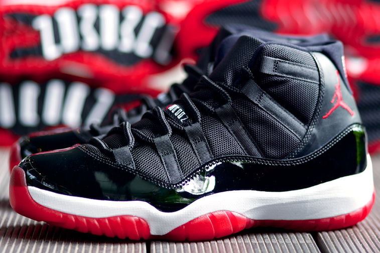
The bottom of the artifact is quite unique, compared to other objects of its kind. The bottom measures to thirteen inches long, and its outline resembles that its owner is relatively large. The bottom is made of a red-see through rubber material, while the red material forms the shape of a foot. The portion of rubber, where one would imagine the heel of the foot contains a separate black portion of rubber, which is shaped like a boomerang. Six inches above the boomerang shaped section is another section of black rubber, which is shaped like the pokemon Ditto. The inside of both black portions of rubber contains ridges that are a lot closer together than the red ridges surrounding them. While the surrounding ridges are separated by approximately half of an inch, the black rubber inside of the red ridges is less than one centimeter apart from one another. While the red ridges are wavy in shape, the black ridges are of a zigzag nature. If one were to run their finger down this particular rubber portion, aside from the occasional pieces of dirt one’s finger would encounter, one will feel a gritty rubber with the jagged touch of what could only be rocks stuck between the ridges.
The object that serves as the subject of my analysis measures to a total of thirteen inches long and six inches high. The sole is divided into two parts, which the designers have said create a more flexible feel for the user of the object. Horizontal ridges begin at the toe of the shoe and transition around the entire artifact. The upper portion of the sole is an inch-and-a-half of white cushioning that when contrasted with the lower red portion and other materials of the artifact, make the artifact much more noticeable.
Looking downward on the object, the light reflects rather brightly above what seems to be a white foundation. The section of the shoe that covers what one can assume would rest a set of toes sits on a double-layered sole, and is made of black patent leather, which resembles the dress shoes of an army command sergeant major. Above the patent leather portion of the sneaker is a material with more texture than the black patent leather and possess six vertical slits on each side in order to hold the laces of the artifact. The black patent leather on top of the double-layered sole creates a red, black, and white combination that coordinates rather nicely with the Chicago Bulls of the National Basketball Association game jerseys.
The crisscross nature of small threads continues upward, only to end in a slightly larger bow. The small threads rest on the tongue of the object and in between one of the threads half way up rest letters that resemble the ancient Greek letters. On the tongue of the artifact, there is writing that if you look at from the perspective of a front view resembles Greek lettering, but if you turn it sideways reads, “Jumpman Jordan.” In between the words “Jumpman” and “Jordan” is the iconic Jordan symbol, which is also on the back of the sneaker.
The Jumpman Jordan symbol, which is also the logo for the entire brand that surrounds that artifact, is a silhouette of the famous basketball player Michael Jordan. The symbol reflects what seems to be Jordan flying through the air palming a basketball over his head with his right hand in what appears to be an attempt to slam-dunk the basketball. His left hand is lowered behind his body with all five of Jordan’s fingers extended near his thigh. His legs are spread as if Jordan is attempting to do a split in the air. His left foot is pointed in forward, which one can only guess is the location of the basketball rim Jordan is attempting to slam the basketball in, and his right foot is pointing outward making Jordan’s posture a position only a well trained athlete could accomplish. The symbol sits perfectly on the back of the Air Jordan Retro 11!
Music and sports have always proven to be areas in which African Americans found themselves able to advance past the societal stereo-types of America. During the 1980’s, hip-hop served as the voice of the African-American community. The lyrical messages of hip-hop along with street fashion combined to form a sound and aesthetic that many African Americans in urban communities came to identify with. The black youth of the 1980’s used hip-hop as a channel to articulate their feelings of isolation from the popular culture of the United States. Thus, the spirit of the hip-hop developed as an expression of the hardships of black urban life.
Sneakers were an intricate part of urban culture in the 80’s. Early hip-hop artist used various sneaker brands to express their affiliations and status. The rap group Run-DMC hit song, “My Addidas,” landed the group a one million dollar deals with Addidas, a conservative German company. The French director Mathieu is quoted as saying that “ Run-DMC really made the world understand that the sneaker is to hip-hop what the crucifix is to Christians.” Other notable rappers adopted their own brands to express their own identities: Fresh Gordan’s “My Filas”; Heavy D and Nike; Busy Bee and Converse; and the Beastie Boys and Suede Addidas. However, with the emergence of a new African American basketball superstar, hip-hop culture would be introduced to a new brand that would give hip-hop a new face for years to come.
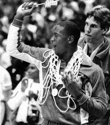
Michael Jordan was born February 17, 1963, in Brooklyn, New York. After moving to North Carolina and playing high school basketball, Jordan signed with The University of North Carolina at Chapel Hill on a basketball scholarship. During his junior season, which would prove to be his last as a collegiate athlete, Jordan led the North Carolina Tar Heels to a N.C.A.A championship. In the same year, Jordan would also help Team U.S.A win a gold-medal in the 1984 Olympic games.
Jordan decided to leave college a year early and enter the N.B.A draft. He was selected third overall by the Chicago Bulls. Jordan’s entrance into the N.B.A would allow him the ability to sign a shoe contract, and unknown to Jordan, change the shoe industry forever.
Today’s Nike Inc. was founded on January 25, 1964, as Blue Ribbon Sports by Bill Bowerman and Phil Knight. Blue Ribbon Sports would officially become Nike Inc. on May 30, 1971. Before Nike signed Jordan in 1984, Nike was mainly a running shoe company, who’s target audience reflected that of their white audience At the time, Nike had set forth to capitalize on the running boom of the 1970’s, yet by the mid 80’s, because of mismanagement and structural problems, Nike was approaching the verge of failure. In 1984, the year they would sign the rookie Michael Jordan, they recorded their first drop in earnings.
At the beginning of negotiations, neither Michael Jordan nor Nike Marketing Director Rob Strasser seemed the least bit excited about the partnership. Strasser felt that “unless it was possible to make one big marketing package—tie the brand, the product, the advertising, and the athlete into one personality—they should forget it.” Nike knew that signing Jordan would be a huge risk, because they realized that the success of their product would be tied exclusively to Jordan’s success as an N.B.A player.
Jordan sneaker of choice when playing basketball had always been Converse, and like many other young African American males of the 80’s, Jordan was also fond of Adidas. Jordan has been quoted as saying that he like many of his other contemporaries thought Adidas made the best product, and had he gotten a decent offer from either Converse or Adidas, he would have signed with them. Nike, which prided itself in taking chances, pledged to use its entire $500,000 dollar advertising budget on Jordan in addition to compensation for him also wearing the Nike shoes.
Jordan ended up signing with Nike for $2.5 million; however, because Nike realized that there success was tied in directly with Jordan’s success as a player, Nike inserted a clause into the contract, which stated that unless Jordan accomplished either Rookie of the Year honors, become an All-Star, or average 20 points per game, Nike had the right to terminate the contract. Needless to say, the contract was never severed. During Jordan’s Rookie season while wearing the Air Jordan 1, Jordan averaged 28.2 points per game, earned a spot on the All Star team, and on May 16, 1985, was named the 1985 N.B.A Rookie of the Year; thus, fulfilling his contractual obligations to Nike.
On October 18, 1984, the N.B.A officially banned the black and red Air Jordan 1’s, because the N.B.A claimed that they violated the uniform dress code policy. At the time, the N.B.A required its players to wear either primarily black or primarily white shoes. For violating this policy, Jordan was fined $5,000 a game, a tab that Nike was happy to pick up. A simple shoe violation wouldn’t be the only controversy Michael Jordan and Nike would be involved in.
Michael Jordan and Nike were redefining not only the shoe industry but also the way business is done in America in general. Never before had a company made an African American male the face of their corporation. A Newsweek article asserted that “The athletic-wear giant is one of a growing number of companies that have begun to use ads made not only with, but by, blacks. The reason isn’t hard to figure out: blacks have become a powerful consumer force. . . To reach them. . . marketers are striving for ads with an ‘authentic’ feel for black music, language, and lifestyles.”
To capture this authentic feel for black music, language, and lifestyles, Nike’s advertising agency, Wieden and Kennedy, hired Spike Lee in 1986 to direct commercials staring Michael Jordan. The agency’s copywriter is noted to have developed an idea to pair Jordan and Lee, because of a character in Lee’s film She’s Gotta Have It (1986). In the film, the character Mars Blackmon refused to take off his Air Jordan’s, even while making love, because they were so important to his sense of identity as a young black man. Spike Lee was one of the most popular African American film directors of his generation. Lee is known for creating films such as Do the Right Thing and Mo Better Blues, which depicted the African American point of view at a time that many in the black communities felt that such a depiction was non-existent in America. The relationship developed into a 16-year relationship, which resulted in the “Mars and Mike” campaign ads that featured Mars Blackmon.Lee’s film’s countered what he himself referred to as the exploitation of African Americans with a “powerful social commentary.” Lee’s 1989 film, Do the Right Thing has been referred to as “the standard bearer for Hollywood on race relations.”
The design of the Air Jordan Retro 11 was a subtle cry for attention from an athlete who was known for being relatively conservative. It stands to reason that the color scheme was designed to match that of the Chicago Bulls team colors. Whether or not the Bulls wore their white home jerseys, black with red striped away jerseys, or red alternate jersey Jordan could wear this sneaker if he felt the need. But the color scheme seems to be the only normal aspect of the shoe, relative to sneakers of its day.The patent leather used on the bottom portion of the sneaker is a clear call for attention. Patent leather was rarely used at the time of this particular Air Jordan’s release, and when it was, it was reserved exclusively for women’s shoes. The use of the shiny material was extremely risky for the shoes success, but clearly neither Nike nor Jordan cared. They seemed to be challenging the way sneakers were designed during that time.
Although, the shoe’s patent leather design made it quite noticeable, make no mistake, the shoe’s designer still had basketball in mind while designing the sneaker. The horizontal ridges in the rubber material at the bottom of the shoe allowed for maximum grip, which allowed Jordan to cut back and forth as he used his cross over dribble and raise off of the floor to implement his famous slam dunk. While the shoe’s sole is also extremely flexible to provide freedom of movement for Jordan’s foot, the sneaker still provided adequate ankle support for a professional basketball player. The sneaker, like most of its day, cam up to the middle of Jordan’s ankle, and was tied rather tightly to prevent, what one can deduce as a sprained ankle.
When this sneaker was released, Jordan was probably hesitant about the design, but gave the benefit of the doubt to Nike, because of previous success. By the time this sneaker released, Jordan was already a champion, all-star, and an overall success; therefore, the failure of such an eccentric shoe, relatively speaking, was far from his mind. If any other player, who had not been as established as Jordan, it stands to reason that this sneaker would not have done as well as it did. However, with that being said, the sneaker’s success is not due solely to Michael Jordan. The success of the Air Jordan Retro 11 is due to a synthesis of things: Michael Jordan’s success, Nike’s brilliant advertising, and hip hop culture.
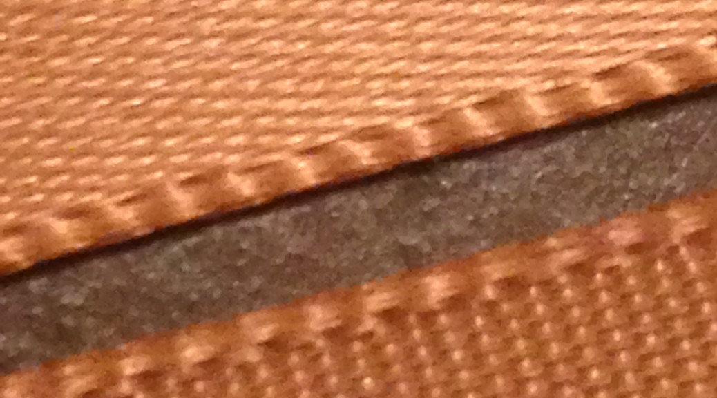
This seemingly weightless object reflects an equivalent color as that of the golden glow from the rising sun. Measuring 24 cm long and 2 ½ cm wide, a long rectangular object feels smooth on one side and rough on the other. A closer look reveals that this aureate fabric is formed with a satin weave in which the threads of polyester intersect to purposely create a smooth, lustrous on the front surface and a dull, matte back.
Side stitching is noticeable on each side of the fabric’s width but on each end of the fabric’s length exists frays. With one simple pull on one of these frays, the fabric will quickly and easily unravel, which discloses the object’s delicacy.
Four tiny pin holes are visible on the fabric, two of which appear approximately 6 cm from each end indicating that these two tiny holes were created by the same pin. Metamorphosing the object to have the two pin holes from each end align, the fabric crosses and the object acquires a new form. When viewed from the top, which is above the pinholes and crossing fabric, the loop of the object creates a flowing loop with no sharp turns. Two equal lengths of fabric create an upside down “v” shape that dangles below the loop, pinholes, and crossing fabric.
According to Robert Friedel in his essay, Some Matters of Substance, “Everything is made from something [and] the making of anything requires that choices be made about the stuff that goes into it. There are a number of grounds for these choices, of which the following seem to be…important: Function, Style, Tradition, and Fashion.”
Visually, color is the initial feature that is noticed, which suggests it holds substantial significance in choosing this exclusive object. The fact that the color is solid implies there is relevance in the isolation. It is also important to note that the shade of the object is not yellow but gold whereby gold is often darker and glossier than compared to the primary color yellow. Additionally, the shade of gold reflects a sense of complexity and depth.
Considering the satin-weave, side stitching, and frays, it can be presumed that care and precision were significant when creating this object. The fact that the object is fabricated using a delicate technique and material suggests that this aureate object serves an aesthetic purpose and is intended to be worn. More specifically, the small size suggests that the object is not used for covering things up; therefore, reveals that there is an intentional purpose for display. Likewise, the pinholes further suggests intentional display and we can consequently determine that the object’s function may be used as a brooch.
The fact that the object has to be manipulated to obtain this shape suggests that the importance of the shape is only second to the set color. At this point we can safely say that the object’s material and function were deliberately manufactured to be a fashion instrument. The color and transformed shape juxtaposed with the object’s material and function, however, insinuates the object was purposely designed to be worn as a sign.
When we compared the shading difference between yellow and gold, we notice a similarity to the satin-weave material. Gold is a darker, glossier shade of yellow and the material is purposely threaded to create glossy front; thus, was the material selected specifically for the color? If so, this would indicate that the color holds a higher importance than originally judged.
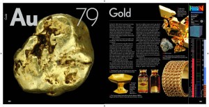
“For a variety of reasons people come to make associations between a material and various feelings, concerns, and attitudes. These associations are rarely stated, but they are quite significant to our understanding of the past and its influence on the present.” And as Friedel claims, “It is actually the question of the relationship between materials and values that is at the heart of this subject;” thus the reason for exploring the element gold in relation to the color of this object. Known as a precious metal, gold is highly valuable because of its chemical and physical properties in addition to its scarcity. History reminds us of wars about people and cultures dying to protect or obtain it or to expand beliefs/societies/land because of it. Do these experiences alter or attribute to the meaningful value placed on gold? But if we set aside the monetary and scientific worth to only consider gold’s obvious feature, its beauty, do we actually treasure its aesthetic value?
Manipulating the object’s shape arouses various speculations when we draw from the previous deductions. First and foremost, pinning the fabric together so that the four pinholes perfectly align, the shape is similar to that of the Ichthys yet without a profound, pointed loop and more fabric dangling below the pin.
Image Credit: by Liz Aragon on sweetclipart.com
Derived from the Greek word for fish, the Ichthys is commonly known as the Christian Fish or Jesus Fish and an ancientpagan symbol used as a visual expression of identification with a specific group of people. However, the position of the pinholes suggest that, unlike that of the Ichthys, this particular object is to be represented vertically. Is there a connection and/or religious undertone to this object and the Ichthys? Jules Prown claims in his Essay, Style as Evidence, “The manifestations of identical elements of style…cannot be considered coincidence: clearly cultural preferences were being expressed. And stylistic shifts…mark a change in cultural values.” But perhaps the only correlation is the method of associating one’s self with a particular group through an “artistic sign.” Prown explains that an artistic sign is “does not pertain to things but a certain attitude toward things.”
Jacques Maquet explores the meaning of objects and what they stand for in his essay, Objects as Instruments, Objects as Signs. Maquet employs us to move beyond simply interpreting objects for their role and function by reading “objects as signs” for their connotative meaning, such as symbols, images, referents, and indicators. Given that “[The meaning of an object] is grounded in common human experiences and given by the group of people to whom the object is relevant,” Maquet believes that it is difficult to derive meaning from objects because meanings are not “culture-specific,” “inherent to the object, or ascribed by the designer” and thus meanings are implicit and always changing.
The gold color and transformed shape seem to be the two most notable physical features of this object; so should these characteristics be read together or separately in order to derive the correct association and meaning? Is color deemed as an actual object or a way to read an object just as Maquet suggests (i.e. referent)? What meanings and values are attached to this object, what group of people gathered the consensus to build these meanings and values, and what human experience grounded these meanings and values?
Kenneth Haltman describes signs as a complex interrelationship between objects and their meaning. He further explains that it is not only important to concern ourselves with what the object signifies but with how the object symbolically expresses meanings and values.
James Deetz’s, “In Small Things Forgotten,” placed significance on the historical analysis of objects in material culture studies. It is through the ‘small things forgotten’ that we can “fill in the cracks between large historical events and depict the intricacies of daily life.”
Today, the gold element is commonly associated with wealth in forms of currency (i.e. money and coins) and jewelry. In reflecting upon the past, it is apparent little has changed regarding what gold signifies but it is relevant to not on how gold signifies has transformed.
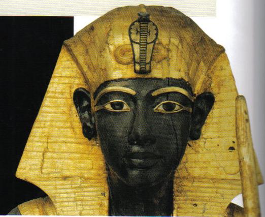
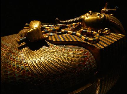
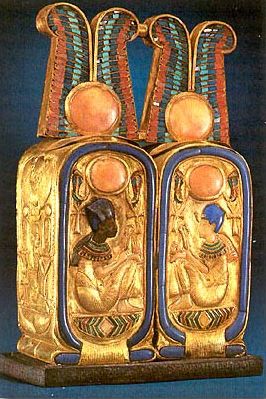
Source of images Theban Mapping Project
http://wysinger.homestead.com/kingtutankhamun.html
Elaborate death rituals, the most famous is the tomb, coffins, and death mask of King Tutankhamun, substantiates that Ancient Egyptians considered gold not only as a highly prized commodity but more importantly, as a symbol of eternal life.
History, it seems, continues to influence our present whereby gold is still viewed as a symbols of wealth (owned by both rich and poor), money (standard for many currencies), treasure (pirates & leprechauns), perfection (“golden mean,” “golden ratio,” and “golden rule”), and achievement (symbol for the highest medal or award).
A concept that is important to note is how Friedel centered his studies on the material in material culture. He emphasized the significance of the “first element” to which we should consider in order thoroughly study and comprehend things – “the matter of stuff that makes up a thing”—the material. In essence, it is “not only the form [of the object] but also the [material itself which] conveys messages to us.” Therefore it would be erroneous, according to Friedel, to exclude the material itself, which is the satin-weave.
The satin-weave is a special weaving technique that has been used since ancient times and rumored to have derived from ancient China. Originally comprised of fine silk up until the invention of synthetic fibers such as polyester, the satin-weave is associated with romance and luxury. Likewise to the scarcity of gold, satin materials were limited to those of nobility, upper class, and church. Additionally, satin-weaving was viewed as a “treasured secret” but eventually this skill broadened and reached America by the late Renaissance. By the late 1800s, satin fabrics were no longer only worn by those of the upper class and was sewn into anything from bridal gowns to lingerie. In the 1920s, satin material became increasing popular and widely affordable due to the invention of artificial silk, or better known as synthetic fibers. The associations to satin that were once sacred are now viewed by some as “profane” due to the rising popularity of satin material and its public display of undergarments, lingerie, corsets, brassieres, and camisoles. According to fashion journals, on the other hand, popularity has begun to associate of satin to sensuousness and lustrous.
A conceptual context refers to the creator’s mind…the physical refers here to the association of the object out of its original, conceptual context as it moves from producer to consumer, out of the workshop and into its use context. In other words, after an object is created it moves into a new realm, both spatial and temporal, as it becomes associated with other objects and a social world of individuals who possess the object. In that sense the focus is not on the thing, the artifact, but on its makers and users as a window into social relations. It is as ‘things-in-motions’ within the context of the social place of the artisans and users that the analysis derives its meaning.
The ribbon, which we can now refer to since our analysis of it is complete, is not a sign “to be read but a story to be told or unfolded about the social impact of the actions of people and their manipulations of objects through space and time” (Rita P Wright, Technological Styles: Transforming a Natural Material into a Cultural Object). The following stages of the ribbon’s life is essential to explain, inform, and describe how the ribbon morphed into cultural object: conception, material selection, design, manufacture, distribution, use, and perception.
Strips of cloth, originally dubbed “bands,” were found from a Turkish archaeological site of Çatal Hüyük, which can be dated back to the 6th millennium. It is suggested that these “warp-faced plain weave bands” may have been used more for decorative purposes, “to ornament and trim garments.” The silk ribbons began to appear during the 11th century and became a more frequent fashion accessory throughout the Middle Ages and Renaissance. However, it wasn’t until the 17th century, when French King Louis XIV became obsessed with ribbons. He adorned “ribbons of gold and silver to hats, sword handles, shoes, sleeves, around the knees, and even to the lower bodice front, where yards of ribbon loops emphasized the wearer’s masculinity.”
It all comes down to HYGIENE. Today’s societal practices would dictate that hair jewelry from the past would be acceptable to collect but not wear, because it is not acceptable to wear something that was in contact with another person’s skin, or in this case scalp. No matter how old something is, the act of it touching someone else’s skin makes wearing such an item unacceptable under contemporary norms. To illustrate my point I will use the case of the thrift store. One would have no problem going to a thrift store and buying a shirt but not underwear. This is because its common practice for people of today’s society to wear under garments, and even with this is mind, whatever article of clothing would have to be dry cleaned, at least for the average person. Collecting an object doesn’t fall under such strict societal guidelines. The collection of hair jewelry would be perfectly fine, because the objects would pose no risk in terms of hygiene.
I find the claim that cultures have developed better hygiene practices over time to be self-evident. I am a huge fan of the HBO series King of Thrones; however, when watching the popular Sunday night series, I frequently say think to myself how nasty the conditions are. While today its common and most would say appropriate for one to take a bath everyday, men and women of that time would be lucky to take a bath once a month. The same mode of reasoning follows as to why we would no longer fill trinkets of dead human bone and flesh. For someone to be in possession of dead human bone and flesh would be considered unsanitary.
Shifting patterns of human behavior with regard to dead things can tell us a lot about the advancements in hygiene of a particular culture. If we look at societies today, cultures that tend to have negative behaviors towards dead things, normally have mores advanced health care systems. In ancient times, societal taboos were based mainly off religious beliefs, but today societal taboos have more to do with health issues. For example, two hundred years ago young adults were discouraged from having sex because the bible told them so. Today, young adults are discouraged from having sex because of the health risk. All in all, different societies dealings with dead people can tell us a lot about their culture, but I feel this is a stronger correlation to that of their health practices.
Pounce is a life-like, life-size sculpture of a panther cast with a sleek and muscular tone. Pounce is the representation of a beautiful and majestic panther, caught in the act of moving forward. The statue is dark in color, but it appears gray with the light of the sun. Its surface is smooth in the sense that it does not present ripples except on the neck, chest, and paws. In these three areas, there are ripples that indicate the presence of soft fur. For the rest, no other traces of fur are visible. The coat color is plain black without spots. The body measures in length more than four feet, and the long tail measures approximately twenty-five inches. The tail is perceptibly curved and points upwards; the definition of the muscles on both sides is clearly elaborated, as well as the strong lines defining the muscles of the legs; the face is not frontal, but slightly bent to the left. The same detailed precision is reserved for the paws. They are large and powerful, and the fur between the toes is incredibly well-modelled. The hind legs are larger and longer than those at the front. The ears of the statue are bent back in listening mode. The head is small compared to the rest of the body, and the eyes are rather big and deep-set, with the pupil not circular in shape, but drawn by two sharp lines. A tangle of fine lines building the underlying musculature suggests the pronounced jaw as well as the elaborateness of the upper part of the head. The nose is broad, outlined by a thin rectangle. At the rectangle’s base, there is a little oval representing the main part of the nose: the nostrils from which the animal is supposed to breathe. The nose is of a different color than the rest of the statue. While the statue is black or dark gray, the nose is clearly golden. The mouth is shut and characterized by a plain line that crosses the lower part of the face horizontally. The face has no visible whiskers. The base on which the statue stands is a simple rock of the same color as the rest of the statue; however, the base does not present a regular configuration because the outlines of the rock are jagged and irregular. The plaque at the base of the statue reads: “Donated by the Georgia State University Alumni Association on its 75th anniversary; Dedicated February 12, 2005. ‘Promoting Panther Pride.’” The plaque is black and the words are written in white. The logo of the university, a blue stylized paw, appears at the bottom right-hand corner of the plaque.
Pounce is not only a statue, but also the mascot of Georgia State University. This bronze reproduction seems ready to pounce on an enemy, hence the nickname “Pounce.” The smooth fur is a realistic detail as panthers are not animals with a thick fur, like wolves and polar bears for instance; the layer of fur that protects their bodies is rather thin as the one found here. Depicting a panther in the process of moving forward is a possible allusion to the path towards the brilliant future that awaits every student, while the base with its irregular edges may allude to a wild landscape in which Pounce is wandering. This detail suggests the idea that sometimes students need to act “wildly” in their academic career and break the rules to achieve successful results. As previously mentioned, the passers-by can notice that Pounce’s nose is of a bright yellow. Indeed, several generations of students have touched Pounce’s nose before their tests, because this gesture is believed to be a good luck charm. Rubbing Pounce’s nose has now evolved into a solid tradition. Although this convention is quite old now, students keep it alive, as evidenced by the different color of the nose. In the same way, the plaque would seem to promote a sense of devotion and attachment to the school, especially underlined by the last words in which “panther” becomes an attribute for “pride.” Furthermore, the plaque looks like a classroom blackboard and references to the academic institution in general. The fact that the Student Alumni Student Association collected the funds to build the statue is significant as this donation shows the profound dedication, enthusiasm, and pride that the alumni still feel toward their old university, an affection that led them to finance the building of a statue that may become, if it is not already, a relic. The statue finds its home on the main campus in the Unity Plaza, a small square situated in front of the Student Center. It proudly stands as a reminder of the greatness and achievements that students can reach in their academic path. It is interesting to notice that Pounce is frequently surrounded by a crowd of chatting students on their way to class. Some of them quickly rub its nose before going to take an exam. The sense familiarity with which students approach the statue shows that Pounce has become an integral part of Georgia State campus, as important as the library or the sports arena. There is only one statue reproducing Pounce on the entire campus; however, the presence of this symbol is crucial, as there are more prestigious campuses in the U.S. which do not put their mascots on display. Georgia Tech, for example, put up for sale a physical model of Buzz, the yellow jacket representing the school, but it does not seem to have a statue on the university ground. A possible explanation is that Georgia State University, having a commuter culture, has the need to enhance the school spirit and unity more than other colleges. Therefore, the usage of symbols becomes extremely important in this context in order to cultivate the institution’s traditions. For the same reason, the statue represents a realistic rather than a cartoonish panther. In fact, a realistic panther better conveys the seriousness of the academic environment and reflects the idea of solemnity and distinction that a cartoonish panther could not capture.
Pounce is not only an inanimate statue, but also a living mascot. Nowadays, mascots come in all shapes, sizes, and colors. They are present at every level – from non-athletic occasions to professional athletic events – and they usually have intimidating or aggressive traits that refer to the concept of competition and rivalry between schools. The panther was probably chosen because, although black panthers are not the biggest creatures in the animal kingdom, some larger animals fall victims to their powerful bodies and extraordinary fighting skills. Another thing to take into consideration is that the living mascot, although sometimes impersonated by a girl, is invariably portrayed as a male panther. The decision of having a male mascot is common to all the schools in the U.S., the reason however is not yet clear. It would be interesting to see a female mascot in the future. Usually, Pounce can be seen walk around campus and greeting students and parents during important events. He also attends athletic events, panther prowls, community projects, etc. Attendance at a variety of University-sponsored events is essential for the mascot to be an effective symbol. It has existed in its actual form since 2009. In the video below, Pounce accepts the ALS Ice Bucket Challenge and in turns challenges the following mascots: Hairy Dawg from UGA; Buzz from Georgia Tech; and Gus from Georgia Southern. When the ice bucket is poured on his head, Pounce limits himself to raising his arms and showing his muscles. “You have 24 hours,” he warns the opponents. The video shows the main characteristics of his personality, which reciprocate the ones of the inanimate statue: strength, combativeness, and intelligence.
Of course, there is a big difference between the statue and its embodiment. While the statue is an icon and a representation of the great history behind Georgia State, the mascot is more like a nice and funny animal entertaining freshmen and children. It represents a stylized panther with blue fur, visible white teeth, black whiskers, and a long tail. The mascot usually wears the men’s basketball or football uniform. The statue is the more serious and static symbol of the institution of Georgia State University. In the past, the logo mascot of Georgia State was an owl, and the students attending Georgia State were called the Owls. This is probably an allusion to the fact that originally the school offered only evening classes. The name was later changed into the Ramblers in 1946 and finally into the Panthers in 1956, which is the one still used today. The first panther-mascot, Urbie, was conceived in 1989: a blue feline, more massive and goofy than the current version, with a bright smile and marked whiskers. The final version, Pounce, was finally created in 1993 when Georgia State entered a new phase of growth and emerged as a major presence in Atlanta. A few years later, in 2005, the statue was financed by the Alumni Association and created by Atlanta artist Tom Sapp. The additional makeover dates to 2009.
The statue representing Pounce is so important in the university culture because it is a symbol of education, of the hard work the students have to endure, and of the hope to reach success and stability in life. Looking at the statue or rubbing its nose is at the same time a physical and a spiritual act as the person performing this action simultaneously sees a concrete artifact, the expectations for the future, the rich history of a prestigious institution, and the sense of being part of a larger community. The student is like a panther. Despite of being a solitary animal, the panther congregates with others of its species when the occasion demands it. Similarly, students at Georgia State proceed alone in their academic career, but they will find themselves working with many other people once the college adventure has ended.
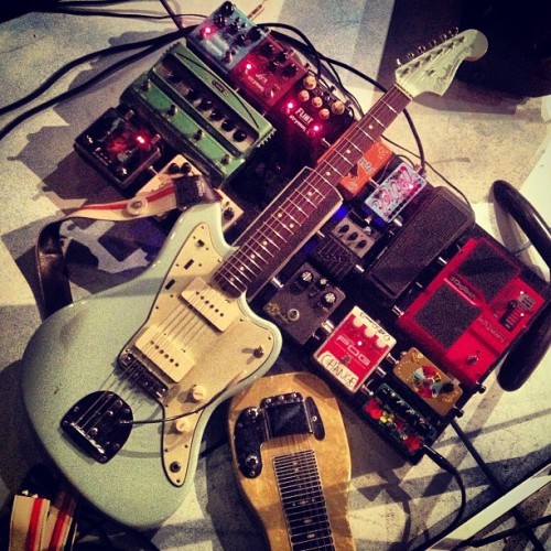
Inside of the rehearsal space, floating atop a sea of tangled cables, an object lies along the floor. It measures at about 40 inches long, 13 inches wide, and weighs an estimated 8.5 lbs (Shine). The artifact appears to be an amalgamation of natural and technological features: its anatomy is comprised of two central pieces of wood, with various other elements like metals and plastics intertwined into the surface of the structure. With even just a light tap, the object begins to vibrate, causing a whir of buzzy noise to fill the room. Though mostly unmarked, the top end boasts the words “FENDER” and “VINTAGE MODIFIED JAZZMASTER” which are etched deeply into it. This object, known as an electric guitar, has earned its place among the most unique instruments in history. Though it has existed for less than a century, the conditions surrounding its history and design yielded an artifact that would transcend genres, symbolize developing countercultures, and provide an entirely new approach to creation and expression.
In order to understand how this instrument has achieved such major cultural significance, one must first look to the intricacies of its design. Though invisible to the naked eye, the inner workings of the object house a great deal of complex wiring, similar to the guts inside of living organisms. In fact, when scanning from top to bottom, there are several parts of this object that seem to be a reflection of human anatomy. The guitar features a “neck” 22.5 inches in scale, along with a “head” comprised of a front bulb metal pegs along the back. Likewise, the “body” section comes complete with parts such an arm, a back, and a “belly”. The body is a structure that is rather unorthodox. Forming no conceivably recognizable shape, it can only be defined by one feature: it’s curves. Though technically amorphous, the buxom design is uncannily similar to the hourglass shape of a woman’s body. This is the first of many signs that this artifact that was purposefully constructed to be admired and desired. The sense of allure is also particularly noticeable when considering the smooth polyester finish: featured in colors such as “cherry red”, “ice blue”, and “butterscotch”, the artifact now appears more akin to a voluptuous piece of candy.
Additionally, there are characteristics of the instrument that embody aspects of nature. Once again, much like a human’s anatomy, the make of this object is naturally flawed. A close examination of the wooden neck reveals it to be slightly bowed and crooked. Just as the human spine is prone to lose alignment under the stress and pulls of everyday life, so does this Jazzmaster under the tension of 6 metallic strings, and intense bending of the tremolo arm. The power of sound is often referred to as having a certain kind of “energy” or giving of certain “vibrations”. By examining the neck of the guitar, it’s clear to see how. Scaling from the nut to the bridge, one may notice that the space between each of the frets becomes increasing smaller as one travels down towards the body. Compare this to textbook examples of energy vibrations and the electromagnetic spectrum, and a diagram of the power of sound waves becomes revealed right before one’s very eyes.
Perhaps one of the biggest indications of the cultural significance of this object lies in the unusual complexity of the history that surrounds it. Judging by the limited wear on the body, and the text “Vintage Modified Jazzmaster” along the headstock, the artifact at hand is not an original model, but a reissue of one from previous decades. The fact that this model continues to be reproduced certainly suggests that it sold well, but in reality, the instrument was virtually ignored at the time of its market introduction. In 1958, the guitar was first produced and released by the Fender Electric Guitar Company as an upscale version of their legendary Stratocaster model. Leo Fender conceptualized the instrument as a “deluxe” guitar, and marketed it as having a more “mellow” sound, specifically to suit the needs of jazz guitar players. However, the fate of the guitar would forever be changed as neither jazz enthusiasts nor the burgeoning rock-and-rollers seemed to be interested in it. From my own experience, I would argue that this is due in part to the Jazzmaster’s hyper resonant qualities, which produced significantly more feedback and white noise than the typical electric guitar of the period. The hi-gain, punchy sound was simply too raucous for the golden generation, who valued harmony and simplicity over energy.
Take, for example, this clip of the Everly Brothers performing their hit “All I Have to Do is Dream” from 1958. Arguably one of the defining songs of this era, the sound of an electric Stratocaster is present, but is placed far in the background while the gentle pluck of acoustics hold dominion. Despite Leo’s vision, the culture that the Jazzmaster was introduced to could not utilize the potential that the technology offered. It would take nearly another 20 years for the landscape of popular culture to catch up with this noisy, wooden object.
However, generational displacement of objects is no anomaly; in fact, it could be argued that many of the world most culturally resonant objects (musical ones in particular) do not find cultural adoption until years after their initial inception. For example, in her essay “Lucubrations on a Lava Lamp”, Jennifer Roberts supports this notion by examining the history of one of the paradigms of the 1960’s. Though the object would become espoused in the digs of the psychedelic counter-culture, the “Lava Lite” was initially intended as a mainstream house hold item, meant for dinner tables, the tops of television sets or as one ad even states, “…perfect for the study or den, so right for the executive suite” (Roberts). Much like the Lava Lamp, the make of a Jazzmaster was an unusual blend between the organic and the technological: it utilized the same standard technology and materials as any other electric guitar of the period, but the combination of a free-floating bridge, tremolo arm, and single-coil electromagnetic pickups created a sound that was too discordant to be adopted by popular culture, and too early for the developing counter culture to be able to embrace it (Audiofanzine).
The Jazzmaster was certainly not the first popular guitar to be met with initial rejection. In fact, across the 84 years since the electric guitars inception, there have been at least 4 major shifts of preferences in body style and sound, each accompanying the evolution of trends in popular culture. For each one of these shifts in sound, the industry’s answer has always been a model that was introduced in previous years, but faced initial rejection by players and listeners alike. In order to understand how a commercially rejected guitar could eventually become a godsend for generations worth of underground musicians, one must first understand the musical climates that preceded it.
The first era spans from 1931 to 1963, beginning with Adolph Rickenbacker’s invention of the electromagnetic pickup, and ending with the rise of the British Invasion. This period emphasized smoother, non-invasive guitar sounds with minimal distortion. This clip of Elvis and his backing band embodies all of these characteristics, both visually and sonically. The featured guitar here is a 1950’s Gretsch archtop, a staple among players of this era. This model has an unusually wide, hollow-body with Filter’Tron style pickups to achieve a sound more akin to an acoustic instrument. It should be noted that in this footage, the electric guitar’s sound is buried in the background, as the piano remains the primary focus behind Elvis’ voice. This is rather unusual, considering that the inspiration behind creating the electromagnetic pickup was to allow the guitar a chance to be heard above other instruments. The fact that its sound remained so constrained during this era reveals much about the fears performers and music producers had about the power of this newfangled technology. In a culture that embraced large size and minimal volume, it’s clear to see how the sleek and noisy Jazzmaster model would fail to resonate within the market.
The second shift of electric guitars spanned from around 1963 to 1970, as British players and American copy-cats chimed in a new generation of exciting and expansive sounds. Juxtaposed to the muted, low end plucks found on early pop and rockabilly records, the era of the 1960’s heralded in a new emphasis on bright, trebly guitar tones. The epitome of this generation of rock music was without a doubt the German-made Rickenbacker guitar models, are famous for the sparkling, jangly sounds that would become synonymous with the music of 1960’s culture. In fact, much like the Jazzmaster, the Rickenbacker Capri series was unveiled in 1958, and was also initially met with confusion in the commercial market. However, unlike the Fender product, the Rickenbacker models would gain widespread appeal at a much quicker pace, as the company began branding itself as the “Beatle-backer” because of John Lennon and George Harrison’s extensive use of their guitars, especially during the fab-four’s formative years. In addition to rock and roll music, this brand was also responsible for ushering in folk music into popular culture, which used its sparkling tone to refresh their classical songwriter arrangements. In this period, the Jazzmaster would see a brief stint in popularity, due to its role in the short-lived surf music craze, but this wave of success was only temporary (Wolk). Once again, the sound was deemed too harsh to have a place in pop music, but the first signs of a significant alternative music movement was beginning to take formation.
But before the Jazzmaster would eventually be adopted amongst mainstream culture, it was the Les Paul electric guitar model that would be the voice of early 70’s guitar players. What little footing the Jazzmaster had gained in the 1960’s was inevitably lost because of a new emphasis on a “fat” guitar tone with longer sustain. The Les Paul was introduced by Gibson in 1952, and once again rose to universal acclaim despite a long period of lukewarm receptions. The success of the instrument is due largely to the sound of its duel humbucker pickups, responsible for creating the wide and powerful guitar tones that would be adopted by musicians such as Peter Frampton, Mick Ronson, and Jimmy Page. As a result, the “retro” look and sound of the Fender Jazzmaster was once again scoffed at by most musicians of this era, and production of the instrument ceased around 1976.
While two decades worth of commercial failure typically marks the inadequacy of a product, in hindsight, the Jazzmaster’s long incubation period was essential to fulfilling its fateful role within underground rock culture. As production began to wind down, hundreds of Jazzmasters began to appear along the walls of pawnshops and discount music stores all throughout the world. However, this also meant that new, high-end electric guitars could be purchased at low prices, thus opening up the door for many musicians who may have been unable to purchase such an instrument otherwise. Just around the end of the Jazzmaster’s first production, cult heroes such as Tom Verlaine (of Television) and Elvis Costello began acquiring guitars from pawnshops, and used them in marking their unique images and sound. Notably, Costello used his Jazzmaster as a centerpiece of his 1977 debut “My Aim is True”, including on the front and back cover art. The guitar, which he claims he “never knew even existed” until his bargain-bin discovery, became crucial to creating the sharp, “spy movie” pluck on his early hits such as “Watching the Detectives” and “(I Don’t Want to Go to) Chelsea”. Much like the archtops, Rickenbackers, and Les Paul models, the previously ignored Fender instrument would finally begin to build a relationship with an emerging generation of musicians.
By the 1980’s the Jazzmaster had become a cult phenomenon, playing a major part in the sound of the developing “art rock” and American “indie rock” scenes. In particular, members of Sonic Youth formed a deep connection with the guitar model, as the hyper-resonant qualities that were deemed inappropriate for previous generations were now perfectly suited for the discordant alternative movement. Because they were so easily replaced, Sonic Youth hoarded dozens of these pawnshop treasures: their inexpensive price tag created the opportunity to bands to conduct extensive experimentations, including unorthodox modifications and new techniques such as bashing them with drum sticks, or recording the destruction of the instrument. Just a few years later, the guitar would become a staple in the arsenal of timeless pop bands such as The Cure and The Smiths. Much like the Lava Lamps of Robert’s essay, this object may have been invented by one generation, but it was destined to become synonymous with another.
What made (and still makes) the Jazzmaster truly stand apart is that the combination of its history, versatility, and flaws have crafted it into one of the few object that provides the player with total control, producing an entirely new range of potential expression. The greatest testament to this statement comes from the work of Kevin Shields, guitar player for the Irish rock group My Bloody Valentine. Between the 1988 and 1991, Shields transcended musical charts, and created entirely new genres of music by taking the style of his peers and adding onto it with open tunings and using the tremolo arm to excessively manipulate pitch. The result was a whirling and warped sound known as “Glide guitar”, which creates dense, highly texturized soundscapes. According to Shields, when being played at extreme volumes, Glide guitar can reportedly influence brainwaves, and puts the listener in a trance-like state(BBC FOUR).
Shields claims to owe his success entirely to the “constant feeling of expression” provided by the Fender Jazzmaster, and he’s not wrong for doing so. Once again returning to its anatomy, there are several key features responsible for crafting this otherworldly sound. Firstly, the combination of the free-floating bridge with the natural imperfections of its wooden body results in an unusually high amount of string resonance along the object’s neck. The overtones created by this resonance have a sound akin to eastern instruments such as a sitar or a tanpura. The sound is incredibly organic, as the vibrations create a natural motion which wanes and waxes, even when droning on a single note. When the motion of the resonant strings is met with a bending tremolo arm, the resulting sound waves are highly texturized and possess a circadian kind of rhythm that is not easily replicated otherwise. As stated previously, all guitars create vibrations, but the characteristics of the Jazzmaster take these energy waves, and manipulate them with massive swells and oscillating tonality to a dizzying, psychedelic effect.
Despite its unparalleled features, the Jazzmaster spent much of its life being misunderstood and dismissed by the company and the culture that reared it. But in this period, stuffed among the pawnshop clutter, the guitar would take on a second life, and evolve into a symbol for change and musical innovation. As if by fate, the Fender model became a physical representation of the repudiation facing the underground rockers who wielded them.By the 21st century, the Jazzmaster made a triumphant return to the market, and has remained there to this day. In his book “Loveless”, author Mike McGonigal shares that he, among others, see glide guitar style is “the pinnacle of guitar music”, and yet to be surpassed (McGonigal). While it may be unclear how time and technology will alter the musical climate, it appears that an object once written off by its culture may also be the one to have the last laugh.
A fitting accomplishment for Fender’s greatest problem child.
References:
“Fender Classic Player Jazzmaster & Jaguar: The Test.” Audiofanzine. N.p., n.d. Web. 04 Dec. 2014.”
“McGonigal, Mike. Loveless. New York: Continuum, 2007. Print.”
“Prown, Jules David., Kenneth Haltman, and Jennifer L. Roberts. American Artifacts: Essays in Material Culture. East Lansing: Michigan State UP, 2000. Print.”
“Shine, James W., Jr. “The Intricacies of the Fender Jazzmaster.” N.p., 3 Jan. 2005. Web. 07 Oct. 2014.”
“The Joy of the Guitar Riff. Perf. Kevin Shields. BBC, 2014. BBC Four. Web. 07 Oct. 2014.”
“Wolk, Douglas. “The Fender Jazzmaster’s Story, From the Fireballs to Lee Ranaldo.”
The present object, at its face, has a triangular shaped side, measured at 7.6 inches tall. At the height of this measurement, the object is sectioned off by a perfectly leveled horizontal indentation that yields to a pyramid shaped portion at .3 inches tall that crowns the remaining portion of the body. At the objects peak, it stands at 7.9 inches tall. The slope of the triangle shaped side is roughly 101 degrees from base to apex.
The object has 4 sides of uniform dimensions equal to the side measured above. When looking at the bottom of the object, when it is turned with it’s apex, at the top of the pyramid shape, pointing downward, we see that the base is squared. Each side of the square, at the bottom of the object, measures at 4.5 inches. Its weight is measured at 330g.
The first component seen on this object is the indentation at what we can presume is the objects front. From 3.4 inch to 7.4 inch marks from the bottom of the object’s face is where this indentation occurs, measured at roughly .3 inches deep into the object’s front. This indentation has a black triangular shaped finish on what appears to be treated plastic. On either side of the triangle are groves following, perfectly, the original triangle shape of the object.
Directly center of this area, resting vertically, is a metal strip . It is thin with several grooves in it, and measured perfectly starting at the bottom and occurring more rapidly as we scan its features to its top. This piece is not attached to this area, rather, if we follow its origination, and maneuver the whole object so that the apex of the triangle is pointing at us, we see a rectangular shaped hole where the object’s point of origination extends from (see image l). The rectangular hole measures about a third of the indentation in the whole object, and extends about half of the indented area’s base, centered, at 3.4 inches on the slope from the base of the object.
Image l
Enclosed around the metal strip, and made similar material, is a pitchfork shaped device with three prongs. The outer prongs of this device hug the metal piece and are thick, whereas the thinner piece, the center prong, is positioned directly atop the metal piece, so that the areas of the metal strip are not visible wherever the center prong rests. They seem to latch on to the grooves of the metal piece and the pitchfork device can be moved to the desired position on the many grooves. The metal piece, at its very top, is housed within a ridge on the indented section. When the metal piece is removed from this housing at its top it snaps forward from the front of the object and swings from one side to the next.
The final piece of the indented portion of the object is located directly underneath the metal piece. It is an additional indentation that is colored gray. It extends the same height as the metal piece but is markedly wider. The component that is most notable of this area is the printed and underlined numbers. The underlines correlate in position with the groves of the metal strip — so that the top number, 40, is underlined very closely to where the first groove of the metal strip begins, when housed in the ridge; and the next number from the top, 42, correlates with the following groove of the metal strip.
Each concurrent number appears on the opposite side of the metal strip, on the final indentation, and they are lowered so that 40 is higher and on the left side (from our perspective) of the metal piece compared with 42; while 42 is higher than and on the right side of the metal piece compared with 44. (40 and 44 are both on the left side of the metal piece).
At the bottom of the final indentation appears to be a pitchfork shaped figure enclosed in a black diamond. Underneath the diamond is the word “Wittner,” presumably the objects maker.
The object, excluding the indentation mentioned previously, appears to be made of a mahogany finish. It has several black striations from bottom to top and it resembles a wooden finish. This finish reveals itself to be a hard plastic by its smooth surface when touched and inspected further. On the the object’s left side, if we presume the indented area is the front, there is a metal knob that makes a click noise when turned, and the noise resonates from the interior of the object, in an area that, to be inspected, would require dismantling the entire object to view the mechanism causing the clicking noise. This knob, presumably, winds up the thin metal piece in the indentation, and when it is wound, it powers the metal strip’s swings, and provides force for the strip to oscillate at different rates, depending on the position of the pitchfork shaped device on the ridges on the metal piece.
The higher the pitchfork shaped device is on the metal strip, the slower it operates — so that 208, the number lowest on the final indentation, swings the metal strip faster than 40, the number highest on the final indentation. Whenever the metal strip crosses the center, where it is housed, it makes the clicking noise described earlier. These clicks can be timed, when maneuvering the pitchfork device, enclosing the thin metal piece in the indentation, downward or upward, and synchronized with the second hand of a clock — or faster and slower.
The final piece we will inspect is the “Wittner” inscription on the final indention, underneath the black diamond shape that houses the pitchfork shape (not to be confused with the pitchfork shaped device that encloses a portion of the metal strip). A quick internet search of the inscription coupled with the object’s description yields promising results. Wittner is a German manufacturing company that specializes in various musical auxiliary equipment. Filtering through the items in which our object is not, in its aspects of shape, size, and color, we find that our object is a Wittner made metronome Model No. 812 K, plastic casing (see image ll).
image ll
This object is not specific to the maker Wittner. Johann Maelzel is one of the early, and questionable, inventors of the modern metronome, but the design of early model components are accredited to Galileo, who first discovered the practical uses modern clock mechanisms.
Maelzel’s professional history is intertwined with Beethoven’s composition of the “Wellington’s Victory,” a composition that Maelzel commissioned the pianist to write and that was eventually performed on another contraption of the inventor’s, the panharmonicon. But after a bitter battle with the composer over legal ownership of the “Wellington’s Victory,” Maelzel, while on a world tour, died aboard the Otis en route to Philadelphia from Havana — but his contribution lasted.
Despite Maelzel’s German lineage, the term metronome actually comes from Greek. It is a combination of the words metron (measure) and nomos (relegating). Whether the ancient Greeks had any notion of developing a metronome predating Maelzel’s model is unknown, but archaeological history reveals that ancient Greece utilized various early time-keeping devices. One of these devices is called the water clock (see image lll).
image lll
Water clocks, though used by many ancient cultures, originated in Egypt around two thousand B.C. These clocks were powered by a water container, that, when emptied into a reservoir, lifted a floating device attached to handle. This handle, attached to a gear directly above it, rose as water filled the reservoir and turned the gear which controlled the movement of a clock dial that made up much of the device’s face. When the water in the supply container ran empty, and the reservoir was filled, the clock stopped and both devices would have to be restored in situ; that is, the container must be refilled, and the reservoir must be emptied . This design required constant manipulation by the ancient Greeks to keep the clocks running, but the goal, if kept, would provide an accurate measure of time elapsed. For this purpose, the water clocks calculated time more precisely than the obelisk, which ancient cultures used with ubiquity, largely due to obelisks’ functioning relegated to daylight hours — they relied on casting shadows determined by the sun’s position in the sky.
The intricate taxonomy of early Greek and ancient Egyptian water clocks begot innovation in the centuries following that led to the invention of the clock, as they are today, and other peripheral chronometrical inventions such as the Wittner metronome Model No. 812 K, plastic casing.
This particular metronome assisted in the composition process of an alto saxophone and piano piece that won first prize at the 2011 Ohio Federation of Music Clubs’ Composition Competition collegiate level. The young man who won the competition began playing the piano at thirteen years of age. During his artistic infancy, he practiced fourteen hours a day, measuring his notes and discerning the distinct taste the staccato and legato flavor a piece of music. His daily schedule deferred to his practice schedule and he committed to the precedent routine with brief rests throughout the day, the naps supplementing the lack of major REM sleep. This schedule would change depending on what time his bus would carry him to his middle and, later, high school classes. He initially learned pieces of music by ear, playing crude renditions of Handel and fumbling through advanced chord progressions of Thelonious Monk.
He exhibited a singular interest in classical and jazz music that distinguished him from his peers. His appetite for the thrill of practicing, however raw, lead him to pursue a richer knowledge of the artistry of composition and arrangement. At fifteen years old, he studied under his first piano instructor who would refine his artistic capabilities. On Tuesdays and Thursdays, at seven o’clock, he would meet with his instructor to develop his ability to read measures of sheet music. Immediately, the instructor was captivated by the student’s quick knowledge and measured understanding of the classics.
He was advised, after a brief stint into his guided direction, by the instructor to seek a more advanced teacher. That year, during his first semester of tenth grade, he heeded his former instructor’s advice and he went on to study under a master class pianist who, over the progression of her advisement, would suffer bouts of disorientation and forgetfulness that accompanied dementia that she suffered in her aged years. Nevertheless, the relationship was a fruitful one and the student decided to attend Shorter University in Rome, Georgia (the city’s name commemorates the Italian city with the same name) in remote appreciation of Italian composer, Antonio Vivaldi.
The student performed well under the tuition of his professors at Shorter, and he graduated three years after he first entered the program. He amassed a comprehensive repertoire with works ranging from early classical to later twentieth century, and many of his own compositions (some of which he entered into competition and won). He then went on to pursue his master’s degree at Cincinnati Conservatory of Music after studying in Austria, the “capital of classical music,” where he learned that composition better suited his interest. There, in his second and final year at CCM, he wrote the piece that would win him the 2011 Ohio Federation of Music Clubs’ Composition Competition collegiate level, and placed him in an excellent position to pursue his DMA at Cornell University in Ithaca, New York, and after his sojourn in this city (named after Odysseus’s refuge in Homer’s Odyssey) there is no way of knowing what direction his musical journey will take him.
The Wittner metronome, Model No. 812 K, plastic casing, accompanied the student in much of his journey, from Rome, Georgia, to Austria; from Cincinnati to Ithaca; and It was used to aide in the preparation of many pieces before garnering the mentioned win. Prior to its current ownership, it was shipped from Allgäu, Germany, according to Wittner’s shipping address.
If this metronome will ever be encased in glass, like Beethoven’s famed metronome from his landmarked house in Baden, Austria, (see map below) is too early to deduct; but there are millions of metronomes, many similar to Model No. 812 K, plastic casing, in use today measuring the practice of aspiring, and accomplished, musicians that may be curated to exhibits such as Beethoven’s .
The Model No. 812 K, plastic casing, may very well be an anachronism with the most recent metronomic devices being digital and found online. They range from traditionally standard (40 to 208 beats per minute [bpm]) to technologically advanced digital interfaces that measure time at 900bpm.
Various measures of time are useful to what flavor of music is being created. The 72bpm in “Kaneda’s Death, Pt.2 (Adagio in D minor)” from the 2007 science fiction film Sunshine, is unique from the 140bpm in Beyonce’s “Drunk in Love,” which, in turn, is unique from the faster 380bpm, at its peak, in John Coltrane’s “Giant steps.” The difference in tempo can be culture and genre specific and may provide abstract insight on the culture attributed to them (high energy 1970s disco tracks tend to have faster tempos than the religiously rigid 17th century baroque pieces).
The metronome simply measures time and a key component of many traditional metronomes is the pendulum. The pendulum on a metronome is a thin, oscillating piece that emits a clicking noise as it crosses the center line of the object. (This pendulum was described earlier in our model as the thin metal piece). Galileo Galilei developed this piece in the early 17th century, but its full functionality came later that century with the invention of the pendulum clock by Christiaan Huygens. Galileo played a major role in scientific revolution during the European Renaissance, a movement that was concerned with ordering the nature.
The clock maintains its basic function, as it has since prehistoric Egypt, with their invention of the obelisk, and that function is to track time.
Although the ancient obelisks were designed to designate the most adequate and productive farming time for the early Egyptians, through the objects’ shadow casting under sunlight, our present mode of life is not disparate from the early Egyptian’s ideas of adhering to the order, or rather, the ordering, of time.
The Model No. 812 K, plastic casing, and its analogues, function reveals the nature of music; and that is, music is a sequence of sounds moving through time. Differences in pattern are in music that reflect the performer or writer or the overarching cultural notions that make up any particular piece, but the principal objective is to utilize the time. Like the ancient Egyptians whose timepiece tracked the growth of their crops, or the pianist that practiced fourteen hours a day to improve his skill, society’s daily occurrences are measured progression, or stagnation, through time — the Egyptian farmland is either tilled or not, but time continues to move.
We are able to order ourselves with time. From limitations in statutes and time stipulations in international treaties, to the more commonplace and, oftentimes, fleeting occurrences in our world, such as the aging of the piano instructor, our lives revolve around the passage of time. We can, in that time, become pianist, inventors, or farmers — or an innumerable host of desirable persons driven by a range of motivations.
This notion of employing the passage of time to optimize human utility, chronicled earlier with the student pianist and the metronome, and that humans are governed by time, the Egyptians and their crops, is condensed, at its essence, in the functionality of the metronome (that the object measures timing to aide in the production of the most suitable composition for its composer) yet the piece must remain in accordance with the parameters of time. The character’s mentioned (the Egyptians, the Greek, the disco music, the baroque music, Beethoven, Maelzel, the student, and his two instructors) all adhered to time, whether or not they were aware, to produce an output — or reap the consequences of it — some more socially and culturally impactful than others. Nevertheless, they were able to impact in some way or another and are comparable to the pieces of music, at their embryonic stage, measured by the metronome, and by time in general, in that it is an laborious task to compose a product worthy to be called symphonic if time is not administered properly, and with the desired flavor, yet something must be created lest time be wasted.
It is an elusive, garbled, and all inclusive concept with many components all seeming to compound upon the whole, repeat what has occurred, and connect dissimilar units.
Cool to the touch, this object feels surprisingly heavy. The structure of titanium steel brings the object’s weight to approximately 5 ⅛ ounces. From afar the object looks like a mass of black but a closer inspection reveals a beautiful combination of ion black and luminous silver with a distinct amount of lime neon green. Laying flat across a surface, the object resembles the shape of a lollipop; A circular head with a thin body descending. The object measures four inches long with its circular head possessing a diameter of one and a half inches and the length of the body measures two and a half inches. The height of the circular head is half an inch high while the body stands at one fourth of an inch tall.
Peering from above, one notices a perfect circle . The circle’s interior reflects a luminous silver, the rim producing a bold ion black. The diameter of the circle measures one and a half inches. A closer look into the interior one notices slow strenuous movement. In the direct center, two hands are ever rotating, reflecting a relative aspect of life; time. Identical to one another, the hands are only distinguishable by height. The larger of the two measures almost a full centimeter while the smaller hand reaches only half centimeter. These hands resemble miniature blades missing only the hilt. Appearing razor sharp, the hands overlap one another with a fat rounded bottom. Ascending towards the top, the hand gradually thins out to a fine point as the tip of the hand reaches right below the rim of the perfect circle. These hands are painted a bright luminous silver. Yet the actual stem of the hands are coated in a whitish yellow tint. This beautiful silver reflects in the line, yet in the dark the hands continue to shine. This tint provides a secondary function other than aesthetics. When in the dark, this tint makes the hands visible to the human eye.
These hands are ever revolving in a beautiful luminous silver background.The silver service is embedded with tiny miniscule dots, each the size of the end of a paperclip. From afar, one would hardly notice these tiny indentations covering the entire interior of the circle as one might only notice a silver background. Though initially appearing as aesthetics this physicality provides the functionality of life to this object. Requiring no battery to operate, this object operates and fuels itself purely off solar-power. Hence this dot-embedded silver interior surface absorbs sunlight which transfers the light into energy to fuel itself.
Following these indentations outwards, one might find themselves peering into the rim of this perfect circle. The rim, the dividing line between the interior and exterior of the object, remains a thin line, a circle, painted a distinct neon lime green. Found directly below this thin green circle, within the interior, remains silver markings, each just a thin silver line.Each no longer than an pencil’s eraser and no thicker than lead from a mechanical pencil, there are exactly three hundred of this razor thin thins. At each interval of twenty five, the line is emphasized as the size is doubled, around the length of a human’s eyelash. These tiny silver markings are found encircling the dividing area between the exterior and interior of the object, which I refer to as the steep. No more than a gradual height increase of one millimeter, this steep provides enough of a height increase to provide two primary functions. The first function of the steep is providing a home for the tiny silver markings. The two rotating hands do not measure these markings as this responsibility is left to a third rotating hand which is activated by a button on the exterior right side of the circle measuring seconds and milliseconds.This silver rotating hand starts from the center of the object and extends directly to the rim ending where the silver markings begin. No thicker than a piece of hair, one would never notice this hand without a closer inspection.
The second function of the steep provides is protection. THis step provides a height increase making the primary circle not a two dimensional object, but a three dimensional circle. By the steep gradually extending outwards, a convex rounded piece of glass is able to be placed over the interior circle providing protection for the subdials, design and rotation hands.The glass appears thick when tapped against, almost providing similar security and protection similar to a window protecting a bank teller or car windows.
Following the twelve emphasized lines located on the rim inwards, twelve identical silver rectangles rest directly above or below these silver lines (depending on location in circle), resting directly on the interior border. These small twelve silver rectangles represent the numerals one through twelve, despite having no numerical value present. These silver rectangles are thirty degrees apart from eachother, just like the emphasized silver lines resting on the steep. At every ninety degrees, the numerals divisible by three contain small silver squares instead of rectangles. These numerals possess squares instead of rectangles due to other aspects within the interior.
Located at the numeral three,directly to the left of the square is an adjacent square, twice the size of the original square discussed. WIthin this square is a numeral that changes everyday dependent on the day of the month. Changing everyday, this number is inscribed in silver writing. ABove that square reading the date is a description written in two lines. The first word, in all capital letters and silver inscription reads, “CITIZEN.” Below the CITIZEN, in italics and slightly smaller font, the inscription reads “Eco-Drive.” The top inscriptions reveals the brand of watch this object remains. The second description reveals the brand’s particular design.
As stated before these inscriptions lie on top of the date square with the inscription ”CITIZEN” directly above the “Eco-Drive” inscription. Now directly below the date square remains one more inscription. The same font, size, and color as the “Eco-Drive” inscription, just not italicized, the markings read “WR 100.” WR is an acronym for water-resistant meaning this object can withstand depths of 100 feet of water pressure.
Redirecting attention back to the centerpiece, immediately left of the center point is another miniature circle.Above and below the center remains two more slightly larger circles. These circles within the overall circle are referred to as chronograph subdials when discussing the nature of this object.
The first chronograph subdial to be described remains the one directly adjacent, left of the center of the primary circle. This subdial remains the smallest of all the subdials. Almost impossible to measure with an average ruler, the diameter measures one fourth of a centimeter. This subdial does not fit the criteria of a perfect circle, such as the its larger brother and sister subdials, and the overall circle it rests within. The top right and bottom right corners of the smallest subdial are overlapped by the remaining subdials in the primary circle; as the silver rim of the two largest subdials lay on top of the greyish matted black interior.
This subdial is divided into four parts by a white cross. These lines of the cross are painted razor thin , only enough to add to the design as these cross provides no functionality, only aesthetics. As each point remains a number in numerical form. At the top, the number reads twenty four. Ninety degrees down, (moving clockwise) the number reads six. Another ninety degrees the number reads twelve, directly below the number twenty four, only divided by a thin white line. The final and fourth point of the cross hold the number eighteen These numbers signify the hours in the day measuring society’s twenty four day in intervals of six hours.
Though the cross remains aesthetic the hours are monitored by a revolving hand. THough not as elegant and beautiful as the sword-like hands rotating in the primary analog face, this ever rotating needle is just as significant concerning the watch’s functionality. The needle begins at the miniscule black dot found directly in the center of the subdial, the size of the rounded end of a pin which extends to the rim of the dial. The hand extends far enough to cover the entirety of the white cross but not long enough to cover the number when it reaches such.
The remaining two subdials found directly above and below the centerpiece are designed similar but have a few distinct differences. SImilarities include that same needle. All subdials contain the same hand discussed in the previous paragraph. Another similarity includes the background of the subdials. All subdials possess the same color background, matted black.
Both subdials consist of the same design; a matted black background with a silver outline. Within this silver outline are tiny black dots encompassing the entire border. These black dots are the size of the end of a paperclip or the same size of the dots within the solar panel. Every forty-five degrees however, the black dots are replaced by a thin black line. Overall both silver borders contain 54 black minuscule dots, and six thin minuscule black lines.
The only difference between the two largest subdials remains the numerals within that circle. The top subdial adds the function of recording the hour in twenty minute intervals moving one hundred and twenty degrees once every twenty minutes. The top number reads sixty and moving clockwise, the next number located one hundred and twenty degrees away from the numeral sixty reads twenty, while the final numeral reads forty.
Now the subdial directly below the top subdial numerals are divided into intervals of ten. The top numeral reads sixty. Moving clockwise, at forty-five degrees, the numeral increases by ten each time reading ten, twenty, thirty, forty, and fifty, respectively. These numbers represent the seconds in a minute, as the hand in the middle is constantly rotating at a rapid pace.
Leaving the interior, the exterior of perfect circle contains three buttons on the right side of the object. The middle, slightly larger than the top and bottom button. The top and bottom button are simply black with the bottom outline in the same neon green button that push inwards. The top button starts and stops the stopwatch function of the object. The bottom button completely identical in appearance, provides users the option to set the stopwatch needle as a rotating second hands for traditional watch wearers who wish to have the traditional analog watch face.
The middle button provides the functionality of rotating the two primary rotating hands clockwise or counter-clockwise. Unlike the buttons surrounding this middle button, this does not push inwards, but can be extended outwards to rotate clockwise or counter clockwise. This button remains the size of a pencil’s eraser. Yet directly in the middle is a slight indentation that is colored the same neon lime green located around the rim of the watch. This indentation provides users the ability to pull the bottom slightly out to allow them to rotate the primary hands in the direction the user pleases.
The remaining aspect of the watch is the band. Painted a gloss black, each link is composed of three identical squares, each side measuring half a centimeter. The middle square, however i raised one fourth of a centimeter higher, so the links can stack on top one another ever continuing pattern. Starting from the top, following the eighth link, a solid black clasp, rectangular shaped. At the top of the clasp, engraved in capital bolded letters reads “CITIZEN” Directly below the letters C and N, lie two silver flat half circles no larger than the tip of a baby’s thumbnail, are buttons to release the clasps allowing the clasp to extend outwards and allow user to place the band around their wrist. Following the links upwards, one reaches the back of the watch, a bright shining silver, directly in the middle engraved reads “CITIZEN” while the bottom following the border reads the numbers and letters “B632-S082846 201022374,” referring to the model and serial number of the object.
According to Wikipedia, wrist watches were invented sometime in the sixteenth century. Initially and for the better part of two hundred years wristwatches were only worn by women, with men generally sporting pocket watches. proceeding the industrial revolution, and following western society’s demand for colonization, and expansion, the majority of the world plunged into a constant warring state. It was soon strategized through the decades the need for an awareness of time to coordinate strategize and synchronized movement of troops, supplies and attacks. BY the the conclusion of WOrld War One, troops returning home continued sporting these wristwatches to where eventually wristwatches were fashionable for both men and women.
As we’ve progressed throughout the decades, western society continues to place a higher and stronger emphasis on materialism, as it is one way to reflect personal and financial success in the eyes of many. Shiny, heavy, attractive objects are what people crave. Televisions, cars, jewelry, clothing and clothing accessories, the list continues infinitely. THis watch fit the description of all three adjectives. The targeted consumer for this object remains obviously the western society male. The association of cheap objects make most, including myself, think of unsturdy light, easily breakable objects. The heavy composition of this watch provides me the security that this item will hold up to the daily wear and tears; that the purchasing price of this item was well worth its price. I feel well-compensated. The design is beautiful and intricate, fashionable and sleek. These features are the cornerstone of what western society thrives off of. Time is relative. So is personal preference. Yet we see how objects and people’s preference towards them is not being determined simply by opinion and personal preference anymore, but becoming more objective as society sets the an objective standard of what should be consumed and why. From advertisements to the standard of living we set for ourselves, and or attempting to live up to the American dream, whatever the reason, intentional or not, our society and our western culture influences our relationship with objects.
The artifact appears as a soft rectangular solid of black, silver, and grey- cast in aluminum, glass, and hard plastic. The body of the object is covered in a shell of light blue rubber and hard, medium-blue plastic, measuring 2.31 inches wide, and weighing 4.9 ounces. Its depth measures 0.37 inches, and the object is 4.5 inches tall.
On the front mirror black surface of the object, near the bottom, there appears a slightly recessed circle, perhaps a button, with a white square inscribed on the center, measuring no more than a half-centimeter or so on each side. Near the top of the façade there is a rectangular shaped recession, with grey mesh at its base. Adjacent to the grey mesh, sits a tiny circular lens. On the east vertical side of the artifact, there are what appear to be two buttons, labeled “+” and “-”, and a switch which can be shifted upward or downward. When shifted downward, the switch reveals an orange rectangle of color above it.
The west vertical side of the object remains flush, lacking any modifying attributes. The south vertical side features two small grey mesh ovals, two tiny screws, and an opening shaped like a rectangle, which appears to be an electronic female plug. The north vertical side features one oval shaped button and one circular opening which also appears to be a female electrical port of some variety.
Removing the plastic and rubber coverings and directing attention to the back of the object, one discovers what appears to be a tiny camera embedded into the top left corner with an accompanying flash, an image of a silver apple with a bite missing, and the following inscription on the back of the object:
“iPhone…Designed by Apple in California…Assembled in China…Model A1387…EMC 2430…FCC ID: BCG-E2430A… IC: 579C-E2430A.
Engaging with the object yields the discovery that this rectangular solid is in fact an interactive electronic device, likely to be used for communication, given the inscription on the rear, “iPhone.” Pressing the oval button on the north vertical side activates the front black-mirrored glass to reveal the date and time, a directive at the bottom, “slide to unlock,” two small digital oval buttons at center top and center bottom, and a camera icon in the bottom-right corner of the space.
The device “awakens” by touching the fingers upon the face to manipulate the device. Sliding down the top oval digital button reveals a brief weather report and the date:
“Saturday November 8th… Partly cloudy currently. The high will be 61 degrees. Partly cloudy tonight with a low of 43 degrees… Calendar.”
Sliding up the bottom oval digital button reveals a menu of buttons:
An airplane, a WiFi symbol, a Bluetooth symbol, a moon symbol, and a symbol with a lock circumscribed by a curved arrow.
Below these buttons is a sliding scale brightness control, with a sun emitting small rays on the left side and a sun emitting larger rays to its right. Beneath that bar lies a sliding scale controlling volume: a spectrum bookended by a speaker symbol on the left, and a speaker symbol on the right, emitting sound waves. At the bottom of the screen, 4 more buttons appear, revealing the tools they represent: a flashlight, a clock, a calculator, and a clock.
At the top of the screen, a status bar sits, indicating the level of connectivity, the service provider’s name, Virgin, and the form of service connectivity, 3G. To the right of this information, a tiny alarm clock, a faded Bluetooth symbol, the figure 75%, and a battery-shaped icon (the battery being ¾ full) appear queued.
With the face of the iPhone unlocked, the screen features several squares that, when pressed, reveal applications which the device can operate:
At the bottom of the screen, a secondary row of applications is anchored at the base:
Phone, Messages, Calendar, and Gmail.
Two circles, one white and one grey, appear above the bottom row. Swiping the finger to the right on the first screen reveals a second screen with similar applications to the first screen.
The following set of images will show the reader some perspectives considered during the writing process. These images composed a portion of an iPhone 3-D modeling draft.
Having focused on the physical attributes and the functions of the object, we can move from description and speculation to deduce that this object is indeed a version the Apple iPhone, a smartphone manufactured sometime after October 2011, making the device an expression of, more or less, present day culture.
Here’s Apple’s Trailer for the iPhone 4s.
Taking Prown’s object metaphors into consideration, the attributive description of the iPhone is smooth, shiny, hard, opaque, light, thin, and clean. Apple’s design seeks to draw out creativity and style, affirming life, enhancing productivity, and creating an atmosphere of “cool.” “Cool ” as a concept implies exclusivity; Dr. Thorsten Botz-Bornstein, a philosophy professor in Kuwait writing for Philosophy Now says, in his article about cool, “the aesthetics and ethics of cool fractures and alienates in order to bring forward unusual constellations of ideas and actions. In a phrase: the cool person lives in a constant state of alienation.”
The minimalistic design resists a loud projection of metaphor like Prown’s teapot: almost no one could call an iPhone “grandmotherly” or “comforting.” I have noticed in my own work, the analogy of the smartphone as a parasite. As a bartender, I’ve observed friends and couples out to lunch or dinner together. At some point, the conversations diminish, and I see the people drift away into the illumined faces of their devices. The objects that were designed to foster creativity and ease of communication seem to have created a precipitate and inverse reaction in the user: a sense of distraction and alienation. I may be making a generalization based on my cursory observations in the workplace, but I believe this example to be an object lesson, illustrative of a trend in culture towards a compulsive relationship to mobile devices and the Internet. As pendulums are wont to do, they swing between polarities, and I believe we’ve seen the extremity of over involvement with our gadgets, that over involvement being the causal event for the age of loneliness.
The muted features of the iPhone- the rounded sides, the relatively light and thin body, suggest that the object should seamlessly assimilate into a person’s life. Furthermore, the sleekness and lack of moving parts indicates that the object would basically be invisible. One could leave it in a pocket or bag and forget about it, thus allowing the iPhone to almost become part of the body.
Russell Belk states in his article, “The Extended Self in the Digital World”, “The Internet and many digital devices free us from the constraints of time and place and create other, virtual, times and places.” While the devices have their own kind of “intelligence,” the effect they have on their owners is profound. The sharing and social media components of smartphone technology also have implications on the extended self. Belk states, “many new possessions and technologies…create different ways through which we can meet, interact with, and extend our aggregate selves through other people while experiencing a transcendent sense that we are part of something bigger than us alone (Belk 494). The desire to connect with other people is part of human nature. The social media juggernaut Facebook, much like corporate radio, have realized what Matt Silverman records in his interview with author Douglas Rushkoff: “the people paying are marketers. That makes them the customers. And it means [users] are the product being delivered to those customers.”
As technology trends further towards ubiquity, mobile technology shrinks in size, increases in multi-functionality, and becomes easier to come by. Service providers offer free phones and free upgrades that accompany contracts and contract renewals. A compulsive relationship to technology and media seems to evoke the words of Marx recorded in Walter Benjamin’s The Arcades Project:
“All the physical and intellectual senses…have been replaced by the simple alienation of all the senses, the sense of having.”
This concept of alienation is especially interesting considering Belk’s ideas of the extended self. Belk’s ideas about virtual brand communities draw an interesting corollary: Belk states that normally, aggregating one’s sense of self with branded goods usually requires ownership; in the digital world, this aggregation can happen in virtual environment in which the user or consumer can engage brands without having to invest capital, creating a virtual sense of affiliated identity. The iPhone bridges the gap between physical and digital possession- one can physically possess an iPhone and then digitally possess all sorts of content.
This idea of the iPhone diverges wholly from older concepts of the telephone in many ways- early phones existed as stationary objects, mounted to a wall and hard-wired into the circuitry inside a building, making the object much less personalized. The evolution of technology from early telephone concepts leading up to the moment in time represented by this object shows a reshaping of the form and the role of the telephone in culture. The major shift is that of purpose: the telephone was a device for communication. Early cellular telephones, car phones, and pagers were devices made to enable interpersonal communication. While the smartphone is a device for communication, it is also a device for entertainment, advertisement, shopping, and distraction. The iPhone is a type of status symbol, unto itself. There are those who have iPhone and those who do not have iPhones. The values of the Apple Company imply creativity, business savvy, and an admission into a type of status of cool in the products they sell, creating a binary dynamism between those who buy-in to the Apple lifestyle and those who do not.
On the other hand, the iPhone is a valuable tool. It synthesizes the functionality of many other tools, thus allowing users to having a myriad of options available to them at the press of a button. There is nothing inherently wrong with innovation. The success of the modern age stems from innovation– the average human life expectancy has increased with the innovations of the last two hundred years. Science and technology offer the promise of a better life and a more informed population.
The ecological aspect of understanding the iPhone should also be considered as a part of studying the cultural impact and heritage of this object. Looking at the concept of ecological foot printing with respect to this object, one can learn a lot about what kind of effect it has on the planet and its people. Writer and engineer Jim Merkel writes in his book, Radical Simplicity about the call for examining patterns of consumption and looking at how the individual impacts the global community with his or her consumption habits. Merkel uses some mathematical concepts to determine the bioproductive area of the planet, subtracting areas that cannot produce vegetation and areas covered by water or development. With a figure of 6.7 billion humans, the bioproductive area allotted for each would be 4.7 acres. Those people earning higher than $100,000 annually use more than 60 acres of bioproductive space annually (Merkel 81-84). Merkel suggests that the solution to the planetary issues of over consumption and widespread income discrepancies would be to consume less, and generate less capital (Merkel 52). Such a concept suggests a radical shift in socioeconomic ideology.
The culture of Apple and the sensationalism surrounding the iPhone brand calls into question the binaries produced from a sense of having and not having. Examining these binaries could look towards a Marxist critique examining the relationships between producer and consumer and the labor value represented by the object. This evokes that masking of how and by whom an object came to be under a social value of the object in question: people want the iPhone, but, oftentimes, they don’t know how or by whom the iPhone was made. Part of this snapshot of history the iPhone 4s offers is a look at the structural issues inherent in the high demand for smartphone technology. Art and culture have begun responding to the economic and social ramifications of the technology.
“Ruined” by Lynn Nottage, a play about the violent situation in the Congo, partially brought upon by the mining of a rare-earth mineral, Coltan discusses issues that are precipitate to an increased demand for mobile technology. Coltan is refined into a powder and used in cellphone technology to keep devices from getting too hot.
Image by Dizolele. Coltan Mining.
Coltan is a key ingredient in the fabrication of iPhone circuit boards.
Nottage’s work connects the sexual violence perpetrated against women in the Congo as a precipitate of these internal social and political conflicts, which arose in part, to the rising demand for cellphones to be manufactured and sold in the western world.
The aim of a material culture analysis of any object should illuminate revelations about the culture that produced said object. The culture of American iPhone users is but only one aspect of the greater picture, as iPhone labor is outsourced, therefore globalizing the artifact. In order to get a clearer picture, it is important to examine the world of those involved in the manufacturing process as well as that of the end users. The situation of the laborers creating Apple products has been something under scrutiny in recent years. At the Chinese plant, Foxconn, journalists have exposed sweatshop conditions. An outbreak of suicides in the Foxconn plant, which produces some of Apple’s products, deepens the concern over the human cost of manufacturing luxury items. These disturbing facts have a contradictory and interrupting effect when taken into view along with the aesthetics of the brand: a paradox between a projected image and a gritty reality.
From Daily Mail. Workers’ quarters at Foxconn.From China Divide. Workers at the Foxconn Plant where Apple products are made.
Juxtaposing the images of violence to the images of sensational consumerism raise an eyebrow to the notions of ethical consumption. How can today’s modern consumer , whose identity to some degree, has been acculturated into the use of these kinds of technology, move forward and make decisions about their own consumption– by understanding that purchasing any object supports and reinforces the existing relationships being negotiated among: the planet’s resources, the laborer who helped to produce the goods, the facility which produces the object, the parent company, the industry that transports the goods, and the retailers who sell the objects. Even if one does not agree with a Marxist critique of capitalist consumption, it is possible to take into consideration that, working within the system, one can make an informed effort to purchase ethically sourced objects with an understanding that many of the structural issues that underlie the situation will only change at a glacial pace.
Staring at the muted lines of aluminum, glass and hard plastic, one begins to drift. So much progress, theory, branding, marketing, research, blood, coal, steam, man hours, industrial processes, fire, iron, despair, hope, innovation, and synergy all play into the formation of something that tries so hard to be invisible. The fact of life for many Americans in 2014 is that smartphone technology is second nature. Most people would never consider giving up the convenience of the mobile phone. Many of our jobs require them. Family life evolves and we need these objects to navigate many aspects of relationship. Our relationship with technology, however, is worthy of consideration: how many hours per day, per week is enough? The beauty and simplicity of the minimalist design obfuscates the reality behind the iPhone.
The culture that produced the iPhone reveals some of the paradoxes of the human experience: luxury juxtaposed next to poverty. Wealthy Americans sleep in cardboard boxes, by choice, camped out to buy the latest iteration of a new product– poor, disenfranchised people in America and abroad sleep on the ground or on a cold hard floor out of necessity, and maybe never get enough capital to afford a smartphone. The paradox of alienation- a product designed to make life easier and relationships more accessible leads many users to a lonely place. The price tag of $0 for the free upgrade on a cell contract with a major provider doesn’t reflect the human and environmental cost of production of the object.
Consider the blank faces of couples dining, absorbed by artificial light.
Author’s Note:
Bringing into the associative notions of business ethics, ecology, violence, philosophy, and pop culture conjures an image of the iPhone that I hadn’t really understood before now. Although the piece might arouse some strong emotions, the work is meant to be an object lesson about material culture, not merely a counter industrial polemic. That might be the biggest concern I have for the work as a whole. My next thought about this whole web of relationships is this: the iPhone is just one of millions of items produced in this contemporary industrial consumer market. I synthesized some ideas some on one little corner of this bigger situation. I don’t mean to vilify Apple, but merely to show something about the culture that produced the artifact.
Belk, Russell W. “Extended Self in a Digital World.” Journal of Consumer Research, Vol. 40, No. 3 (October 2013), pp.477-500. The University of Chicago Press. http://www.jstor.org/stable/10.1086/671052. 02 October 2014. Web.
Benjamin, Walter. “The Collector.” The Arcades Project. Harvard University Press. 1999. Print.
“iOS 8.” Apple.com. Apple. http://www.apple.com/ios/. 02 October 2014. Web.
Merkel, Jim. Radical Simplicity: Small Footprints on a Finite Earth. Canada: New Society Publishers. 2003.
Prown, David Jules. Fact or Fiction. History from Things: Essays on Material Culture. Eds Lubar Steven, and Kingery, W. David. Smithsonian Institution Press. Washington. 1993. Print.