Midterm Reflection

With completing all of the assignments so far, I have learned a great deal about the subjects of the assignments I have done. The readings about the homeless informed me about their lifestyle. I also enjoyed the articles about gender because I did not realize there was even an issue there. My writing process and research are definitely different in this class from past classes. In the past, I have not really gone to a site to take notes and do the research. Instead, I have gotten my information from sources like articles or books. My writing process is different really only because of the type of writing we are doing in this class. We are doing more summaries and analysis than writing about past events or making arguments.

Primary research is more interesting to me than secondary research because I get to go out and find the information myself. I have learned from this class that the better the research is, the better the writing can be. The assignments that I have done so far will help me do a better job on future assignments because I feel like I have a better idea of what is expected. 

This is the first time I am posting my work like this, and i’m not quite sure if I like it. The posts that I have created have been written with the intent of my peers and professors being the audience. The information given in my posts could help inform the reader more about the topic of the post. Also, the integration of multimodality has allowed me to be a little more creative with my work which I do like.

I feel that I can show I understand what I am reading and also that my writing flows well. I know I need to work on portraying the meaning in articles better and more accurately. Being a little more detailed couldn’t hurt either. Other than that, I find the quizzes very helpful because it gives incentive to read. My effort put into this class could definitely improve, I need to work on completing all of the quizzes instead of only some of them. I plan to work on starting on assignments earlier because I have been somewhat of a procrastinator. I also need to try to add more details and images, specifically to my summaries. So far, I have not really struggled in this class, and I am enjoying the research part of it.

Annotation #6.

download

“What is the Difference Between Accessible, Usable, and Universal Design?”. DO IT. n.p. 20 August 2015. Web. 21 February 2016.

This source is about the different approaches that can be taken to ensure that built environments along with other things are easier to use. It differentiates between accessible, usable, and universal design of environments.

An accessible design means that people with disabilities have been taken into consideration. The Americans with Disabilities Act requires all services that are open to the public have to be fully accessible by people who have disabilities.

The universal design is similar, but different from the accessible design. The universal design is not aimed specifically towards people with disabilities, but instead it is for all people. A universal design is meant to enable the greatest use to come from a built environment for everyone.

The usable design is aimed towards efficiency and effectiveness. With this being the focus of usable designs, people who have disabilities are sometimes left out.

These three designs together can make any built environment accessible to anyone. I chose this source because I wanted to look into wheelchair accessibility in the built environments. My fourth and fifth sources both have to do with wheelchair accessibility in the built environment also.

Annotation #5.

download (1)


Joseph Shapiro. “Stop 1: Dyckman Street Subway Station, Inwood, Manhattan”. In Helping Those with Disbilities, ADA Improves Access For All. National Public Radio24 July 2015. Web. 21 February 2016.

Not having elevators in subway stations in New York caused people in wheelchairs to not be able to access the subways. The way subway stations were originally built created discrimination against people with certain disabilities. The Americans With Disabilities Act helped to change that. It added elevators to major subway stations and made it to where elevators would be added to new stations being made or when a major renovation is done to existing stations.

Often times, changes have to be made to built environment so they can be of use to more people. When the subway stations were first built, wheelchair accessibility was not a problem, but over time built environments will have to change due to the changing society. This article pointed out hoe built environments have to change sometimes because of the changing society. This relates to my fourth and sixth sources because it is on the area of wheelchair accessibility.

Annotation #4.

Film about accessibility for disabled people in public buildings and places

HuntleyFilmArchives. “Film about accessibility for disabled people in public buildings and places – Film 31191”. Online video clip. Youtube. Youtube, 27 March 2013. Web. 23 February 2016.

I chose this source because it is closely related to my fifth and sixth sources by it including the main topic of wheelchair accessibility. It points out the problems for people with disabilities that are created by the built environment not being accommodating. One specific example of issues in the built environment is the lack of lowered curbs for wheelchairs which makes it harder for people in wheelchairs to maneuver. It also explicitly says how built environments can be improved to help people with disabilities by adding smooth ramps where there are also steps. Another specific example of built environment issues given in the video is how doors need to be wide enough for wheelchairs to get through. The last example in the video that I find noteworthy is the handicap bathrooms made specifically so people in wheelchairs are able to use them.

This video shows what simple things can be done to the built environment to provide easier access to those with disabilities, specifically in wheelchairs. The source’s only weakness is that it is not current information. Even with it being outdated, it makes several good points about how the built environment can be made more easily accessible.

Reading Summary 4

download

The article “His & Hers: Designing for a Post-Gender Society” by Suzanne Tick speaks on the topic of design and its relation to gender and the somewhat new lack of separation between male and female. Tick starts off by pointing out how there are no longer distinctly defined genders, but instead there is male, female, and everything that lies somewhere in the middle of the two. She believes that it is a designer’s duty to promote acceptance and change where it seems necessary in society to accommodate all of the people who identify between male and female..

Suzanne Tick continues on with her views on today’s designs. Landscapes are still very modern, which she says is driven by men’s perception. Offices and such, where it has typically been a man’s place of work, are designed in a way to appeal to a man’s wants and needs for that space. Tick says that even the designs in the world of technology are affected by there being male dominance in that industry.

Then she goes on to talk about the movement for gender sensitivity and equality, the He for She Movement. It is a movement that entreats men to help work towards gender equality around the world. Another related movement towards equality is the LGBTQ rights movement that has made it legal for same-sex marriage. Suzanne Tick says “Masculine and feminine definitions are being switched and obscured.”(Tick, Line 57).

With women becoming more prominent, treatment in the work place has become more equal. This means designers have to figure out how to design layouts that are more gender sensitive now. Including making alterations in the work place such as letting more light in and adding more softness to the layout. Building designs have to accommodate males and females now.

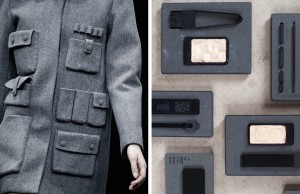
Suzanne Tick says that fashion and beauty are the first areas to undertake the changing trends that come from gender roles becoming unclear. Clothing items are becoming more gender neutral because of the changes in self-identification, and some designers have already taken a step in that direction. Tick recognizes Alexander Wang for his women’s winter coat for it having a masculine edge to it, and she also recognizes Annemiek van der Beek’s for her primal skin makeup because it was made so men are be able to use it too. These two examples show how easy it is to accommodate people who identify as male, female, or anything in between.

MASS MACHO

Suzanne Tick points out that androgyny is very familiar to most people today. It is not uncommon to see a person and not be sure if he is a he or if she is a she. It used to be that transgenders were not accepted in society. Now, schools are allowing students not to put their gender down if they would not like to. Some accommodations are being made for transgenders because they are no longer as rare as they used to be and are no longer such outcasts. The lines between men and women and between masculine and feminine are slowly fading away as people identify themselves differently.

Gender neutrality has become very important with today’s society. Designers are now creating less gender specific clothing, schools are making accommodations for transgenders, and some places are even getting unisex bathrooms. Suzanne Tick believes accommodations should be made so every person can feel like they belong, and that people should not be forced to choose a gender.

Suzanne Tick. “His & Hers: Designing for a Post-Gender Society”. Metropolis. Metropolis Magazine, March 2015. Web. 14 Feb. 2016.

Exterior Built Environment Description: Little Five Points

IMG_5150

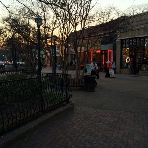
Little Five Points has been apart of Atlanta since the early 1900’s. It is only two or three miles away from Downtown Atlanta. The Little Five Points area is off of Moreland Avenue in Atlanta. It consists of many little restaurants: like Little Five Points Pizza, Zestos, and The Porter. Along with many choices of restaurants, there are several clothing stores also. Most popular clothing store in Little Five Points seems to be Rag-O-Rama which is mostly recycled clothing. Along with these places are stores like Criminal Records, Crystal Blue, Vape Atlanta, and many more. Criminal Records is a well-known music store in Little Five. Crystal Blue is a little shop that is painted blue which sells things like jewelry and other little odd and ins. Vape  Atlanta is in pink building and it sells probably just about any flavor of vapor you could think of. All of these unique places are centered around what used to be the Five Point’s intersection. It was where Moreland Avenue, Euclid Avenue, and Seminole Avenue all intersected which gave Little Five points its name. Now Seminole Avenue is no longer connected because it was turned into a plaza between some of the shops. Little Five Points is basically a few short strips of shops all interconnected at what used to be the the five pointed intersection.

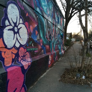
All of the places located in Little Five Points are Unique. Almost every store is a different color. There is graffiti and murals painted on just about every flat surface. The storefronts are also usually quite interesting with their setups.IMG_5153

The area is pretty easy to find your way around. The only hard part about visiting Little Five Points is where to park your car if you drive there. Little Five Points is not your average commercial area, it has a bohemian vibe to it. All sorts of people can be seen at this location enjoying a meal, shopping, or just socializing. The uniqueness of Little Five Points draws in many varieties of customers. I enjoy going because it is not just another shopping center, it is weird in a good way and there is always something interesting to see. Going to Little Five inspires me because I am very appreciative of the different forms of creativity and art that are throughout the area.

IMG_5156

Thursday, February 11th, 2016. @ 6-7 PM.

Exterior Built Environment Description: Digital Record 5

IMG_5164

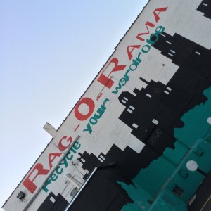
This advertisement is on the back of a building in Little Five Points which faces the main area to park there. This is one of the many advertisements for this clothing store. There are many other murals painted on the sides of buildings suggesting one to “recycle their wardrobe” for this store.

Exterior Built Environment Description: Digital Record 4

IMG_5161

On the side of one of the buildings in Little Five Points, there is a large mosaic full of tiles with their own picture. This picture is of the center of the whole thing where it all comes together. The top writing says, “THE LITTLE 5 POINTS PIECE OF The WORLD WALL for PEACE“, and the lower writing says, “‘THE WORLD WALL FOR PEACE’ HOLDS UP A VISION OF GLOBAL UNITY. THERE ARE 29 WALLS LIKE THIS ALL OVER THE WORLD, BUILT BY VOLUNTEERS FOR PEACE.”

Thursday, February 11th, 2016. @ 6:00 PM.

Exterior Built Environment Description: Digital Record 3

This is a recording that I took of part of what I heard while visiting Little Five Points. There was a man sitting outside of the stores sitting on the curb, playing a beat on a handheld bongo type of drum. There was a couple dancing to it and a man taking several pictures of the scene. He continued playing for only a little while.

Thursday, February 11th, 2016. @ around 6:00 PM.

Exterior Built Environment Description: Digital Record 2

IMG_5154

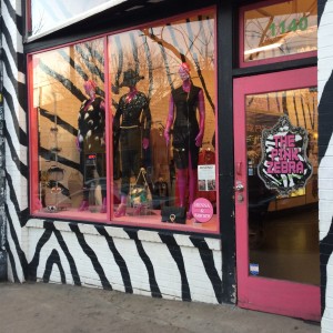
On the main strip in Little Five Points, I came across this little shop. What caught my eye was the paintings on the storefront, it is not something a person could easily overlook. The storefront itself draws so much attention to this little place. It is a good way to get people to come take a look to see what they have inside.

Thursday, February 11th, 2016. @ around 6:00 PM.