Companies in many industries have adopted AI policies to ensure this emerging technology is used responsibly and ethically. Newsweek and Macmillan Learning are two companies that are taking advantage of the positive features of AI, while also recognizing it has the potential to harm if not used ethically. In their policy statements, both companies address this dilemma. Macmillan’s policy states, “We are transparent and accountable in how we ethically use AI” (Macmillan Learning AI | Macmillan Learning US), while Newsweek asserts, “journalists will be working with AI in some form, and we want our newsroom to embrace these technologies as quickly as is possible in an ethical way” (“Newsweek Updates Policy on Using Artificial Intelligence”). In their policy statements, both companies emphasize the requirements and importance of transparency and human oversight.
The authors of “Co-Authoring with an AI? Ethical Dilemmas and Artificial Intelligence” review the AI policies of organizations engaged in legal and scholarly writing. The missions of the companies discussed in this article differ from Newsweek or Macmillan Learning, so their policies are more focused on AI publishing issues. However, they are also challenged to devise policies that explain their companies’ use of AI. For example, the AI policies of Science forbid the use of AI generated text, and Springer Nature requires the use of AI to be properly documented. Elsevier has a detailed policy that recognizes the usefulness of AI which “is permitted only to “improve readability and language.” Thus, there is a ban on using it for generating ideas” (Jabotinsky et al..). Elsevier’s AI policy goals are comparable to those of Newsweek and Macmillan Learning – emphasizing ethics, transparency, and human oversight and control. At a minimum, these are the concerns that should be addressed in a company’s AI policy. AI should be used as a tool to help edit documents and provide details about query topics. It should not be used to generate original ideas or co-author documents.
Primary Audience: Researchers and Academics, Healthcare Professionals, Data Scientists and Engineers, Students and Educators.
Secondary Audience: Medical Device Manufacturers, Policy Makers and Healthcare Administrators, Patients and Patient Advocacy Groups.
Audience Values and Opinions: Emphasis on AI and machine learning in healthcare, interest in interdisciplinary collaboration, desire for improved diagnostic accuracy and personalized treatment.
Intention
Overall Intention: Promote the advancement and adoption of innovative diagnostic technologies in healthcare.
Secondary Intentions: Educate the audience, foster collaboration, inspire innovation, advocate for technology adoption.
Medium and Publication
Medium: Web.
Reason for Medium Choice: Reach a broad, global audience quickly and efficiently; provide up-to-date information; encourage collaboration.
Publication Venue: Website.
Context and Values: Increasing digital technology reliance, rapid evolution of AI and machine learning in healthcare, emphasis on interdisciplinary collaboration.
Technologies Used: Web design and development, interactive elements, multimedia content, search engine optimization (SEO).
Design and Organization
First Elements Experienced: Header and navigation bar, hero image/banner, primary content area.
Last Elements Experienced: Footer.
Design Choices: Logical flow of information, emphasizing key elements with contrasting colors and sizes, high readability with contrast, clean and organized alignment, proximity and grouping of related elements.
Emphasized Elements: Call-to-action buttons, headlines and subheadings, key visuals.
Layout Techniques: Grid system, whitespace.
User Experience
Readability: High contrast between text and background ensures readability.
Navigation: User-friendly header and navigation bar for easy site exploration.
Engagement: Use of multimedia content and interactive elements to enhance user engagement.
WEBSITE ANALYSIS
If you see this image on a website it lets viewers know that information about healthcare is a prominent feature. The MRI machine, EKG images, CT scanner, internal organs, and the blue cross on the computer screen will certainly capture the attention of the site’s primary audience – healthcare professionals, medical students and teachers, and medical engineers and researchers. In order to deliver effective medical care and information, these groups must be aware of the latest developments and techniques in their field and this image from the Multimodal Frameworks in Healthcare Diagnostics website implies that this vital information can be found here. Patients, healthcare policymakers, and medical device manufacturers, the secondary audience, may also be attracted by this look. It promises all audiences the interconnectivity of medical image analysis enhanced by AI and machine learning to deliver elevated healthcare with speedier and more accurate diagnoses and personalized treatments.
As readers scroll down the website they see a navigation bar that includes menu items Call for Papers, Dates, Submissions, Organizers, and Venue. These topics align with the website’s purpose of promoting the advancement and adoption of innovative diagnostic technologies in healthcare which is explained in the introduction paragraph. The call for papers solicits collaborative and innovative research papers on a variety of healthcare diagnostics that can be improved by incorporating multimodal approaches. Other menu items detail how papers are to be structured when they are due, how and where they are to be submitted, organizers of the event, and where the conference to discuss the submissions will be held. This variety of activities promotes interaction among healthcare professionals and provides an opportunity to gather with interested parties to increase their knowledge of the most recent technological developments in healthcare diagnoses.
The medium chosen to spread the word about multimodal approaches to healthcare is the website Multimodal Frameworks in Healthcare Diagnostics. The site is designed for technically savvy people who are interested in learning about the latest innovations in healthcare diagnostics. The web allows organizers to reach a global audience to share and exchange current information and host interactive activities like calls for papers, collaborative sessions, and special conferences. These activities are features of a well-designed website that uses maps, graphics, and multiple links to educate users with a logical flow of information.
The website is designed with pastel colors and an easy-to-read font that attracts users to explore its content using the navigation bar which is centered under a descriptive eye-catching image. When clicked all items on the well-organized navigation bar sends users to a different section of the main page. This web design is known as a single-page application (SPA) or a single-page website. It is efficient, loads quickly, simplistic, and user-friendly. This design is an excellent choice for a call-to-action website with a single focus or goal. It is easy to see that the goal of this site is to solicit “original, high-quality papers” about the topics listed as they relate to the delivery of multimodal healthcare diagnostics.
When users click on “Call for Papers” they are directed to this section of the main page which lists topics of interest for scholarly submissions. Next are “Key Dates” related to this project, followed by paper “Submission” details. This section has multiple links that assist those planning to submit papers and/or attend the conference. The links guide users to pages that are part of an online conference management system hosted by Microsoft (Microsoft Conference Management Toolkit). The pages are well branded, but layouts are congested and there are so many options, it’s hard to know where to begin. Contained on the main page of the destination site are instructions for creating an account and a pictorial step-by-step guide on how to create one. It is apparent that these systems are not connected because the navigation bars are not similar and there is no link to return users to the referring site. The destination site’s design is all business and there are no eye-pleasing frills which is a sharp contrast to the design of the referring site.
Next on the menu bar is “Guidelines,” which also has several links. This item details how papers are formatted, and a one-way link sends users to the Springer website which provides additional information about several topics, among them are ethical standards, process review, and how to submit papers for publication. This may have been a design misstep because logically the “Guidelines” tab should have come before the “Submissions” tab. And there is an email address for those needing additional information about submissions. The “Proceedings” item explains on which website the accepted papers will appear, and links to the profiles of the “Organizing Committee” are also listed. The “Venue” is the final menu item. It displays a map showing the location of the conference where the healthcare diagnostics papers will be presented and discussed. More information about the conference can be found at Home – 2025 Medical Image Understanding and Analysis Conference (MIUA). There are also two additional links of maps that give broader views of the streets in the vicinity of the conference site.
Overall, the Multimodal Frameworks in HealthcareDiagnostics website is designed well and creates a logical flow of information. The contrast between the white background and the black text makes the site easy to read. The navigation bar, graphics, choice of colors, and hero image are positioned well and the site design is clean and uncluttered. Visitors to this website can easily determine its theme which is displayed in pastel colors at the top of the main page.
REFLECTION
I am leery of AI. My past experiences using it for academic projects have not been positive. In one class we were required to ask AI about colonialism in Africa and in another class, we were seeking answers to political questions. Both instances yielded vague and incorrect information from AI. When I provided the correct information, the response was “sorry” when it should have been “I will further investigate the topic.” So, when I signed into Copilot, I was not sure it would generate useful information. After I entered my notes for the outline, Copilot gave me a well-organized and usable outline for this assignment. The outline made writing my web analysis easier because all the required items were listed and explained in the outline.
Citations
[A variety of medical diagnostic tools].(n.d.).[Digital Art].Retrieved February 13, 2025.MIUA. https://mm-hcd.github.io/
2) How and where do you engage in digital media production and/or user-created content and/or user-engagement platforms? Why?
Some of the best memories of my life growing up came from watching cartoons. My favorites were Ben 10, Infinity Train, and Justice League Unlimited. They were fun to watch and always left me fascinated. The shows’ abilities to respect audiences’ intellect and creativity while tackling real-world issues influenced me to follow in their footsteps and create my own cartoon series. Using social media outlets like YouTube and Instagram, I show snippets of upcoming episodes. I also receive critiques from a select group that comment on my series. This feedback helps me improve my cartoons and gives me ideas for other episodes.
Writing and producing this cartoon series allows me to express my creativity without worrying about censorship due to unwanted audiences viewing my work. I have the freedom to create for an audience that enjoys my cartoons which tackle heavy themes and are still action-packed with fantastical plots.
The blog I maintain for my Digital Writing class also lets me engage with classmates by writing commentary on their views of assigned topics. I also make comments on the Toonami message board, my favorite programming block that broadcasts Japanese anime and American action animation. If this genre appeals to you, check it out at VIZ | Blog / Toonami.
The article “Eliza: Lessons from Interactive Novels about Publishing in the Era of AI” delves into how generative AI and interactive fiction affect digital publishing. The example the author, Dora Kourkoulou, chooses to study is Eliza, an interactive novel/game. She explores how the technologies in this game are very progressive, making it difficult to determine what content was generated by AI and what was created by humans. This same dilemma exists regarding digital publishing and other projects that use AI. Is it possible to determine the portion of the project completed by humans?
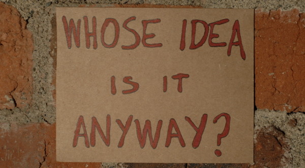
Throughout the article is the concept of “blurred lines,” and this is definitely what happens when AI is part of the project. AI was originally developed for marketing and advertising but over time has morphed into a knowledge wizard capable of performing a variety of tasks. It has been trained to learn from and anticipate human reactions. Just as we are joining in convergence and participatory culture, so is AI. Every time we engage with AI-enabled technology, it learns more about us and tries to simplify and enhance our experiences across various media platforms. Recently, Google used this approach and “gently nudged” its email account owners into using a passkey to log on to Gmail instead of using “old” passwords. So, if you want to access your Gmail regardless of the platform, users must first enter the passkey using a cellular device. Google’s AI is participating in convergence culture and dragging its users along because they need access to their email accounts – allowing them to engage in participatory culture. So, whose idea is this – AIs or yours?
Citations
Artificial intelligence explained in 2 minutes: What exactly is AI? (n.d.). www.youtube.com. Retrieved January 11, 2022, from https://youtu.be/UdE-W30oOXo
Snow Fall – The Avalanche at Tunnel Creek tells the story of an avalanche that ended the lives of three people. The narrator weaves the story with multimodal elements – photos, taped recordings, videos, and animated graphics – which helps readers visualize the surroundings and arouse empathy and pathos, making them more vested in the narrative. The primary audience for this story is skiers and snowboarders because it reminds them of the hazards of snow related to their sport. The rhetorical elements of ethos and logos are also prevalent in the piece. The author establishes ethos by giving readers extensive technical details and a precise account of the actions that led to the avalanche. The logical arguments about the causes and effects of avalanches, and avalanche safety, show logos. These elements help the writer tell a compelling story that readers find logical, reliable, trustworthy, and memorable.
Snow Fall is told on a uniquely designed website that uses color to help readers understand and envision dangerous avalanche conditions. The use of color is discussed in Chapter 2 of Writer/Designer and it was used strategically on the website. The web developer does this by using white, black, and grey tones to show whirling winds and snowstorms, suggesting impending doom. Some photos fade from monotones to warmer colors and throughout the presentation, there are only a few colorful photos. This design creates a mood that complements the narrative. Additionally, the pages of the website are well organized and standardized within this presentation. The logo is present on all pages and so is the navigation bar. These common features give the webpages the “illusion of continuity” recommended in the Page Structure chapter of the Web Style Guide.


