Jennifer's Blog

ENGLISH 1002

Month: February 2016 (page 1 of 2)

Annotated Bibliography 4,5,&6

addictinginfo.org

addictinginfo.org

Staff, Curbed. “It’s Time to Stop Describing Spaces as ‘Masculine’ or ‘Feminine'” Curbed. Vox Media, 15 Dec. 2014. Web. 21 Feb. 2016. <http://www.curbed.com/2014/12/15/10012002/masculine-feminine-design-decor-writing>.

Comparing the reading summaries of the positive light feminine architecture, this article is portrayed in the exact opposite tone where they say that the gendered labels on modern architecture degrades the feminist movement. The article sets examples of how feminine pieces of design in interior decor is deemed as frivolous while the masculine features of decor is portrayed as staple pieces of the interior built space. Having the dichotomy of the masculine and feminine features, the article paints a great image of how the interior space is built and how the submissive tone of the feminine features plays a vital role in demoralizing the importance of the feminine movement. The article also shows that in order to have the certain labels of ‘feminine’ and ‘masculine’ there has to be stereotypes set in place and thus furthers  the  negative connotations of feminine features. Perpetuating the traditional gender roles, labeling the interior space also builds up more of the lackluster status quo that this modern age is already breaking down. This article is relevant since we spoke about the built environment and how the feminine architecture movement is showing great strides in feminist movements. And even though the two articles don’t share the same sentiments, we can see both perspectives on the issue making a wider picture for us to draw information on. 


Steinmetz, Katy. “The Gender-Neutral Bathroom Revolution Is Growing.”Time. Time, 11 Jan. 2016. Web. 22 Feb. 2016. <http://time.com/4175774/san-francisco-gender-neutral-bathrooms/>.

This is another article that debunks the greatness of a gendered society but dives into the specifics in the fashion world and how the subsequent marketing is also being influenced by the labels of gender roles. This article also follows on the idea the other article showed of how the labels of gender idealize the masculine features yet still ignoring the more prominent feminine features. When the article said that there are many instances of androgyny in the fashion industry but most likely featuring manly features while juxtaposing only with frivolous feminine features. They say that they see many manly built females promoting menswear yet there is not androgyny with curvier women promoting the same menswear since that doesn’t sell. The article also highlights how the fashion industry uses these blurred gender lines only to market the controversy and not the actual design of the clothes. This is another article that shows the other side of the reading we did in class as well as showing the other perspectives in different realms other than architecture.


Krentcil, Faran. “Here’s the Problem With Fashion’s Androgyny Obsession.”ELLE. N.p., 02 Sept. 2015. Web. 21 Feb. 2016. <http://www.elle.com/fashion/a30209/the-problem-with-fashions-androgyny-obsession/>.

Time wrote this article to highlight the great strides and influence San Francisco is having with gender neutral bathrooms. They are passing bills to make many of the city’s single occupancy bathrooms into non gender specific bathrooms and therefore they are causing great influence to other city’s as well as colleges and public schools .Safety is also another main idea in this article in which they highlight the dangers transgender people face in order to attain a basic necessity like the bathroom. This article touches on the ideas we spoke about on the importance of a comfortable shared space like the bathroom to people who are not gender specific or transgender. However this article brings a new light on the other positive influences a non gender specific bathroom can bring like a mother with a son or a caretaker. These other examples helps to connect the transgenders’ issue with the shared space with those within the community who can benefit from these open, comfortable, and safe space.


Making Bathrooms More ‘Accommodating’

gender neutral

Accommodation

The author sets up the article nicely by showing the audience what is really wrong with the word and implication of ‘accommodation’. Those who have to accommodate feel like they are complied to do so and so people who just want equal access feel further stripped away from the normal society by being labeled as a burden. This sets up societal norms that people feel the need to fit into. This word of ‘accommodation’ just further exemplifies the stigmas that surround the entering age of gender fluidity. The article also brings up the fact that it’s the transgender people who seem to be doing the most work when it comes to making everyone comfortable in the reoccurring issue of bathroom assignments. This fact also highlights how much work there is left in radically changing the society’s discomfort with having a safe and comfortable environment for all groups. Everybody has to use a bathroom in any situation they’re in especially in restaurants, workplaces, malls, and parks. So having a basic need not being available to your set of people, is inherently pushing that specific group out; a way of using the built environment to push unwanted people away.

History and Gender Roles

The article also highlights an interesting backstory to the introduction of the female bathroom. The backstory sets a theme of weakness and gender stereotypes that are still shared by some to this day. The inclusion of this backstory introduces the topic of how these places of female assembly is being intruded on by a new character of female. This all comes together to describe and humanize the other side of the battle of equal access for trans people. Though trans women might see themselves as women it is almost impossible to have all women have that same acceptance. A commentator shared an interesting view on how it seems as though once again women are having to be pushed over by men even if they are trans women. The oppressive gender role of men is still seen in the bathrooms as women see as this infiltration of their private space as a power struggle.

Fitting in the Mold

The article points out the fallacies with boiling down gender to chromosomes and with that they highlight that it’s not about the labels of gender that trans people seek but fitting in and being with the group they identify with the most. The author also includes an example of wanting to fit in with the story of a 12 year old transgender girl. While this is one story of environment that is more than accepting, there is still much work to be done outside of this one success story in order to achieve the societal acceptance of all gender bathrooms The article also says that change is made by making small adjustments which will not only help ease the safety of trans people but to help ensure that they are accepted in all places and not just confined to the places that have gender neutral bathrooms.

His & Hers: Designing for a Post-Gender Society

vintage-sexism-2

Designing for the New Gender Era

This article highlights the change of traditional gender roles and how the new generation of designers and marketers have to evolve to include the new breakdown of the previous idea of ‘women’ and ‘men’. With these roles being more and more challenged in today’s society, the new world for appealing to men and women is becoming a wider and more general platform. The designers want to not only appeal to these “obscured” gender lines but to make sure they are accepted and comfortable in the setting of a society that is deeply rooted in a modern tone. Not only are the gender lines being more fluid but the role of women and men are being equalized therefore the overpowering masculine features of modern architecture is being switched out for softer textures and fabrics. This rise in the new form of Modernism is showing a new era of social change and therefore a new era of design.

Individuality

In creating this individualistic society filled with blurred gender roles and a new power role for women, these new designs and architecture is a new form of representation and sense of self.  With this new rise of importance of self expression, comes a new era of importance on representation and how designers keep up with the changing tides of identity. With companies like Lego changing their branding to accommodate the growing markets of fluid sexuality and identity, more and more brands are rushing to make sure they fit into the new ‘status quo’ of open acceptance. As well as toys, we see new strides coming with the new trends of androgyny and male centered makeup. New ideas from designers are pushing for this new idea of androgyny where men do things that were previously marketed for girls and girls wearing things that have boxier frames. There seems to be no more rules when it comes to designing for the future in terms of ‘will women buy this blazer’ because the new answer is ‘yes’.

Design of the Public Space

The end of the article also highlights an issue brought up in the New York Time’s article on how the shared space and the inclusion of a gender-neutral design is an integral part of modern times and modern design. ‘Accommodation’  is brought up as the mode of conflict resolution and with that comes the introduction of a gender neutral space and having the built environment around us being inclusive to every group. The article also parallels the issues that might arise with the first steps into the gender neutral society to the issues that arose with accommodating to disabled people. The article spoke of how the issues of inclusion were met with rules, compliance, and inconvenience.  This feeling of inconvenience makes the disabled and trans people feel as though they aren’t a part of the society to begin with. So in order to avoid the same sentiments shared by the lack of accommodation with disabled, the article speaks to treat everyone the same and to have basic places of comfort and safety be available to all people without the groans of having to change the predisposed molds.


Mid-Term Reflection

Upon taking the course and finding out it was a hybrid technology immersive class, I knew in that moment that most of the reading, writing, and research I have previously done would be completely different to what this class would expect from me. While in previous classes I have done a number of critical analyses on my reading, I don’t think those have really compared to the complexity of the reading summaries I’ve done in this class which calls for critical analysis while differentiating your own thoughts from the author’s as well as the author’s thoughts from the primary source’s tone. Through learning how to effectively with in this course so far, I think I can use that to pin point the exact points of interest and main ideas of an article or of a built environment so that I don’t over cloud it with my judgements. I’ve also learned through the Built Environment Description writing, that compiling research and putting that into a concise format is harder than it seems. With there being so much to observe within an hour of being in an environment, it’s hard to fulfill the prompt as well as completely capture the essence of the place you’re observing. With all these blog posts I put up for this class, I feel that my peers can look at the compilation of posts as a whole and see a cohesive story of how the environment around us affects us in deeper ways than we originally think. And utilizing this mode of writing in a blog makes it more user friendly and has a different tone than writing a term paper. The idea of accessibility also comes into mind when thinking of the differences I’ve encountered when comparing the term papers I’ve written in the past, in which only my teachers will see, to the blog posts in this class ,in which many of my peers are able to access it.

Over the past assignments, I’ve realized that one of my weaknesses is not being able to cohesively and logically put together transitions and sections to match the tone and ideas of the author. So I want to work on organization as well as reflecting the author’s ideas harmoniously in my future blog posts. While I do have my weaknesses, I believe one of my strengths is being able to have a wide and polished range of vocabulary that elevates my writing. I hope to use that selective vocabulary to better convey the message as well as articulate poignantly in my blog posts.

Though I haven’t been able to go in for a group study or a group conference just yet with my busy schedule of working and taking 18hrs of school credit, I want to utilize the great opportunity our teacher has made available to me to both earn extra points as well as get a better understanding of the assignments and get feedback on what I have so far. I have had made extra effort in making a blog post about the new experience I’ve had in the library which helps engrain that new experience into my blog as well as my one memory for future use. I have also had a few instances in participating in the quizzes which helps to better shape you as a rhetorical writer. Though I am currently satisfied with the amount of effort I’ve put in the class so far I always feel there’s still room for more improvement and growth so I want to make a bigger effort in earning the most possible points I can for the week including writing more reading summaries or more annotated bibliographies.

I want to start to work on my organization in my writing which not only could help the formation of my future reading summaries but my Built Environment Analysis as well. Organizational skills when it comes to writing is not only just limited to the scope of that one assignment so working on that aspect of my writing will help all of my future blog posts in this class.

Built Environment Description: Inman Park

Inman Park is located on the east side of Atlanta and is Atlanta’s first planned suburb. The carefully constructed nature of the city is shown through the meticulous and planned tone and style of the neighborhood. You see both the rustic and gritty style of Inman Park juxtaposing the urban and suburban feel of the city and while both tones are drastically different from each other, they come together to give off a very modern yet inviting style. The city also composes of art, deliberate grit, and oddly the usage of nature. Everywhere you look you’ll see trees and foliage contouring the landscape and outlining all the contrasting elements of the city. Inman Park also has pieces of architecture that are very aged and have a more dated look to them and considering the city was planned and built in the late 1880’s, these older buildings still hold a harmonious theme to the city. The city was deliberately planned around open spaces and even to this day the city is very open and easily maneuverable.  You can access all parks and buildings with the ease of turning a street corner or just going down a simple flight of stairs. And while maneuvering the open streets you can observe the muted colors and red bricks of the city be juxtaposed with the bright and bold colors of graffiti sprawled all over the buildings sometimes to convey art or sometimes just to put a company name out there. This universal use of graffiti for both commercial and artistic use shows the lucid and bold tone of the city. The signage of the city is almost limited to the use of building art and graffiti which shows a new style of conveying the usage of the space by utilizing the said space. The bright uses of color and the familiar usage of red clay brick makes you feel comfortable and intrigued in this perplexing city that seems to make you at home while still leaving you with the feeling of adventure and exploration.

Digital Record of Inman Park #5

choco

While there at the Krog Street Market, I stumbled upon a chocolate store that made their own batch in the building. The chocolate was artisanal and definetly reflected the type of small business mentality that the whole Market had. There was no big name companies there besides Jeni’s Icecream which is still an artisanal ice cream shop that has roots in Atlanta.  This chocolate stood out to me since it was made in Inman Park and a product of the modern tone of the city.

Digital Record of Inman Park #4

contrast

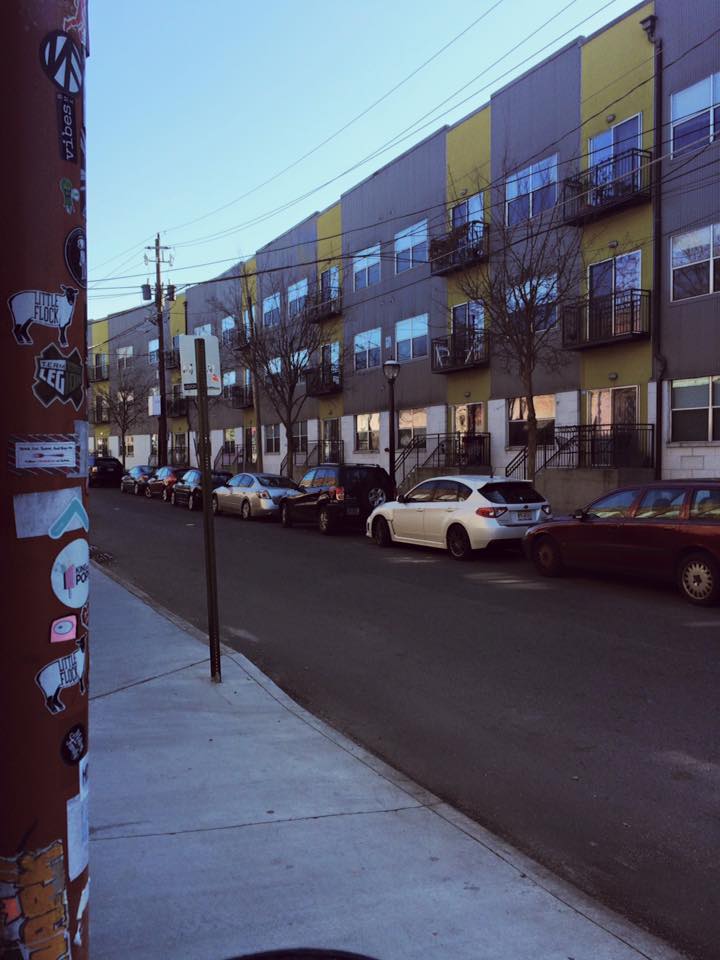
Like stated before, Inman Park has a very contrasting feel to it. With one side of the picture being rustic and urban the other side shows a more modern and suburban feel to it. Many buildings surrounding the area show this modern appeal to it while also being surrounded by street art and grit. The two different sides don’t seem to clash at all but mesh together to build a cohesive mood to the town.

Digital Record of Inman Park #3

Parking

This photo is showing the no parking signs and how most of the residents purposefully ignore the signs and still park as they please. This is another indicator of how accessible Inman Park is. People park where they please and even the law enforcement in the town don’t take the towing policy to heart making it seem like the whole town is in cohesion about accessibility. This parking structure made it very easy for me to maneuver around town without having to worry about where to park or how much I had to pay for parking since parking around town was all free and easy to find.

Digital Record of Inman Park #2

Fish Graffiti

This graffiti wall shows the three aspects of Inman Park all in one photo:art, city grit, and nature. All three components of Inman Park are shown harmoniously on this street with the art of the Koi fish being predominantly shown through. Throughout Inman Park, you’ll see purposeful art being splattered across many residential and  commercial buildings adding to the rustic and modern feel to the city.

Digital Record of Inman Park #1

Krog Street Market Hall

Krog Street Market shows a great variety of vendors and sellers that all stem from the same ‘intown’ culture their website conveys. Every inch of the decor stems from rustic wood to urban metal and uses both themes to mesh together in a cohesive modern feel. Though it is labeled as a Market, I saw no fresh produce or goods being sold besides the local butcher in the building. Krog Street Market perfectly conveys the type of feel that Inman Park has with the purposeful graffiti and the modern architecture.

Older posts

© 2024 Jennifer's Blog

Theme by Anders NorenUp ↑

Skip to toolbar