A long time ago in an office not that far away, I had just finished an initial meeting with an English professor. After meeting with a faculty member, the designers on our team will reflect on what was discussed and send a follow-up email to recap and provide next steps. I found myself stuck on the “next steps” part. I knew what to do next and had even discussed it with the professor I had met with, but something was a little off. This feeling didn’t impede us from moving forward with the project, but for me, it was the start of a long journey about the process of process.
That was over four years ago, and it turns out what I was feeling was a disconnect between the cognitive and affective components of designing a course. Like, cool, we’re going to do this step, and maybe later we’ll do a few other steps in this sequence. The process makes sense on paper, but the process is removed from the realities of actual humans working through the course design process.
This feeling of disconnect permeated throughout the entire Course and Program Design team. After a good bit of internal reflection, we felt that we were not providing transparency and clarity on what the faculty experience would be like when partnering with us. In an attempt to better communicate with potential partners on how we work when designing courses, we’ve developed and evolved a lot of documentation over the years. Earlier this year, the outline below was what we used on our website showcase our process.
This outline is a great high-level look at what we want to do when designing a course. You can see we have split up our process into five separate areas. However, this outline in no way attempts to fix the disconnect mentioned earlier. We wanted to take a deeper dive into defining and illustrating our process. Our goal was to provide a resource that provided a glimpse into the faculty experience in addition to the procedural steps that we followed. To help accomplish this goal, the team decided to create a course design customer experience map (cx map). A cx map illustrates the process that an identified user of a service or product goes through during their time using the said process of service.
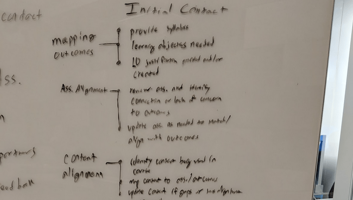
To get started, I took each step in the original outline graphic and expanded them into some of the action items that faculty and I accomplish at that point in the process.
My next goal was to find a delicate balance to give enough details without getting so granular that no one would care to read them. Once I broke each section down, I wrote the new more defined process steps with descriptions and shared it to the team for comments.
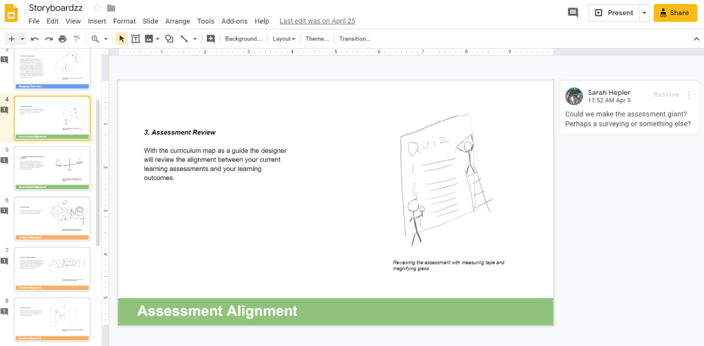
So now we had the steps and descriptions written out, but what we wanted was a visual representation of our process. This means I need to create storyboards that show possible ways we can represent each step with graphics.
I reached out to the team for feedback on the visuals, and we found ourselves further revising the steps and descriptions again even though we had already gone through a review process. Once the team liked the new descriptions and signed off on the visuals, I did a quick mock-up for the team.
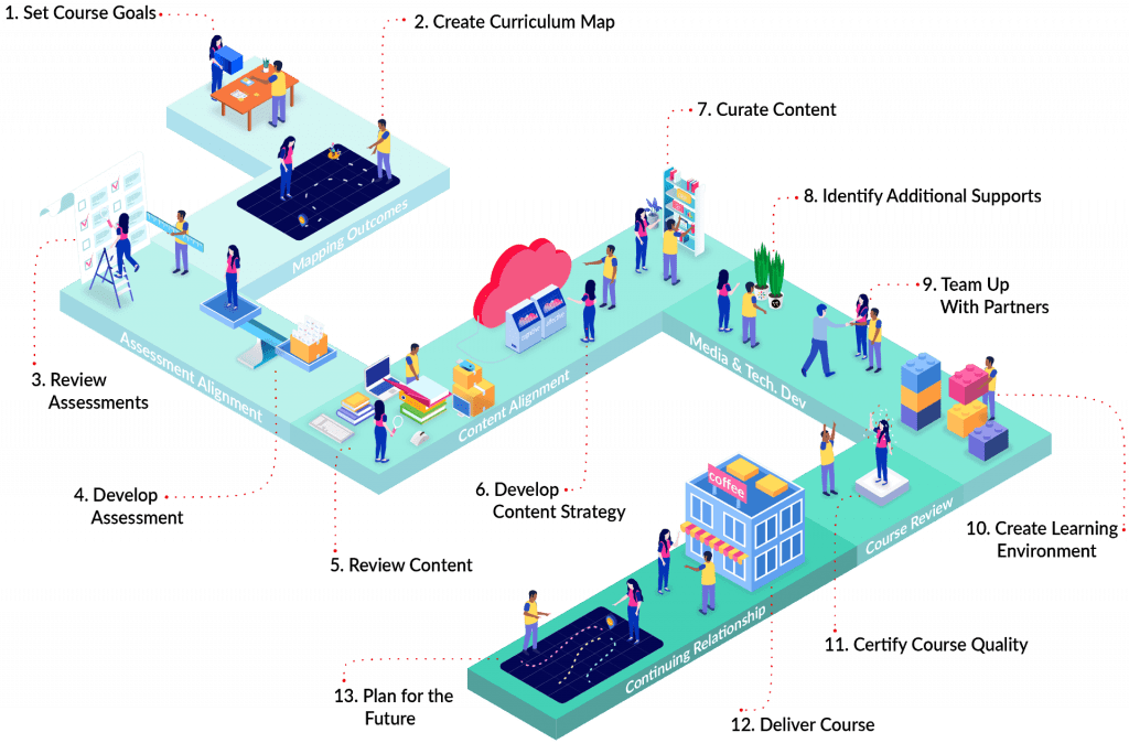
After getting the thumbs up, I partnered with Alec on the multimedia team. We had been in contact earlier, so he already had a good idea as to what we were trying to achieve. Together, we discussed visual styles, color palette, and layout. We worked collaboratively in Illustrator to create a version of the CX Map and then (you guessed it) we sent it off to the team for feedback.
The other designers provided feedback, and we once again iterated the step descriptions to text more appropriate for our audience. This infographic is our final product (for now). If you’re interested in learning more about the Course and Program Design Team or our design process you can get in touch with us at cetl@gsu.edu.

Taylor spends his time at CETL designing learning experiences and eating assorted breads


You must be logged in to post a comment.