The State of GA logo displayed at the top left of the webpage.
For my Digital Built Environment Description, I chose www.georgia.org. This is the website for the Georgia Department of Economic Development (GDEcD), that plans, manages and mobilizes state resources to attract business to the state of Georgia. The GDEcD also promotes the state as a tourist destination and a site for on-location filming.
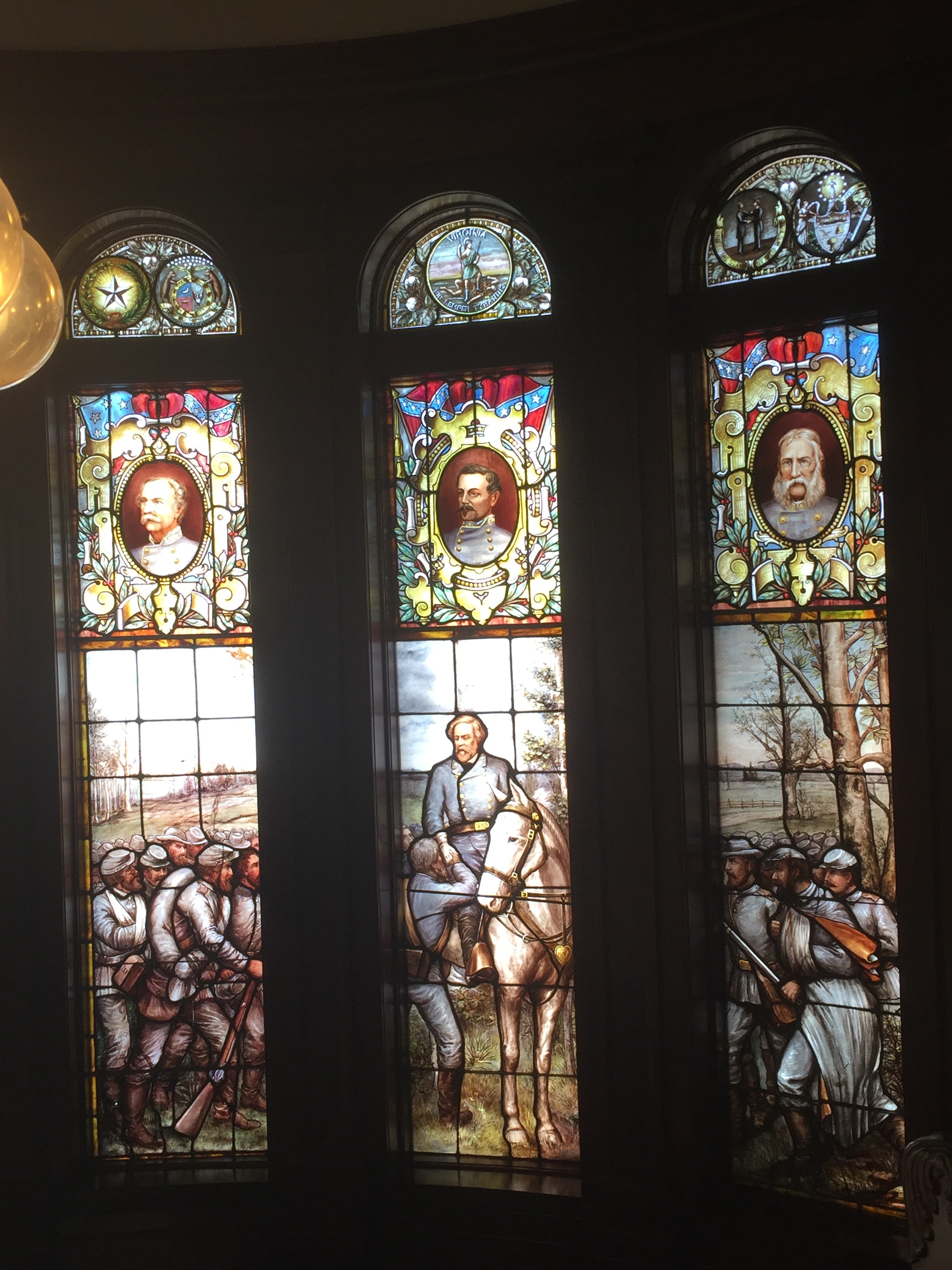
The top of the www.Georgia.org homepage
When you first get to the homepage of the site, it doesn’t quite present like the website of a government agency. It has a slightly flashy, modern feel to it, with the main color scheme being composed of a grey patterned backdrop and white panels with text on them. In the top left corner, the website has a row of flags that change the website into the respective language of that country and redirect to a different page on the site regarding international trade with that country. This adds significantly to the functionality of the website as well as it’s legitimacy in it’s efforts to attract foreign business to the state. directly below this is a row of icons linking to different social media websites like Facebook and Twitter that allow you to follow the GDEcD.
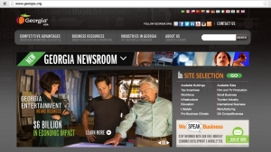
Moving on down the page, the next feature is a row of menus with drop down sub-menus that appear when you hover your mouse above them. The names of the menus (with subtitles in parentheses) are: Competitive Advantages (Incentives, Workforce & Lifestyle), Business Resources (Growth, Relocation & Innovation), Industries in Georgia (Key Sectors & Strengths), About Us (Contact & News) and next to that is a search bar to search for keywords within the site.

An example of the drop down menu
The most striking feature, to me, is the scrolling billboard just under the row of menus. It displays news and other important items on a timer of about 30 seconds and also has an option to pause or move forward or back one slide. The current installations are an ad for Georgia tourism, an ad for Georgia as the #1 state for business, a poster stating Mercedes-Benz’s intention to open facilities in Georgia and a poster stating that Georgia is home to 20 Fortune 500 companies.
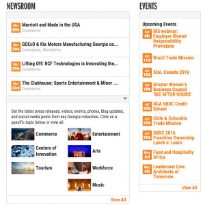
The Newsroom and Events section
Scroll down further and you will find a list of dates of important events. Some of these events include: Brazil Trade Mission, Greater Women’s Business Council, and Leadercast Live – Architects of Tomorrow. To the left of this is a “Newsroom” column with recent stories posted in chronological order. It even has a section below this that allows the user to select an individual sector to view stories within that sector only. These sectors include: Commerce, Tourism, Centers of Innovation, Entertainment, Workforce, Arts and Music. then, at the very bottom of the page is a black backdropped section with contact information and a reiteration of the menus at the top of the webpage.
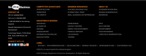
Very bottom of the webpage
Overall, the spatial and visual modes of this website combine very effectively to give a professional impression to the casual user. The site is very much oriented towards business executives and others who have the ability to bring commerce to the state (as evidenced by use of certain buzzwords like “Incentives”, “Innovation” and “Sectors”), as well as individuals who may bring income to Georgia as tourists.