During my time as a SIF, I have had the privilege to work with a wide array of technologies and softwares. Through the development of my technical skills and the experience gained I have grown tremendously not only as a student but as a researcher. With this expansion in knowledge of certain technologies I have grown an affinity towards mapping technologies. Time and time again as a SIF and after several projects they have never failed to exude their critical role in research. Whether it be to organize data, promote the visualization of our changing surroundings,or share data and issues in an impactful manner, mapping has shown to be very useful. I’d like to highlight on the different ways it has made our projects stand out and neatly display research.
I have primarily used google maps, Esri’s ArcGIS, and story maps. Here are several ways to present or organize research through geospatial tools and mapping:
1934 Tax Maps (Georeferencing):

During the 1934 tax maps project, I was to georeference several old tax maps of Atlanta that had been recently scanned and added to Georgia State University’s special collections. This is useful so that once the GeoTiff has been created for an image it can then be opened in a mapping software that will place the map spatially accurate on top of maps of today. This is very useful when seeing how our infrastructure has evolved since the 30’s. These maps also display census data depicting where certain races were typically located, this is useful in the research of anthropology and human geography, simply to name a few.
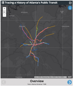
Tracing a History of Atlanta’s Public Transit (interactive Visualization tool):
Mapping can also be used to educate and hopefully make an impact. Another project that included heavily on mapping, was the Atlanta Mass Transit project (link to full interactive version below). This interactive map shows the history of Atlanta’s public transit system through almost a decade. Its interesting to read its history of the destruction the revival of mass public transit in our city.
http://www.arcgis.com/apps/MapSeries/?appid=7f0b953943a7490f80e2dc1ebf7f64e3
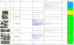
3D Atlanta Research (Data Organization & Visualization):
Mapping has shown to be very useful in not only presenting data but organizing it as well. Through the 3d Atlanta project, the research team has the job of finding information and pictures of areas around our campus from the 1920s and beyond. The research team is in place to aid the technical 3d side in order to recreate the most accurate 3d model of downtown Atlanta in the 30’s. With so much treasure out there we had come to the issue of how to organize all of our data. We came up with the idea of placing the images of the streets and information onto a google map so that once the 3d modeling team moved toward that direction in the virtual engine they could simply pull the images from the map where all research was organized spatially.

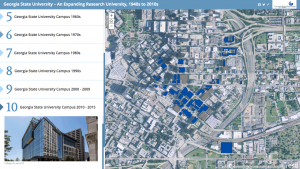
GSU Growth Map (Interactive Visualization transition):
One of the most recent projects where mapping has proved its valor, was the GSU Growth map project we were assigned to aid in for President of the University, Mark Becker, and the Launch of GSU’s Burning Bright Campaign. This project was very rewarding. We were able to use Esri’s ArcMaps and Story Maps to create a great interactive representation of how Georgia State University’s campus has grown and evolved since its founding. This tool has helped to promote the future growth of our university.
All of these projects have evidently shown the impact mapping can have on research. I hope to learn more on how to incorporate mapping into research and look forward to whats to come.
Until next time,
Alexandra Orrego