Personal Cultural Heritage

I will not lie, this was a difficult assignment for me. My family history is riddled with tales of drifters and early deaths, and unfortunately, those who probably knew more than they shared are in their graves. While I wish I had cared more about where I came from when these folks were around, some of the stories are lost. Nonetheless, I did manage to dig up a few interesting pieces of art that I feel reflect my cultural lineage.

This first work is a screenprint on Lenox Museum Board and was fashioned by Andy Warhol in 1986 as a part of his Cowboys and Indians portfolio. While many recognize this image as Annie Oakley, a famous American markswoman, her real name is Phoebe Ann Mosey, and she happens to be my relative. Her father and my great-great-grandfather were brothers making Annie and my great-grandmother first cousins. We often brag in our family that with this lineage we are all fantastic shots! Unfortunately, her story reflects the poverty-stricken childhood that she endured and after her mother was widowed twice, she was forced to move out and work as a caregiver at an infirmary [1]. However, she persevered through many years of mistreatment and made a name for herself with her skill [1]. By the time she was 15, she was able to return to her mother’s home and help support the family [1]. She is a symbol in our family of strength, and her legacy has proven that with hope and determination anything is possible.

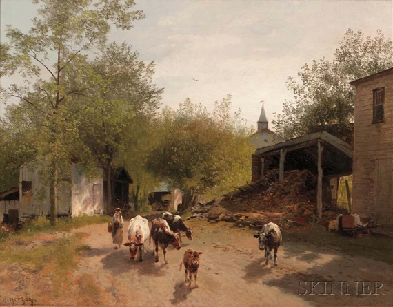
This second work is entitled Early Morning on the Farm and is an oil on canvas painted by Hermann Herzog. While the date of this work is unknown, Herzog was alive from 1832-1932 [2]. This work is significant for two reasons, Herzog was of German descent and migrated to America in 1871 settling in my home state of Pennsylvania [2]. He later became a citizen in 1876 and was known for painting landscapes of places he would visit [2]. While there is very little information on this painting, it does remind me of very early pictures of the Corle homestead that many generations of my mother’s family occupied. Just like the artist, this side of my family migrated from Germany as well and settle in Pennsylvania in the 1800’s. I have many fond memories of lazy summer weekends spent on the family farm where the work was never done, but my pap, his brother, and my uncles never seemed to mind. This picture reinforces to me that the perfect job is one that does not seem like work at all. It is amazing how a simple picture of herding Jersey cows to another pasture has the ability to take me back to a different place and time. I miss those days.

I thought I would share this little gem as well. This is a copper tea kettle that came “across the pond” from the old country. There is no date and no artist to give credit to, but it is a fascinating piece that was brought with my great-great-great grandmother when she migrated from Germany in the mid 1800’s.


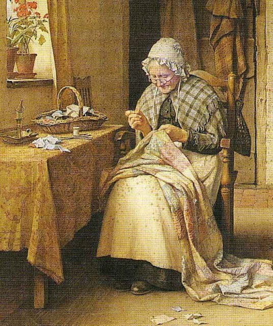
This next work I chose to showcase is called Making a Patchwork Quilt by British painter Charles Edward Wilson. It is no secret that I come from a long line of quilters with an ancestry that can be traced back to England and Germany. In this work, there is presumably a farm wife constructing a quilt from whatever material she had on hand. This could be from worn out bedding, clothes, or even chicken feed sacks. While quilting skills have been passed on from generation to generation, there has been a shift from necessity to simply creating something beautiful “just because.” What I find striking about this piece is the simplicity of the background with what appears to be an oak table, candle lamp, and house plants in the window. This environment has a very familiar feel and reminds me of my youth. Sturdy, humble surroundings that were not riddled with the materialistic possessions of the present day. Pastimes were not spent in front of a screen playing a game or trolling endlessly on social media; they were spent constructing real tangible items or finding true joy in caring for a plant. I feel very fortunate to know how to sew and quilt and find great satisfaction in watching a plant thrive. I am also glad that my own have taken a bit of interest in these pastimes as well.

I chose this final piece because of my maternal grandmother. Her mind is now lost to Alzheimer’s disease; however, when I was a little girl she would play on her organ the song “Ave Maria” which is based on the traditional Catholic prayer to Mary. This work by Sandro Botticelli, Madonna of the Magnificat, 1481-82, reflects the subject of the song, Mary, mother of Jesus Christ. His emphasis on the importance of Mary is detailed in the larger size of the work as well as the extensive use of gold paint to decorate her robe, crown, and portrayal of the divine rays of light [3]. It is also noted that she is being crowned the Queen of Heaven by the angels [3].My grandmother is Catholic, and even though I am not, I appreciate the praise that she had for Mary and now looking back I realize that she was sharing her convictions with me. In fact, Mary and the song devoted to her, “Ave Maria” was so important to her that I had it played in the prelude to my wedding.

When I look at all of the works that I chose to present in this final post, I realize two things. First, I have an unyielding desire, much like Annie Oakley, to succeed. Honestly, I am not sure I will ever be content. Life is too short to be ordinary and confined to preconceived boundaries, right? Secondly, the last three works speak of the fond memories that I had growing up. I think it is important to understand where we come from and what skills, as well as thoughts, we have developed as a result. This gives us a true sense of self and the greatest gift we can give to our younger generation is the continued traditions and skills that make us who we are. We are all very diverse beings with rich histories. It is important that we embrace that.

References

[1] http://www.biography.com/people/annie-oakley-9426141

[2] http://www.edwardanddeborahpollack.com/Herzogbiography.html

[3] http://www.wga.hu/frames-e.html?/html/b/botticel/22/30magnif.html

I Haz Meme?

I am a little bit on the fence as to whether all memes are considered art or not. I feel as though the original creation of a meme is counted as art. This is because it accompanies thoughtful consideration in the selection of an image, wording, and presentation. (I quickly discovered that this is much harder than it looks. I spent a couple of hours trying to pull my own meme together.) When the same images continue to pop up with different thoughts imposed, my perception of the meme being artful seems to fade. In fact, the repetition of images begins to feel a bit cookie cutter.

Overall, though, the internet is a wonderful arena for the art world. The greatest asset is the ability to reach across time zones to not only share but also support art. It allows the collaboration of a community that would not exist otherwise. I grew up in a time when there was no internet use, and I can speak from experience the doors that it has opened, if used wisely, have been incredible. The web exposes us to a widely creative and diverse world that we would never be able to experience otherwise.

In closing, I thought I would share a little bit about my meme. My youngest son Aaron completed this assignment, and it is funny because we all have been posed questions in class at one point or another that seem silly. I personally had a question regarding an obscene amount of watermelon or candy bar consumption in the first math class I had to take when I returned to college. For an adult, we chuckle and think “Couldn’t you have made the question more realistic?” This is an interesting insight into the mind of a mere elementary school boy, and it shares with us (because we probably don’t remember) that even though they are young, they also wonder about the reasoning behind certain coursework as well.


Personal Truisms

Jenny Holzer’s entire goal is to get people to step out of their comfort zone and think. Her Truisms are not only thought-provoking, but they also help to break down misconceptions…especially when viewed by those with an open-mind. I think the most compelling aspect of her art is her ability to directly get her point across in a simple, easy to understand manner. In a sense, if we were to group her Truisms together, we would realize that her underlying message is that knowledge is power and it is monotonous and counterproductive to live a bias existence.

My Truism is rather lengthy, yet it is something that I feel very strongly about, especially in the current political landscape and movements that are occurring. A pet-peeve of mine is when individuals, and we most often see this on social media, form opinions based on how they experience life. The best current example of this in regards to the women’s movement towards equality. Unfortunately, some of my female counterparts are disgusted by this. They are content to “just be” and do not understand the motives behind the marches. They feel this way because they have not experienced it first hand in their lives. That is OK, and they should consider themselves fortunate; however, I think that it is selfish to degrade anyone who feels that this is a cause worth fighting for. The biggest problem with our nation is that we do not know how to view the world through other people’s eyes. For me, I may not agree with your viewpoints, but I promise always to respect them. I recognize that we are from many diverse backgrounds and are faced with different obstacles, but to attack a perspective that you fail to try and understand is foolish.

I am fortunate….I grew up in a household where my parents came from opposite sides of the aisle, and I can tell you that what they taught me was successful relationships are a result of learning how to disagree. Maybe, if the world could do the same, we would be a more content society and stop the constant bashing that results from ignorance.


Contemporary Twist on Goldfish, Henri Matisse 1912

Swedish Fish, Aimee Dickson 2017


The work that I chose to recreate is an oil painting entitled Goldfish by Henri Matisse, 1912. This is a rather simple painting with the distinct focus on four goldfish in what appears to be a glass cylinder. They are bold in color, and the front and center stance relays their significance to the viewer. It seems as though the setting is in a sun room or covered garden area of sorts with the container sitting on top of an accent table surrounded by tropical-type flowers such as orchids, elephant ears, and other nonspecific foliage.  These surrounding areas are a direct contrast with their softer and more natural coloring. The background flooring is rather dark allowing the brightness of the goldfish to pop. This painting undeniably speaks of a space that is used for contemplation.

It is said that goldfish were the subject of several of Matisse’s works. Upon a visit to Tangier, Morocco he noticed the fascination that the populace had with these creatures’ calm and graceful presence [1]. This, in turn, was a reflection of the lifestyle that the local culture possessed and Matisse felt it only appropriate to capture this same serenity in his work. It is also noted that he was rather versed in the natural landscape and often painted vegetation and moving water to further reckon his feelings of paradise [1]. These features in Matisse’s work are credited back to the Islamic influence of art [1]. This painting speaks of a slower and more simplistic way of life and Matisse does achieve the feeling of tranquility with this work.

The first type of analysis that can be used to view this canvas is Iconographic. For Matisse, the fish are representative of tranquility and peace with their graceful movements [1]. He was intrigued by the attraction the Moroccans possessed for these creatures and noticed that the presence of fish was a representation of their quiet, relaxed lifestyle [1]. The nondescript plants in this painting speak of the cohesiveness of nature. It is said that for Matisse the goldfish and foliage were symbols of paradise. The soft background pallet automatically creates a sense of calm and balances the overall feel of composure.

We can also view this oil work using a biographical analysis. As mentioned earlier, leading up to this creation, Matisse visited Morocco for several months in search of inspiration and was attracted to the relaxed lifestyle that the culture enjoyed [1]. Combined with his use of Fauvism, this speaks of his desire to be creative with color while at the same time, not necessarily producing a realistic depiction of an event or subject [3] [4]. The representational subject matter speaks of the Matisse’s quest for finding complete tranquility in his life with the elimination of the often depressive works of the art world [2]. This work is certainly a time stamp of this desire of complete peace because it is one of twelve in a series of works with goldfish as the main focus [3].

I personally have an affinity for fish and own several of aquariums, which is why I am drawn to this piece. I agree with Matisse; fish are intriguing to watch, and their graceful movements are relaxing. At the same time, I also happen to love sweets, and when I first viewed this work, I immediately felt as though these goldfish were more reminisce of gummy Swedish fish. I decided to experiment with the subject of my photograph being four Swedish fish floating in a rather large glass container of blue lemonade adorned with lemon slices and a sugar coated rim. The savory snacks of popcorn and crackers are the perfect complement to the drink and the background is comfortable theater seating. My hope is that my photograph reminds the viewer of a relaxing night, perhaps spent with family or friends, after a long stressful week of work or school. Much like Matisse’s Goldfish, I feel this work also speaks of calm even though it is not filled with the softness of tone or natural subject matter. In a sense, this is a temporary escape from the rigors of daily life.

References

[1] https://www.khanacademy.org/humanities/ap-art-history/later-europe-and-americas/modernity-ap/a/matisse-goldfish

[2] http://www.henri-matisse.net/biography.html

[3] http://www.henrimatisse.org/goldfish.jsp

[4] https://www.moma.org/artists/3832?locale=en

House on Fire!

My house is filled with things that I love, but it unrealistic to even think that I could take them all. This image is representative of the items I would hate to lose.

First and foremost, the picture of the trick-or-treaters is a photo of my kids from October 2009. It was taken when we lived in Georgia (the first time,) and I love it because it not only captures their innocence and youth but it is a time-stamp for a much simpler time. It is representative of an era before fractions, soccer, dance and social conflict. This was when my children viewed my husband and me as “the best people ever.” They are still good kids, but these years passed by rather quickly and now all that is left is pictures like this.

The second photo is an aerial view of my grandparent’s dairy farm in Martinsburg, PA. I spent many summer days on this farm and seeing this fills me with memories of my youth. While the farm is still in my family, my pap passed away in ’07, and my gram sits in a home. Dementia-type Alzheimers has erased her memory. If your grandparents are still around, soak them up because they will eventually become a memory!

There are a few precious pieces that I would be sure to grab. First would be my wedding band and diamond. I am fortunate to have a great marriage, and these rings are representative of that. The necklace was a gift from my husband when he returned from serving in the military. His tour was eighteen months long, and he left when my oldest son was two weeks old. This necklace is representative of the closure of one obstacle in our marriage. The money clip is that of a significant other that I lost before meeting my husband. His name was Terry, and he was killed in a car accident twenty years ago this month. While it took me a long time to let go, I realize that we were never meant to be. I will never forget him and am very thankful for his memory. He was a great guy.

There are a few essentials that I could never leave behind. First is the set of Epipens. My boys have anaphylactic food allergies and require these in the event of a reaction. They are a life-saving tool that I never leave home without. This is the same for the chapstick. Ever since junior high, I carry a flavored Lip Smacker. Having dry lips is torturous to me, and I act a little bit crazy when my daughter takes mine for her own use. Finally, I have Coke-bottle lenses and cannot see even a foot in front of me without some sort of corrective measure. While I do wear contacts most of the time, my glasses are tried and true, and I cannot function without them.

It is no secret that I like to sew. The coverlet that is shown is a work in progress. It is known as a Cathedral Window and is handstitched. I have a tremendous amount of time in this and would not want it to burn. The thimble in this image is my favorite. It fits my finger perfectly, and I have yet to find something similar in the store. Much like the chapstick, I get a little nutty when I have misplaced it. I am very much attached to this small piece of silicone.

Last, but not least, the picnic basket that is in the photo has no sentimental value. I just like it. In fact, I collect old picnic baskets. I believe this one is from the 40’s or 50’s. I would use it as a vehicle to carry everything out of my burning house. My theory is that anything functional should be beautiful as well!

A “Thousand” Words

Using a formal analysis of this oil painting entitled The Two Fridas, we see two women who appear to be mirror images of one another. With the significant area that these women cover, they would be considered the subjects of the work. Both have raven-black hair that is fashioned in a tidy updo with blushed cheeks, a dark unibrow, and identical stares. The woman on the right, though, is a bit shadowed and seems to be slightly further away from the viewer. They are sitting on what appears to be a wicker bench with metal supports, and the directional line of their forearm leads the eye to recognize they are holding hands. With clothes that are reminisce of the early twentieth century. It is noticed that there is a contrast in the tone of their attire. The woman on the left is wearing light colored clothing adorned with intricate moss green scrolls and rust colored flowers while the woman on the right is wearing garments that are darker. Her dress contrasts using solid blue, brown, and orange with a wide eyelet or lace hem. These women seem to be connected by a common vessel that is stemming from the right subclavian arterial branch of their aorta. It is noticed that both of the women have a heart depicted on their outer garment. The woman on the right seems to have a closed loop of vessel with her heart intact with a visual witness of myocardium while the woman on the left is missing the myocardium allowing her atrial and ventricular chambers to be visible. It appears as though she is losing blood, and in an effort to control the bleed, is using a surgical clamp of sorts. The sky is dark with many gray clouds with a subtle hint of moonlight. The ground is reminisce of dirt. There is near symmetry in this painting which makes it appear balanced.

Using a biographical analysis it is quickly realized that this artist has just ended a rather toxic marriage that was riddled with infidelity. It is believed that this work is representational of the Frida who was unloved and heartbroken in the white dress versus the Frida who was loved and content with her inner being portrayed in her dress of traditional Mexican garb. While it is difficult to see, the small picture in her hand is that of her husband which reinforces the Frida on the right is a symbol of a happier existence when her marriage was still intact.  It is also reasonable to consider a psychological analysis as well to understand the emotion this painting is portraying entirely. It is clear that this was created at a time of mental anguish.There is a sense of sadness that surrounds this work. It is understandable of how she views herself in two different lights. The broken heart and open vessel communicate that she was barely hanging on and signifies a broken soul, while the treacherous appearance of the sky presents a sense of turmoil. It could be said that one of the greatest tragedies in life is when we lose our sense of self and this painting is reminisce of that. The Two Fridas can also be viewed using a feminist analysis as well. She appears to communicate to women the feelings that only a woman can have at the loss of love. Maybe it has to do with the way a relationship changes our being. When it is good, we are content, just as the woman on the right. When the relationship has come to an end, a part of us has died as well. From a female standpoint, this may be something that the male psyche cannot entirely comprehend. Maybe the question is that women are more vested when it comes to the cohesiveness of a relationship?

My original interpretation of the work is that the artist is trying to depict two separate personalities. I felt that the woman painted in the white dress was representative of one face that is superficial and puts on a “show” for the world. The ripped dress with the torn heart, to me, felt as though this was a painful part to play, almost as though she is not true to herself. The clamping of the blood vessel seems to have the feel that she is trying to hold this persona together, but it is getting more difficult with the passing days, and she is unsure as to how long she can sustain. The dark, stormy appearance of the skies also reinforces this sentiment sharing that her soul is in turmoil. However, the representation of the woman who is in less formal clothing seems more content. Her heart is not broken, and because she appears to be set a bit in the shadows, it is clear that she is the true hidden being. The reason I do not like this work is that it is not aesthetically pleasing to me. I have a hard time with the elegance of the characters married with the frankness of the broken vessel and torn heart. For me, it is a bit much and contrasts a little too harshly.

Yet, with understanding the backstory of this particular work, I have had a change of heart. Prior to understanding how to read arts symbols, I would have thought this was just plain odd. What Frida Kahlo is portraying in The Two Fridas, though, is raw emotion which makes me uncomfortable with her honesty, but I am sympathetic to her tragic message. Ultimately, this means she was successful. There is something about the saying that there is “comfort in numbers” and for someone who has been through the same heartbreak as Frida, they may view this piece with the security of knowing that they are not alone. For Frida, this was an outlet, and that I can appreciate. Frida Kahlo was not only complicated but a fascinating being as well. I encourage you to visit any of the sources below to learn a little more in depth as to the motives behind her work as well as her life’s story.

Sources

http://www.biography.com/people/frida-kahlo-9359496#synopsis

http://www.fridakahlo.org/

http://www.fridakahlo.org/the-two-fridas.jsp

https://www.solidarity-us.org/node/2782

The Best of Super Bowl 51: Mr. Clean ~ A Sex Symbol?

While some individuals may argue that this is not the most artful Super Bowl ad, I found this Mr. Clean ad really entertaining and incredibly creative.  What is different between this commercial and other cleaning lines is its ability to morphs a seemingly boring brand of cleaning products into an item with sex appeal and desire.

The tone is set beginning with the provocative music playing in the background and the obvious attraction that the female actress has to Mr. Clean. Why is he so appealing? First, he is donning tight-fitting clothes, and a rather fit male physique. There is great detail in not only his movements but also his muscle definition and tone. He is also rather tall which typically is considered attractive and “ideal.” The white clothes that Mr. Clean is wearing, though, are still representative of what is being sold. After all, most of us associate white with clean, right? His clean shaven head also could be rendered a symbol of cleanliness and order which I believe most women do desire.

This commercial definitely speaks to women that if they use these products, they will be happier, but it also says to men, if you clean your wife will find you irresistible. I think it did a great job capturing a wide range of audience.

I do not feel that any commercial is worth the monies spent.  Even though I found this commercial engaging, it does not make me want to go out and buy Mr. Clean products. I do recognize, though, that there are people who would be persuaded. If these individuals did not exist, companies would not spend 5 million in marketing for little to no return on their investment.

Spectrum of Representation

While every artist creates with intention, the subjects of his or her designs range in a series of categories from recognizable to perplexing. The classification of the most identifiable theme is known as representational. Works that fall under this subset are typically mirroring images of the world as we know it. Great examples of this type of work may be in the form of photography or portraits fashioned to emulate the realism of the subject. The second grouping is known as abstract. Even though these creations are considered to be familiar to most viewers, they are a bit theoretical in nature. The abstract is often described as distorted in that it depicts subject matter that is recognizable; however, it is represented in a more creative means and does not mimic the image as it would be viewed in the real world. The final classification of art is known as non-objective. These types of works are not recognizable to the viewer and are subject to interpretation. Often the artist garners their use of shapes, strokes, and colors to communicate a feeling or a message. Ultimately, though, the real meaning lies within our interpretations.

The following artworks are arranged beginning with most representational, transitioning into abstract, and finally, ending with the most non-objective subject matter. For continuity, I chose to present my spectrum in something we all recognize, the rising of the morning sun.

Tobacco Sunrise
John Harding, 2015

This first work, Tobacco Sunrise, is an actual photograph; therefore, it is deemed the most representational example of a sunrise. Upon viewing this picture, it is clear with the colors of the sky that this marvel that is witnessed during bright, early mornings is an exact depiction of a sunrise. The detail of a photograph cannot be replicated in any other type of media which makes this more representational than the next piece.

In this second example, Sunrise at the Eastern Swamps, it is evident that the subject is also a sunrise scene. This example is different, though, because it is not an actual photograph. For this reason, it is less representational than the first featured photograph; yet, the detail in the shapes and blending of colors make the focus distinct and recognizable to all. It is clear that the artist has taken great care in the fine details making this another example of a representational presentation and definitely less abstract than the third work.

Sonnenaufgang 1 (Sunrise 1)
Josef Scharl, 1944

The third example, Sonnenaufgang 1, can be considered both representational and abstract. It is similar to the previous piece in that it is indicative of a sunrise. What moves it into the mindset of an abstract is the artist’s choice of colors and shapes. These are not realistic depictions of an actual sunrise, rather they symbolize a simplified version, and with the lack of a detailed background, this makes this particular painting more abstract than the previous sample of a sunrise; however, it is still more representational than example four with its obvious lines.

Norham Castle, Sunrise
Joseph Mallord William Turner, 1845

This portrayal of a sunrise entitled Norham Castle, Sunrise, is more reminisce of an abstract. It is even more simplified than the previous painting, and with the lack of clean lines it gives most viewers a sense of the morning sun; yet, it does have a rather flat effect. Due to the lack of specificity, it could also be considered a constant in nature as well. The emphasis appears to be in the shading of the scene rather than the actual definition of objects. Yet this same sentiment does make this work less non-objective in comparison to the next example.

Sunrise
Cecil Collins, 1961

In this work called Sunrise, the movement towards nonobjective-type abstract art is becoming evident. It is abstract with the presence of silhouettes that are meant to symbolize the sun, sky, and landscape; however, with the black and gray color scheme it is more difficult to tell that this artist’s work is representative of a sunrise. Even though the simple shapes and monotony of color make the viewer question what they are looking at which is a characteristic of non-objective subject matter, these same features are also responsible for making this piece less non-objective than the sixth work.

Permanent Sunrise
Alejandro Propato, 2013

This representation known as Permanent Sunrise, would be considered more non-objective than abstract in comparison to the previous work because it is only recognizable after the viewer is privy to its title. With the poles and the colored stranding symbolic of the sun’s rays, this sculpture would probably hold more meaning depending on the time of day it is experienced. Its subjectivity to interpretation, and clean lines are the hallmarks of a non-objective subject matter. However, due to the multiple bends in the work it is still not as non-objective as the final work featured in this post.

Sunrise
Jane Manus, 2011

This metal sculpture, known as Sunrise, is clearly identified as a non-objective subject. This work is more non-objective than the previous example because it is simply fashioned using straight lines, rectangular segments, right angles, and is colored in a basic yellow. The uncomplicated effect of this sculpture forces the observer to make their own interpretations based on past experiences, beliefs, and partialities.

Art In My Environment

For a piece of art to be used as decoration in my home, it either needs to have meaning, or I have to love it. The first piece of art that I will feature in this post possesses meaning. It is a watercolor painting that was made by my elementary school art teacher, Mr. Charlie Barr. While he is retired, he continues to make artwork and sell it on occasion within the Homewood Retirement Community. Even though this particular painting is untitled, it reminds me of the bleak, long, cold winters of home. The colors are what make me feel this way. The sky is shaded in blue, gray, and white which is reminisce of a pending snowfall. The tree limbs are bare, and there are accents of snow covering the trunk of the tree. Pennsylvania is known for its mountains, and I notice that the faded tree line in the background speaks of the cove in which I grew up. Overall, the monotone colors of this painting give me a sense of calm and familiarity. The frame also tells a story as well. I can tell that it is recycled and this is a testament to where I am from. It speaks of the frugal and non-wasteful nature of Morrison’s Cove which is another reason why I love this piece so much.


There is no texture to speak of because it is a 2D image. The lines of the main features of the tree are witnessed as continuous striations; yet, within the smaller branches of the tree, the less significant limbs are represented by a series of breaks.These deliberate lines of the tree make it clear that it is the focus of the painting. Contour lines are also present, and they are experienced in the faded treeline background of the mountainous areas. Again, the shape of the tree in some aspects seems to be geometric in nature, but it also has accents that are rather organic which I feel helps lead to a feeling of calm. The principles of this artwork could be described as creating a feeling of unity through the use of tone of color and continuity of scene between the background and foreground. The emphasis is placed on the tree as a result of the larger appearance and darker colors in contrast to the faded background. While this painting does lack symmetry, it is still pleasing to the eye. This is probably due to the long reaching branches that are noticed on the left that attributes to its balance. Even though I have had this painting hanging in my kitchen for several years, until today, I never really noticed the tree line in the background. My focus has always been on the tree in the forefront. Overall, I feel that Mr. Barr was trying to share the simplicity and calm of nature.

The second piece of art that is in my house is not only beautiful, but it is functional as well. It is a piece of Flambeaux pottery that serves as a cookie platter and is the work of Cambell Pottery. I was first drawn to this cookie tray due to the beautiful colors that can be described as cool in nature with a mix of blues, greens, and yellows. What is so wonderful about the design is that it is very random and reminds me of a snowflake or frost on a window. Due to the nature in which it is created, no two are alike, so each cookie plate, while is similar in shape, due to the coloring parallels to that of a fingerprint. This is a functional work, and I feel that everything in my environment that is functional should also be beautiful, and I believe that this special plate embodies those characteristics. It makes me smile!

The outlines of the plate are rather clean and concise, and the shape is geometric and symmetrical. Within the body, though, random veins are surrounding the framework of the plate that not only lends to an interesting texture but also gives it an aesthetic appeal. The glaze makes it smooth and speaks to the class that one experiences when seeing this in person. While there are multiple colors and tones in this tray, there is very much a balance that is created. The centered length of the plate is lighter in tone with the width contrasting with the deeper blues. The randomness of the design is asymmetrical in nature; however, with the balance of colorways on either side seems to make the piece pleasing to the eye. While there is a significant amount of variety in the shapes of the glaze, it appears to contrast nicely. I have always been intrigued by the intricacies of this platter along with the other pieces I have been fortunate enough to snag. I believe that the artist’s message is that life is too short not to enjoy the beauty of everyday things. Why should a cookie platter be ordinary and boring?


Art is an individual’s ability to leave their mark on the world by sharing their story.

Art in its finest form tells a story. It is a way for an individual to share the hardships they faced; the emotions they felt as well as the causes they deemed were worth fighting for. Art can be regarded as a tangible way for an individual to leave behind a lasting legacy, whether they intended to or not. The history that a piece possesses can be viewed not only with fondness from relatives but also as a primary source for historians. The materials that are used are a testament to the resources available, and the practices can be attributed to the technique of the time. Just like texts and memoirs, art can symbolic of the roots of our history.

These images embody my definition of art. This type of quilt is known in Pennsylvania as a hap, and my great-grandmother made it in the 1940’s. The beauty of this piece is the tone of the colors that she chose and the manner in which it is sewn, which is known as crazy quilt piecing. She chose a decorative stitch known as herringbone, and it is quilted using a multitude of red and green threads.  What is so interesting about this hap is that it was constructed at a time when inhabitants were incredibly frugal and resourceful. The fabric that adorns the top is fashioned out of my great-grandfather’s worn-out suit coats.  The backing appears to be pieced from leftover upholstery fabric, while the thinness probably lends itself to the interior being a recycled blanket, rather than batting. This hap ultimately is a work of art to me because it is not only aesthetically pleasing with the collaboration of textural knits and obvious skill, but it imparts with the world the mechanisms of survival of the 1940’s, as well as the creativity that was enjoyed as a pastime among women.

Hap fashioned in 1940’s out of retired suits.


Decorative herringbone stitch with running quilt stitch in red and green thread.


Upholstery Fabric Backing

As outlined in Module 3, art is so much more than visual interest. It is a deliberate expression of thoughts and beliefs of everyday happenings as construed through the eyes of an individual into a creative medium. Art is a type of communication that, interestingly enough, can take on a different meaning for anyone who experiences it. The subjective nature in which it is received is dependent on an individual’s principles and acquaintances. Often regarded as a fingerprint, art gives people a way to express their individualism. It can also be considered as a time-stamp embodying all the characteristics of the era it is created. It has the ability to invoke raw emotion enabling each of us to learn a little more about the world around us. No other species is privy to the art experience.

While I focused in my explanation of what I determine is art as to the materials used and the story that was to be told, the information in Module 3 expanded my understanding. First, art is to be regarded as intentional. It is created with a purpose of sharing an underlying idea and boasts a deeper meaning than what can be appreciated at face value. Interestingly enough due to subjectivity, the basic idea that is expressed by the creator may be interpreted in a different light by others who live in different socioeconomic classes, periods or even cultures.  It is also understood that art has the ability to make the ordinary extraordinary. While I agree with most of these sentiments, I do feel as though sometimes art is created unintentionally. I believe that it is possible that certain works may have been accidental in nature; however, with the right mind, they have the ability to give new meaning to an otherwise senseless object. In the video “Art Now” Leon Botstein used the example of children engaging in finger painting was not regarded as art because there is no intention; however, I look back over my own children’s pieces and view them as priceless oeuvres that capture the thoughts of their young minds.

Finally, beauty is not a factor in what I decide is art to me. I focus more on the history and the emotions that the piece develops.  I feel as though the beauty can be reckoned in the emotions and not necessarily with regard to the immediate senses. If art is to be a communicator, it would be rather vain only to consider its characteristics at face value.