The digital built environment that I’m describing is te women’s Atlanta Dream. The layout of the site is very blocked and segmented instead of having a feminine touch to it being that it is a women’s basketball team. I believe the NBA tried to equalize the sites by having a neutral color, those colors being the team colors. The website of the Atlanta Dream is very informative instead of commercialized like the men’s basketball team website. It gives information on college players and their dealings in the WNBA. Unlike the Atlanta Hawks website, the Atlanta Dream has lots of drop down menus that stay at the top. On the Hawks’s website these drop down menus travel as you’re scrolling. The word ticket is significantly bigger on the site for the men’s basketball team than for the women’s. This might shed some light on the popularity of the team. In my opinion, the Hawk’s are by far the more popular team in basketball. The Atlanta Dream plays other WNBA teams but they are more in the background supporting and teaching young women of adolescent age. Their goals are to educate about health and wellness, the benefits of education and insipire young women. By the looks of their site it looks like they do a pretty good job of giving back to their community and inspiring the young women around the city. Comparing the men’s and women’s basketball sites in Atlanta really let me know the lack of national popularity for the team but the local pride that it carries.
Tag Archives: Atlanta Hawks
Digital Record 2
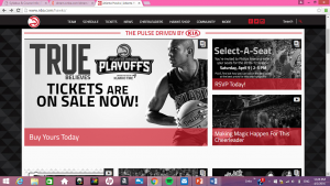
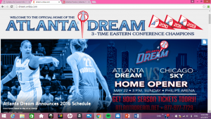
I look at the Atlanta Dream again in comparison to the Atlanta Hawks. Looking at the Atlanta Dream, they have the 3 years they won the conference championships which automatically doesn’t look the best because it only has 3 flags and its 2016 so they haven’t won in 2 years. They’re advertisement to get tickets is labeled in red but it still isn’t super noticeable. They do however have an ad that drops down when you first try to get on the site for single game tickets. However, on the Atlanta Hawks teams’ page there is one man with a basketball and the “Buy yours today” sign and the ad to get Hawks tickets are way bigger. They put a greater emphasis on getting the Hawks tickets.
Digital Record 1
- Atlanta Dream
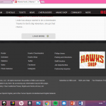
Here is one example of how non-marketed the team of Atlanta is compared to the Atlanta Hawks Mens Basketball Team. You can see here that at the end of the page on the NBA Hawks website (bottom picture) it states who the team and whole association is owned by and the rights they reserve. It also states who it’s owned by. There are various links to affiliated websites. All the Dream has is the very basic of sites. There not much except the basic and bare minimum of information. This sheds some light on how much more popular the NBA team is than the WNBA team. Its two solid colors make it look very boring.


