The digital built environment that I’m describing is te women’s Atlanta Dream. The layout of the site is very blocked and segmented instead of having a feminine touch to it being that it is a women’s basketball team. I believe the NBA tried to equalize the sites by having a neutral color, those colors being the team colors. The website of the Atlanta Dream is very informative instead of commercialized like the men’s basketball team website. It gives information on college players and their dealings in the WNBA. Unlike the Atlanta Hawks website, the Atlanta Dream has lots of drop down menus that stay at the top. On the Hawks’s website these drop down menus travel as you’re scrolling. The word ticket is significantly bigger on the site for the men’s basketball team than for the women’s. This might shed some light on the popularity of the team. In my opinion, the Hawk’s are by far the more popular team in basketball. The Atlanta Dream plays other WNBA teams but they are more in the background supporting and teaching young women of adolescent age. Their goals are to educate about health and wellness, the benefits of education and insipire young women. By the looks of their site it looks like they do a pretty good job of giving back to their community and inspiring the young women around the city. Comparing the men’s and women’s basketball sites in Atlanta really let me know the lack of national popularity for the team but the local pride that it carries.
Category Archives: Built Environment Descriptions
Digital Record 5
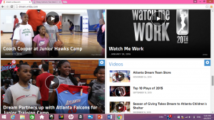
From this portion on the website I get the feeling that this women’s basketball team gives back to the community in a lot of ways. There are lots of children in groups on the site with descriptions of group tickets and how they also participate in fundraisers. I feel like on a mass scale Atlanta Dream is working in the background by giving back to their community and partnering with schools to change children’s lives and inspire young girls. On a mass scale they aren’t as popular as the Atlanta Hawks but they are noticeable and relevant through these children and all of their fans.
Digital Record 4
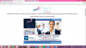
Looking a little closer into the website I see that this team’s main focus is “Health & Wellness, Education & Inspiring Women”. This website does a good job of capturing strong, independent, self-sustaining women. Atlanta Dream is an excellent example of a basketball team displaying strong educated women who inspire other youth girls aspiring to be in their place or even to just succeed.
Digital Record 3
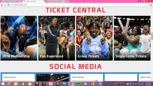
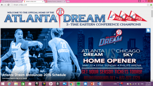
In this portion of the Atlanta Dream’s website I see a lot of women. Not only the players but the fans. I see young girls. This may be to have the website market to young girls who are basketball fans. The website is very block formatted and segmented. Its background is white instead of the regular girly color of pink, in fact it’s blue borders to represent the color of the team not just the gender. I think the pictures are to show that they have a lot of fans who are young girls with their families.
Digital Record 2
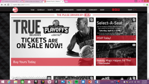
I look at the Atlanta Dream again in comparison to the Atlanta Hawks. Looking at the Atlanta Dream, they have the 3 years they won the conference championships which automatically doesn’t look the best because it only has 3 flags and its 2016 so they haven’t won in 2 years. They’re advertisement to get tickets is labeled in red but it still isn’t super noticeable. They do however have an ad that drops down when you first try to get on the site for single game tickets. However, on the Atlanta Hawks teams’ page there is one man with a basketball and the “Buy yours today” sign and the ad to get Hawks tickets are way bigger. They put a greater emphasis on getting the Hawks tickets.
Digital Record 1
- Atlanta Dream
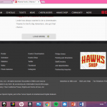
Here is one example of how non-marketed the team of Atlanta is compared to the Atlanta Hawks Mens Basketball Team. You can see here that at the end of the page on the NBA Hawks website (bottom picture) it states who the team and whole association is owned by and the rights they reserve. It also states who it’s owned by. There are various links to affiliated websites. All the Dream has is the very basic of sites. There not much except the basic and bare minimum of information. This sheds some light on how much more popular the NBA team is than the WNBA team. Its two solid colors make it look very boring.
Built Environment Description of Phipps Plaza (Interior)
Phipps Plaza was opened in 1969. It’s target customer are the rich and wealthy customers that mostly reside in Buckhead and other rich people from various countries touring America or Atlanta specifically. Phipps was described as a relaxed upscale shopping experience by most who pay it a visit, another person had described the place as a “high end fashion model’s dream”. There are lots of hidden messages I found when visiting this mall. One is that the middle class and poor aren’t really welcomed. I partially got this notion from all the designer stores in the mall. To be able to afford some of the simplest clothes in Phipps, you at least have to own a house. These are not specific requirements, however, if you can afford a house you might be in the income range to shop here. Even Lenox has stores the middle class can afford like Forever 21, Wet Seal, and Victoria Secret. Phipps Plaza is full of designer stores who meet the needs of their rich clients who add to the malls revenue. I went in a store called Naturals while observing the mall. The salesman in the store tried to sell my friend and I expensive salt scrubs claimed to be from Israel. I started asked him if there was an H&M, Forever 21 or any store of that nature in the mall and he replied “Oh NO honey! This is Phipps!” Right then, I understood the reputation Phipps holds throughout Atlanta, Georgia and the rests of the country. It truly is a mall catered to the famous and wealthy people. With waterfalls, couch chairs, neutral colors, a chandelier, and lost more bright lighting throughout the shopping center, Phipps definitely wheels in the high end customers who are familiar with luxury and class.
Digital Record #5
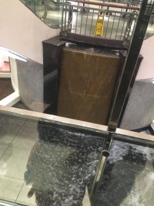
The water fall in this mall can be heard from most places inside Phipps. I think this water fall is an important part of the mall. It provides relaxation while shopping. The neutral colors of brown and black along with its shiny surrounds give the mall an elegant touch as well as calming the shoppers as they ship through the expensive mall.
Digital Record #4
To have an Art Gallery in a shopping mall already speaks highly of the area and the customer because it wouldn’t be there if it weren’t for those two factors. Wentworth Gallery serves the wealthy travelers of the world, the cultured ones of society. Selling paintings that cost hundreds or thousands of dollars, they receive regular customers from Phipps which reiterates how much wealth comes through Phipps Plaza. I researched the gallery and they also do “Home shows” where they bring various pieces to your house for free if you are within 50 miles of their locations. This is extreme and also gives another hidden message. Most of these shoppers are able to buy the artwork making them assumed to have higher incomes. Restating the assumption that Phipps is mainly for the rich and famous.
Digital Record 5
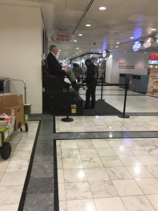
This image is of a man shining an elderly man’s shoes. I think it shows southern culture and provides a sense of traditionalism to which ever customers are still interested in shoe shining. This seems more at an aim to target the older generation. This shoe shining kiosk is most likely in place to make the person feel more personally welcomed. I noticed the man getting his shoes shined was talking a lot to the gentleman who was providing the service. This can also be a means to socialize and become friendly with workers and locals.

