Author: aboll1@gsu.edu

I hope you had the time of your life….a reflection on SIF

As finals week quickly approaches, we are working at full capacity to bring projects to a space of completion.  And while the thought of the end of the semester brings along with the quintessential dialogue of, “…gosh…where did the time go?”

Indeed, where did it go? It went into projects, big and small, that have brought new resources and information to the Georgia State community. Each click of the mouse bringing us closer and closer to the creation of a tool or resource which did not previously exist.  Through this post, I’d like to take a moment to look back and summarize the SIF experience.

What you all have hopefully learned from me: 

1) Maps have power 

Maps, even within the current communication age which we are living in, still remain undervalued and misunderstood.  Maps gain our trust just by the mere act of being maps. They have the power to explain the world in ways that words do not. As I was told during a recent interview for my own thesis project, ” If a picture is worth a thousand words, a map is worth a million.” The ways we are making maps in changingWe should be critical of maps and understand the different viewpoints from which they are created

2) How to make your own maps 

Throughout the blog post I have been able to offer a number of step by step guides to supply readers with some starting points to Google Earth  work and tools like Batch Geo. Additionally, over the year I met with over a dozen individuals to speak with them about their own mapping project ideas.

3) Additional information about Atlanta’s history

 I have contributed to two main projects: The Atlanta Mass Transit project and the 1934 Tax Map project. Both projects aim to consolidate a collection of historic maps representing Atlanta to tell a larger story about the city’s past.

What I have learned from the program:

1) How to navigate interdisciplinary collaboration

Working with students who don’t think in the same framework as you offers one a unique, challenging, and eye-opening perspective through which to organize projects. Since I was declared a geography major my freshman year of undergraduate, I have become increasingly emerged in the depth of the jargon which geographers use. In the projects where I’ve had the opportunity to work with students from a different discipline, I have had to re-position my language so it can be understood by a broader audience.

Additionally, through this experience I have gained the skill set of understanding how to bring together people from different disciplines and move through a space of project visioning and planning. What I’ve experienced to be the most challenging in these conversations is expectation management. While I am completely aware of what the realistic possibilities of mapping are, it is difficult for me to know the boundaries of a computer science student, an artist, or an anthropologist. We all have some informed idea about what the others do…but we remain unaware of the details. Because of this, there is a need for a lot of discussion and planning to place during the project planning phase.

—This is my idea—is this possible for your skill set—-is it possible within this time frame?—–

2)How to start something, even though you don’t know what the “end” looks like 

While there is a need for a lot of project planning, it sometimes comes from a place of conceptual idea formulation. Especially within the conversations including technology, there is a wide array of possibilties for what a final product will actually look and function like. So sometimes I felt like the John Burroughs quote, “Leap, and the net will appear.” But that is the name of the game.

Speaking of the end, it’s good for us to take into account concepts of project longevity and adequately documenting the steps and processes of the project as to allow for simplified upkeep and troubleshooting once you’re no longer a part of the program. How have you ensured the longevity of your projects? My teams tended to use  Google docs to record the process as it was taking place.

3) That innovation is not about re-inventing the wheel

A majority of my role as a SIF was one of two things: 1) making individuals aware of the resources they have available to them so they can apply these resources to their own unique, awesome, and important research or 2) taking the resources that are currently available and rearranging them in a different format to make something new. Is this innovation? I would say so (but, of course, I am biased since the concept is directly related to the deliverables that I produced for the past year…).

And with that, I sign off. I hope it’s been the time of your life…
#TheDress

A quick update on the SIF projects I am working on currently:

  • Atlanta Mass Transit: The team has presented a draft story map and is working to address the suggested edits. We are presenting our final draft March 24th, and expect to make the story map public by April 1st.
  • 1934 Tax Maps: All of the team members have been trained on how to use ArcGIS to digitize and clip their assigned collection of tax maps. The project will be completed, meaning that all team members will have their assigned maps digitized and clipped, by the end of the semester. What is especially neat about this workflow is that seven of the ten team members had never used ArcGIS before working in CURVE/SIF. Three of the students who I worked with last semester on the AMT project learned a bit about Arc last semester, so they have been providing support to the five novices.
  • ArcGIS online: Through this project, I provide consultation services for GSU students, faculty, and staff at CURVE. So far this semester I’ve assisted 2 Masters students from Geoscience, 1 PhD student from History, and 1 professor from Education.
  • SIF showcase: I am now part of a team that is organizing an hour long event consisting of a series of short presentations highlighting a few of the SIF program projects. I’ll be meeting with each of the groups to complete a practice run through of each group’s presentation.

Now that I’ve got you all up to speed on what my SIF work has consisted of, I’d like to follow up my last post about the #MakeItHappy and discuss…bam bam baaaaa——#TheDress! 

“Amber! What about #TheDress makes it worth discussing in your blog post?! Everything about the freaking thing has been talked to death!”

Well let me take a moment to relate this to my past conversations, specifically around mapping.

In recent weeks, as I’ve been working on a number of different maps, I have been presenting map drafts to people: colleagues, friends, strangers, and even my mom. One of the questions I ask people when they’re viewing a map is, “are you colorblind?” because color perception is a big factor in map design. Because of the recent phenomenon with #TheDress-this question now, almost exclusively, sparks a conversation about the infamous photo of #TheDress.

“I’m not colorblind, but I’m not so sure I see all my colors right after seeing that picture!”

“No-but did you see that dress thing!? It messed with my brain! What did you see?”

“Well not usually, but when it comes to blue and black, I’m not so sure.”

If you’ve done your reading, you know that the discrepancies in the color perceptions of this picture have to do with white balance and overexposure of the image. But this post is not to dive into the details of why the image was perceived differently, I want to talk about why people talked about the dress.

Why?

Because conversations around #TheDress share many parallels to the challenges of mapping and the internet that I have addressed in past posts.  More specifically, the issues of visual interpretation, authorship/citing sources, and comments that take place discussing the post.

As I’ve gone into detail about interpretation and sources in past posts, I’d like to piggyback off of my #MakeItHappy post and discuss the ways in which dialogue is tending to take place through social media. In this post, I shared an experience where a comment I posted which critiqued (what I deemed) a poorly constructed map was responded to from another commenter as being harsh and I was told to #MakeItHappy. In the discussions, I saw taking place around this dress-there was plenty of opportunities for people to attempt make the dialogue take a more positive tone: yet I did not see this happen. Not even once.

What I did see was strongly worded insults on people’s vision and intelligence in heated debates about the colour. Why is it that the #MakeItHappy campaign did not make its way into the #TheDress comment stream? Better yet, why are people discussing this topic that makes them feel so angry in the first place?

This video by CGP Grey discusses this exact topic: how content that sparks angry emotions tend to be discussed in internet comments more often than topics that make one happy. I encourage you to take the 7 minutes to watch it. The basic concept of the video is that anger is one of the most powerful emotions and, because of this power, becomes one of the most significant drivers of online discussion.

So how is it that we can encourage positive, yet critical, conversations on the internet? I don’t have an answer. The #MakeItHappy doesn’t seem to be doing the trick. But the main question I have to ask is why are people allowed to attack others on their level of intelligence based on how their brain perceives a poorly exposed picture without being shut down, but I am unable to offer a critical reflection of a tool which is being used to produce knowledge about the world?  How is it that I can convince people that they can be angry, but maybe they should adjust the concepts or people that they are angry toward?

As the Atlanta Mass Transit story map is slated to be made available to the public in less than a month, I have become curious about how it will be received. Will it make people angry? It’s possible. It’s possible that people will see the potential that Atlanta’s rail system once had, and be upset that those plans from 1960 where not what became reality. This anger may result in a local viral circulation and the project will be celebrated. But what if it doesn’t make people mad? What if it is an interesting source of information, but nothing that elicits an elevated emotional response from users? Will it then simply live on the internet with the rest of the billions of resources that are underused? And if so, is it fair that information goes unnoticed simply because it doesn’t make one overly upset or overjoyed?

These are just some ideas that I’ve been mulling over as mapping continues to transition to web-based platforms. Feel free to let me know your thoughts on the topics I’ve discussed here. While the water I’m wading in seems pretty murky to me at the moment, with more thought and examination I am sure that, in time, the sediment will settle and the answer to these questions will become clear.

*Ignite, Inspire, Involve*-Amber


Its the Most Wonderful Time of the Year

The semester is winding down-which means the whirl of finals and holiday plans is upon us.

As my first semester as  SIF comes to a close, I would like to use this last blog post of the semester to as a space to reflect on the experience and make some “resolutions” for the upcoming year .

Reflection: The bulk of my time as a SIF has been spent teaching faculty and students how to create maps for a broad range of topics:

  • location of long stay motels in Atlanta
  • race and mobility in Atlanta’s past transportation planning
  • shoreline accretion and erosion of St. Catherine’s Island
  • relationship between college enrollment and twitter presence
  • relationship between elevation and issues of mold in English Avenue/Vine City
  • examining Atlanta mass transit planning historical planning documents

When looking back at this list, I appreciate the diversity between all the projects. Isn’t diversity, after all, the reason many of us have chosen to study geography/cartography? That was my justification anyways 🙂 As my experience suggests, geography can be explored through an almost endless amount of perspectives and maps are infiltrating other arenas of thought.

Beyond the diversity, I’d also like to point out that I’ve worked with five people this semester that have never once before in their lives used ArcGIS, which is the primary mapping program I tend to use. ArcGIS is an extremely dense program that has a  pretty significant learning curve. And, as Einstein has been quoted as saying, “If you can’t explain it simply, you don’t understand it well enough.” So, through the process of teaching these Arc newbies-I have sharpened my own Arc skills. How awesome is that!?!

Resolutions: As noted-a majority of the guidance I offered was within ArcGIS platform. Because ArcGIS is the primary tool taught within the GIS courses in the Department of Geosciences here at GSU, it is the one I am most familiar with.  In the upcoming year, however, I would like to push myself to become more familiar with additional mapping/designing tools. Which tools exactly?

  • Mapbox
  • QGIS
  • InstantAtlas
  • Adobe Illustrator

So thanks for an awesome semester, Student Innovation Fellowship! So far, my role in the program has allowed researchers from all over campus to incorporate maps and spatial thinking into their work, while simultaneously challenging me to be a better cartographer.

Last map of the year: Christmas Lights & Holiday Light Displays in Atlanta

Cheers to the upcoming 2015 Spring Semester!

*Ignite, Inspire, Involve*-Amber

Servers and SIF Longevity

This post will be a short update of some of the challenges I have run into with services available to students on campus in relation to servers and Esri’s ArcGIS.

I’ve been working on two projects this semester which pair historical maps and planning documents for the city of Atlanta with present day data using Esri’s ArcGIS Online. One of the limitations of ArcGIS Online is that you are not able to host raster images on the Esri servers-you need to host them on your own servers. Server upkeep and support for ArcGIS was previously provided by a the technical advisor/GIS coordinator in the Department of Geosciences. For a number of reasons, this position is currently empty within department and, to my knowledge, there is no one at any level of campus providing the necessary support to GSU’s established GIS. Since the completion of these projects hinges on the ability to host this data and given the mission of CURVE for supporting the research and digital digital scholarship of students, I think it would be appropriate to explore possibilities of a server being available to students as a service of CURVE.

This topic brings to light an interesting aspect of SIF that I had not previously considered–longevity:longevity in the sense that a project can continue once the current SIFs have graduated and moved on. To “continue” just doesn’t apply to a scenario where it has not yet been completed and the torch needs to be passed for the completion to be achieved-continue also means understanding how to update, migrate, or expand the project. Maybe the blogs can server as a point of reference for offering this type of longevity-but I am not so confident. I think it may be useful for each project to come with a “Final Report” at the time of its completion outlining the project in detail. This type of report would provide a safety net for avoiding any gaps in knowledge caused by a person leaving.

Thinking in terms of longevity, the SIF program will be able to provide services to the students, faculty, and staff at GSU without getting its foot stuck in any unintended creations of knowledge gaps along the way. Because, as has been demonstrated through my experience with the servers, these types of gaps that can cause real hindrances to our desire to be innovative on campus.

*Ignite, Inspire, Involve*-Amber


Why I’m Obsessed with Google Earth

I have a confession to make.

I am addicted to Google Earth.

earth

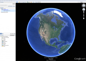
Google Earth is a virtual globe, that also serves as a map and geographical information program, which has been around since 2004. By mapping the Earth through collections of satellite imagery, aerial photography, and a 3D Globe and by offering additional capabilities such as viewing 3D buildings and landscapes, it makes for a fun and engaging user experience. Pin points can be added, symbology can be changed, information pop-ups can hold explanatory text or be embedded with videos. And the program is free and just requires a quick download to your desktop.

GE can create a special visualization experience in the classroom-especial through the creation of personalized tours. GE allows you to record tours as you zoom in and out between points, change perspectives, or even enter into street view (how-to video here). These tours could easily be incorporated into a lecture or group project.  You also have the ability to see historical imagery in some areas.

There are additional fun tools such as flight simulator and Ocean View. Did you know that you can see a 3D rendering of the Titanic using GE?

But that’s not all!

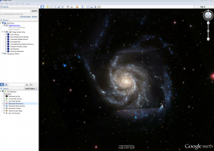
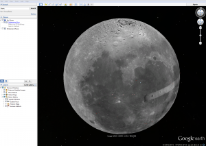
GE now lets you adventure to places you aspired to visit when you were a child with aspirations to be an astronaut: through the GE sky feature you can tour the galaxy. Visit the constellation of Orion, the  Moon and Mars.

skymoon

There are a lot of possibilities when it comes to using this tool for visualization in your classroom. One additional note is that Google Earth looks amazing on the interactWall in CURVE. The touch capabilities are fantastic (try pulling up Paris or Las Vegas next time your work bring you there) and it really immerses you in the experience.

If you’d like some assistance in learning how to incorporate Google Earth into your classroom, feel free to send me an email (aboll1@gsu.edu) and set up an appoint to work with me at one of CURVE’s collaboration workstations. I can provide training, both one-on-one or for a group, to get you and your classroom on its way to engaging with space in an interactive, engaging way.


Show Me Don’t Tell Me: Geotagging Images

To continue on in my series of mapping tutorials for GSU students and faculty-I’d like to talk about geotagging photos. Knowing spatial location and relation of thing is becoming, for many fields, an important way to enhance understanding, goals, and outcomes.  This post will outline two software packages available to many in academic fields that can help visualize the spatial locations and relationships of our photos, ArcGIS and Adobe Lightroom.  Many of us take photos with our phones as the technology is ever increasing the number of megapixels and other key features.  Most smart phones have GPS as well which can be used to assign specific coordinates to each photo..  My fiancé has a DSLR camera that doesn’t have GPS, however for cameras without you can buy modules that have GPS receivers to do the same as smart phones.  For those with phones or cameras that cannot capture GPS coordinates, a simple hiking GPS will work because there is free software available (my fiancé recommends GPicSync) that will match image capture times with GPS ping times to get a relatively close coordinate match for your photos.  So no matter what type of phone, camera, or GPS device you have there are quick and simple ways to get coordinates assigned to your images.

Photos and GPS Coordinates

The first step is to capture the images and GPS coordinates, either in the same device, like smartphones or GPS capable cameras, or use a separate GPS device, such as those for hiking, to log coordinates in time along your journey.  For those using smart phones to capture images and coordinates at the same time the following links may help to locate the GPS features in your phones to make sure it’s activated.  Your individual phone brand and model likely have similar instructions and a quick google search would likely get you to the right settings.

http://support.sprint.com/support/tutorial/Turn_GPS_on_or_off_Apple_iPhone_5_64GB/440

49-158-3

http://support.sprint.com/support/tutorial/Turn_GPS_on_or_off_Samsung_Galaxy_Sreg_4_n

onSprint_Sparktrade/48285-158

For those needing to match GPS coordinate logs with photo captures here is the link to GPicSync (https://code.google.com/p/gpicsync/) where you can download the software and find how-to instructions for getting GPS coordinates embedded in your image data.

Once the photos have GPS coordinates embedded to each file we can begin to look at the two software packages for viewing and making maps of your photos.  First we will look at ArcGIS.

ArcGIS

ArcGIS is a very powerful software package not only for viewing but also editing other geographic data, whether that is points, like our photos, lines such as roads, or shapes such as buildings.  All of these types of spatial data can be imported into or created and edited within ArcGIS to produce maps.  Other tools within ArcGIS can also be utilized to measure important information related to your project (distances, populations, etc.).  To import photos into ArcGIS follow these steps:

  1. Place the photos you have taken (with GPS coordinates embedded by the methods mentioned above) in a folder on your computer.
  2. Open ArcGIS and go to the ArcToolbox under the geoprocessing drop down menu and navigate to ArcToolbox\Data Management Tools\Photos\Geotagged Photos to Points.
  3. Once the Geotagged Photos to Points dialog box has opened click the “open folder icon” (folder with a little blue arrow above).  In the Input Folder window click the “connect to folder icon” (folder with black plus sign above).  Navigate to the folder where you stored the photos, single click on the folder and click Add.
  4. Now back in the Geotagged Photo to Points dialog window select the folder where you want the output feature or layer file to be saved.
  5. Uncheck the include Non-Geotagged Photos and Add Photos As Attachments selections.  Click Ok on the main dialog window and ArcGIS will add your photos to the Table of Contents as a new layer.  Now you should see a number of points on your map where each point represents a photo you took.  You can click the HTML popup icon and then click each of the points to display each photo at the associated point.
  6. At this point you can add other data in the form of shapefiles, base maps, or other methods you know to enhance your map or provide geographic reference features for your photos.  The final step once you have your map created would be to export it to a file (pdf, jpg, etc.) or print it.

Adobe Lightroom

Lightroom is an Adobe product that is mostly devoted to photo viewing, organizing, and editing.  However a nice feature that was added in version 4 of the software (current version 5) is the map module.  This module allows photos to be viewed on a map simply by zooming and clicking on photo location pins.  To get to that point there are a few steps to go over first.  As before we want to be sure that our photos have GPS coordinates embedded, either at the time of capture with smartphones and certain cameras, or later with the GPicSync software.  Once we have the photos in one folder we can open up Lightroom and get started on importing and mapping our photos.

  1. Open Lightroom and be sure you are in the library module (top right area of the program contains the modules).  From this screen click the import button in the lower left corner to bring up the import dialog.
  2. The left column is for selecting your source folder so from here you will will navigate to the folder where you have our images stored.
  3. Once the folder is selected you will see the photos added in the middle of the screen with a few options up at the top of this middle section. For the purposes of this exercise we want to make sure add is selected because this will add the photos to the Lightroom catalog.  The photos will be in the same location on the computer, Lightroom will just know where they are and have them loaded every time you open Lightroom.  Be sure to scroll through the photos and make sure they are all showing up and checked with the check mark in the upper left corner.
  4. The right side is where the photos will be added to (catalog, another hard drive, flash drive, etc.).  For this excersie since we have the photos on our hard drive already and just want to add them to the Lightroom catalog (i.e. get Lightroom to recognize and know the photos location and data every time we open the program) we will want to be sure that the icon to the right of the arrow says My Catalog.

*For those who want to use Lightroom to manage all their photos, beyond this one project, the other features and options not discussed here can be learned by doing a quick Google or YouTube search for those specific features.

  1. Under the My Catalog on the right hand side there are a few more options.  The File Handling and Apply During Import options are primarily for those using Lightroom to manage and edit their photos (change color, change contrast, add keywords, building previews, etc.).  For this exercise we will not change any of the default options.  If you would like to learn more a quick Google search should turn up a lot of great resources.
  2. Finally click import at the lower right and Lightroom will begin adding your photos to the Lightroom Library.
  3. Now that your photos have been added you can switch to the Map module by clicking on Map in the top right area of the program.  This will bring up a google map and your photos should show up where you took them with small yellow or orange pins.  By zooming in and out of this map using the scroll wheel on your mouse or the plus and minus signs at the bottom left of the map, Lightroom will begin to group or ungroup photos together as the spatial distance between them increases or decreases, respectively.  Hovering over the pins brings up a small thumbnail of the photo(s) that location.  Tools for changing the background map and other mapping features can be found under the View drop down menu.
  4. From here the final step would be to display or print the map using Lightroom itself or by using the print screen feature (ctrl + print screen).

In conclusion, ArcGIS and Lightroom both offer ways of importing and viewing photos on a map.  ArcGIS has more editing options for adding other geographic data before exporting to a final map or other software.  Alternatively, Lightroom has less capability for editing and adding other geographic data but it can be helpful for organizing and editing large numbers of photos and keeping track of that information every time the program launches.  Depending on your projects, desired aesthetic, and preferred workflow either program can help to visualize photos and tell your story in a new way, with maps.

Inspiration from TEDxPeachtree: SIF Symposium

Its here.

Midterms.

As the academic calendar continues to progress, midterms allow you the awareness of “further than we were, but not yet where we need to be” in classes and projects. The same mindset has been being applied to SIF as I had my first small group checkin yesterday. Myself, Ryan, Sruthi, Roxanne, and Valerie all met with Brennan to check in on project progress and the overall SIF experience so far. Because I had not not even met some of these SIFs before, (I’ll remind you that I was not at the SIF kick off meeting in August since I was still living in DC at the time) I really enjoyed that we got to spend a large portion of our time together simply sharing in detail who we are, what projects were were assigned to, and providing an overview of the details of each project and its current status. What was most enjoyable about this was, when these SIFs spoke about their roles and objectives, you could see their faces light up with excitement. And when you hear about their projects, it is easy to see why. My SIF colleagues are working on really meaningful projects that utilize technology in innovative ways. Ah ha. Just what we’ve been striving for all along. But that is my honest reflection towards these projects. People are excited about the work they are doing because it simultaneously interesting, challenging, and best of all-creating a useful end product.

This same theme was present in during the TEDxPeachtree event that I attended last Friday. There were four speaker sessions, each which had a different theme: Frontiers, The Lab, Sensory Percussion, and Play. My colleague, Thomas, also did a recent post about TED that you can refer to if you’re not familiar it. Innovators gathered at The Buckhead Theatre to share their tales about challenges and successes in projects ranging from fractal thinking and virtual reality to beatboxing and using scientific data about the sun for a public art installations.  As a person who’s spent more than their fare share of time on the web watching TEDx videos- I kind of knew what to expect from the presentations ; what I did not expect however, was that the 30 minute breaks in between each session would prove to be just as thought provoking as the presentations themselves.

During the breaks, people would flood into the lobby of the theatre and engage in rigorous dialogue inspired by the just ended session. Reflections and reactions were shared between people who (most of the time) had just met. Perspectives would collide and coalesce, ideas would proliferate, business cards were exchanged. The excitement and potential contained within the room was almost intoxicating. This visceral experience is the thing you miss when you interact with these ideas virtually-through videos and the comments section.

So with this in mind, I propose we explore the possibilities of organizing a type of SIF Symposium that would allow the Georgia State community to come and experience our excitement with us. I imagine SIFs doing pretensions in the CURVE space, specifically on the interactWall, and then during break times the SIFs of that session could possibly take a post at one of the collaboration stations where they can interact with interested members of the audience. These types of symposiums could increase innovative dialogue across campus and potentially spark collaborations where it may not have occurred before. This is crucial as it is only through creative and collaborative projects that we will begin to address the problems of the 21st century classroom.


BatchGeo: a simple tool for visualizing point data

I would like to begin a series of “Maps for the Classroom: How To” blog posts that will share with readers different tips, trips, and tools that educators can use with little to no training to visualize spatial data.

The first tool I would like to highlight is called BatchGeo. In CURVE this week, we had a student who came in and wanted to learn more about how to bring a spreadsheet of addresses into the ArcGIS environment. Well, as is not unusual for ArcMap, we ran into challenges when the geocode address tool kept giving us an error message. But never fear! BatchGeo is here!

BatchGeo is a website that generates point based maps from Excel spreadsheets.  Let me provide a little overview of the workflow this site:

First thing to do is organize your spreadsheet in a way that allows BatchGeo to “talk” to the information.  I suggest making column headers such as “Address” ,”City” ,”State” and “Zip Code”. You can also add additional information (some examples may be the name of the location or contact information for a business you’re representing)-this information will be displayed whenever you click on that location on your soon to be created map. When you’ve finished organizing all your information-all you have to do is copy and paste your spreadsheet into the box at the top of BatchGeo’s webpage.  Then hit the “Validate & Set Options” button.    BatchGeo typically is able to automatically detect which column is which, but to make sure it didn’t make any mistakes go through and see that, for example, the header you put on your address column shows next to “Location/Address”

Once everything is set-hit the “Make Map” button and a typical Google map will be populated with markers that represent the addresses from your spreadsheet. From there you can “save and continue”-then enter an email address to which you will be sent a link that allows you to return to this map.

The reason that I am partial to this tool is that, if you scroll to the bottom of page your map is on, you have the option of exporting the map as a KML file-which is the file type used in Google Earth. Within Google Earth you have the ability to create tours that fly from location to location for an engaging viewing experience. This could provide a unique addition to a lecture.

Even more than that-there is a tool in Esri’s ArcMap that allows you to convert KML to a layer. These layers can then be use for more advanced analysis.

BatchGeo offers a simple way, not only to visualize points, but to use these points in additional platforms. This flexibility, as it proved for one visitor to CURVE this week, provides the GSU community a gateway to interdisciplinary spatial research.


40 Maps That Explain the World

This week I wanted to discuss maps and the internet; a very broad topic, but I wanted to see what would grab my attention with this general topic after a quick internet search.  The very first search, “maps” in google, brought an article from the Washington Post with 40 maps that explain the world from a range of time periods across the last millennia.  This struck me as the epitome of what it means to have maps on the internet.  One link got me to 40 maps about the world, many of which I had not seen before.  Each map a high density information delivery system on its own, but with 40 of them I can learn an immense amount of information about the global economy, cultures, social issues, and history.  I imagine it would take me most of my day to learn the same amount of information if I were to read articles describing these maps in detail. However, maps offer visual and spatial relationships that allow absorbing new information to be efficient and timely.


A few examples of the maps within this article include: how humans spread across the world, major shipping routes in the colonial era, north american languages before colonialism, and Europe as mapped by tweets.  One that stood out to me was a map of the Happiest and Least Happy Countries.  The link to the original article was provided and I was able to quickly get into the details of how happiness was assess including the individual parameters that make up happiness, according to this study, and the data collection methods.  The original article even showed a table of happiness per country comparing surveys conducted in  2005-2007 vs. 2010-2012.  This on top of the original map provides the extra dimension of time to an already impressive data set.  Adding the extra data dimension of time is when maps and data sets can become truly powerful, hopefully fostering learning and inspiring change.


This spoke to me of why I love mapping and, even more  specifically, the power of maps.  In today’s internet, social media connected age, quality is becoming ever more important than quantity.  The maps presented in this article had links leading to other articles and videos, providing more information, links, and hopefully source information.  For me quality, source information, and details about data collection are just as important as the final map.  Attention to detail and quality data collection can make or break a map.  Presumably the maps of today will live on indefinitely. Therefore, the difference between a good map and a great map could make all the difference for communicating information and influence change.