VisMe Experiment

Over the last two weeks, I have been on campus visits. The campus visit is the last stage of the interview process for those of us staying in academia once we get our terminal degree. One of the steps in the campus visit interview (one of my interviews lasted for 21 hours over 2 days to give you a sense of scope), was to give a scholarly presentation on my own work.

One of my main aims was to use a presentation software that would look clean, and be something that most of the faculty I knew would be present for my presentation had not yet seen a lot. After some research and one trial with a timeline software, I chose VisMe.

Below is a mostly final draft of my presentation. If it works properly, you can push play, or click through it to view it.

The process of using VisMe was interesting, particularly since I didn’t *notice* that it is still in beta when I began. In fact, despite the very clearly noted ‘beta’ attached to the logo, I still missed it, all the way until I was frustrated with the build process.

VisMe-beta-marked

What I DO like about VisMe is the clean minimalist design that is really in at the moment. Each template has a library of pages the user can choose from in order to built a well rounded presentation. The designs are built already to give the user a sense of how a presentation could look, depending on what the presentation material is covering.

And even though the pages are built for you – here is an example:

VisMe-sample-page

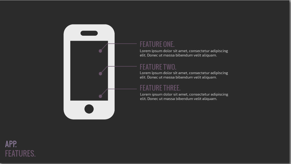
You are not required to keep the page this way. As you can see, I altered the template page a lot to fit my needs.

Visme-sample-page-2

As a user, I am able to completely revamp any aspect of any slide that I choose. But I found the template to be a really great guide as a first time user. The end product turned out beautiful, and I was complimented on how clean it looked.

Because VisMe is in beta, it still has a lot of bugs. Among these bugs are the incredible difficulty involved in clicking on text I have created in a text box. Once I created text, and aligned it with other objects, if I found a typo, or wanted to edit, I had to drag the text box away, and then click vigorously and hope that I might somehow land my cursor in the magical spot that would then select the text I wanted to edit. If my apartment neighbors didn’t think I was crazy already, they surely do now. Frustration.

And then of course there are the mystery issues that come with all software. For example, I published my test presentation to see what options would appear once I published. The library of slides disappeared. I had to completely start my presentation over. Of course it turned out better, as many of you have probably experienced for yourselves. But… this problem has only happened one time. I published the above presentation, and none of the same problems persist. Face to palm – I’m feeling a little gaslighted.

The last problem I want to address is that once an animation is applied to text, it cannot be fully deleted. It CAN be altered, but not completely deleted and this led to more frustration and yelling on my part. Because of this issue, I ended up downloading each slide (a publishing feature) and putting the whole thing inside a power point presentation – animation problem solved.

Probably the most interesting part of VisMe is that it exists in the cloud. Since I only played with the free version, I had no access to the cloud editing and sharing capability, but it exists. Of course, my presentation exists in the cloud, and is clearly hosted above that way, which is a viable and relevant part of cloud computing. But in order to access sharing features, I need to pay the monthly business fee, which is not feasible for a scholar who might use this once or twice a year. But knowing it exists is relevant to many of the arguments I am currently making about the work of composing in the cloud – so I may dip back in here for further exploration.

Until then – give it a try if you are in the mood to learn something new that is improving as the company grows.


Edge Website Prototype

In moving ahead in the process of getting Edge magazine off the ground, Nathan Sharratt and I took some time to develop a prototype using sites.gsu.

After much consideration, and thanks to Nathan’s artist’s eye, we decided to try out the theme called Hueman – a cute portmanteau smashing together color and people. The theme has a lot of affordances with menu bars, sidebars can be moved (for example), and with scrolling posts. It favors media and can be formatted in several ways that may end up working out really well for what Edge becomes.

One of our hopes is to feature student designed banner images containing their interpretations of our project name, ‘Edge.’ Below, you can see a banner that Nathan created in just a few moments. The name of the magazine is prominent, with a cute tagline I invented on the fly. The prominent design can be replaced easily with a student designed banner.

Edge-Banner-prototype

What’s more, we plan to archive all featured student images in an archive so they are searchable by students and future employers that may wish to see what students have produced. Further, we can replace and move around any of the menus you see in the image above. We can alter the colors, and re-arrange the sidebars.

There is only a small portion of the sidebars visible in the image above, but if you look below, you will see lower down on the same page, which features both left and right sidebars (one with a blue header, and one with a green header), and the post scroller.

front-page-scroll-tester

Nearly every aspect of these sidebars can be altered, including content, color, and position. But what is exciting to me, is the scroller in the middle, which is currently featuring a video. Nathan pulled a video from an art installation he did and put it up on the Edge site, just to see how it would look. The scroller displays a thumbnail, and can be played right in-site. It also features text area below, and can be made to pop-out. We can insert still images, audio, video, and so on. But we did find that if there is no featured image, this area remains ‘blank,’ which you will see if you go to the website in the next week or so: sites.gsu.edu/edge.

One of the pages I have worked on from the beginning is the missions statement page. It turns out that writing a missions statement is very tricky. Word choice matters VERY much because our audience will be quite diverse, and I need to make sure  our mission statement points only to potentially positive missions. Below is the top part of the missions statement.

Mission-statement-page

You can see the image that I have chosen as a placement image. Ideally, I will feature something that takes place on GSU campus, but I haven’t yet come up with the right idea that will portray ‘mission statement for our magazine.’ Below the image, you can see the beginning of the mission statement. And to the left, you can see that on this page, we experimented with a single sidebar, and chose what goes on it. For now, we are using the term ‘baskets’ instead of categories, because we use that word a lot in meetings, and I thought it would make some of us giggle.

Featuring particular posts profiles on Edge has also been a popular topic in meetings, so Nathan and I decided to create a test profile, which can be navigated to from the front page (if you look above to the second image). Below, you can see that Nathan created his own profile as a test piece.

Profile Test

The page is a static page and can be archived, categorized, and featured on the front page, as needed. As you can see, we have moved the menu options around in the sidebar, which demonstrates all the menu options available in the theme without having to hack it.

Overall, we’re pretty excited to see our first project prototypes go up on the site. We plan to build one of each medium that the theme allows, and try to do a few cross-media pieces to, to show what the website might be like when it officially launches next Fall.

In the meantime, stay tuned for more developments on Edge and feel free to leave comments below with suggestions, problems, or thoughts.


The Tableau Experience

Today I attended “The Tableau Experience.” I’ve been struggling with what to call it: a conference, a convention… It had only one speaker, and a Q&A – and a wet-bar.  So… I’m settling with ‘experience’ as they do. What it really was though, was an advertisement.

Don’t get me wrong – I like using Tableau to recreate charts for the Tobacco Ebook I’m working on, and this ‘experience’ was worth it for several reasons:

1. The speaker demoed several ways to share data that I haven’t seen in action since I’ve only been using it to create charts for data sets that are already created for me.

Tableau_Experience


2. There were a lot of people there from many different kinds of institutions.  I met others from universities like me – Georgia Tech, Gwinnett College, and so on. But I spent most of the time schmoozing with a lady from Home Depot, and then talked briefly to a man from a company called Norfolk. Everyone was using Tableau for something different – I’m pretty sure I was the only one making an Ebook.

3. I was able to ask about that pesky issue Ryan Cagle and I have been having in trying to get the distance between pane tick marks and labels to be exactly the same in all our charts so they’re uniform within the Ebook. Sorry, Ryan – there is no way to do this. The guy I asked said your idea was the smartest.

Overall, I’m glad I went to the Tableau Experience. And so I leave you with a picture of my spoils, the swanky bathroom in the wetbar, and the view from the 16th floor. Enjoy:

Tableau_Experience-2

Art Vandenberg and the World Community Grid

Today I went to the talk given in CURVE by Art Vandenberg. When I decided to attend, I didn’t know what the World Community Grid was, and now I know – and I think you should know too.

First, Art started off telling us a bit about himself. Here he is on the right:

I hope you all recognize that guy on the left by now :)

I hope you all recognize that guy on the left by now 🙂

Art was funny, and personable, and the perfect person to be telling us about World Community Grid.

What IS the World Community Grid, you ask?

ArtV_1

It’s pretty much the most complex, yet most simple thing you can do to help save the world. Essentially, if you join the world community grid (make sure you join the GSU team!), whenever you’re not using your computer, and it’s on (this also works on android phones, but they have to be plugged in), the world community grid can use your computing power to increase their ability to solve data problems like producing clean water, or mapping cancer markers. It’s really that simple.

And what’s cooler, is that all of our library computers (CURVE too) are already running world community. When the library is closed, there is a lot of world saving going on in there.

I left the link up there at the top of this entry – check it out. And if you have additional questions, go ahead an leave them below in the comments and I’ll see what I can do to find you an answer.

Tableau Training

Since the beginning of SIF, I’ve been on the Tobacco Ebook project. I have learned iBooks Author layout and design techniques, which has completely reoriented my thinking about how design works, and increased my attention to detail by… a lot.

This week, I got moved from layout and table building within iBooks Author to recreating charts in a program called Tableau. Tableau can create really clean-looking, beautiful line graphs, bar graphs, and many other types of graphs and charts, like pie charts :). But it’s not easy. First, the data in the spreadsheets the book writers provided us with must be formatted in a way that Tableau ‘likes,’ which is a feat all on its own. If the data isn’t formatted properly, nothing works. Then, the chart has so many formatting options, its enough to make any beginner’s head spin.

Here are two screen shots of graphs I’ve been working with that I can’t seem to get to combine – one line graph and one bar graph:

Tableau line graph

Tableau Bar Graph

The good news is that once I figure out how to make the graphs function the way I like, they are actually pretty easy to make and turn out well. Thankfully, Will knows how to do most of it and is helping me figure out the trickier aspects. Phew!

National Day on Writing Success!

In case you didn’t hear, this past Tuesday was the National Day on Writing. And thanks to a bunch of people in the English Department, the Linguistics department, and some other organizations (I think there was a sorority involved somewhere), it went off really well.

I’ve talked before about the Digital Archive of Literacy Narratives, and the project I’ve been working on to find an easy, low amount of hardware way to record using iPad. I blogged a little about it a few weeks ago, and it turns out that the simplest result was the best result.

Here is a picture of the ultimate set up we decided to go with:

DALN_2

As you can see, it is very minimal in its hardware involvement.

We ended up investing in the adapter I mentioned in an earlier entry, which I linked above. The adapter is called the iPad Camera Connector and runs about $30. The snowball you can see in the picture plugs right into the adapter and then it just works. It took me a while to figure out that it needs no other software or authorization on the part of the iPad user – it simply plugs in and works with all the already installed iPad software.

We were at our National Day on Writing table from 10AM until just before 2PM and managed to collect 20 narratives ranging from ‘the first books I read’ to ‘When I learned to read music’ – each one was interesting and wonderful.

Here is a picture of Michael Harker explaining the paperwork to a student who gave a narrative:

DALN_1In all, the day was a big success – we even found we could upload the videos into the DALN system right from the iPad.

I’m pretty happy with how this project is turning out. I learned a lot about iPad interface and hardware (adapters) and a lot about the first things to try. Ooh – and that simplicity is pretty much the best thing ever.

So – in the interest of being as hip as my fellow SIF bloggers, I leave you with a bit of inspiration – not a music video – but  drawing I did on a tablecloth and a restaurant. Enjoy:

Robot-VR


iPad Research = iPad Play

Over the last few weeks, I have been playing with the iPad 2 for my Digital Archive of Literacy Narratives project I’m involved with through the English department. The goal is to find an innovative way to record video using the iPad. My focus has mostly been on sound, as I attempt to get to know the iPad and its foreign (to me) software.

Last week, I played with a microphone called a snowball, which looks like this:

snowball

taken from amazon.com

The snowball is a pretty high quality microphone, which I have used to record videos in a booth for the American Literature Videos Project. The Snowball plugs right into a computer through a USB port, which is super cool because it doesn’t even need a separate power source. The unfortunate part is that the iPad does not have a USB port. So I need this adapter:

I want this adapter so bad.

taken from http://bluemic.com/blog/2011/03/snowballonipad/

And we don’t have any at the Exchange. And the Digital Aquarium doesn’t have any either. And no one I know with an iPad has one, with the exception of a friend I have who works a LOT with macs – in Flagstaff, Arizona.

And so I went back to the drawing board and decided to start from the beginning. I realized I really don’t know what a direct video using only the iPad sounds/looks like. I also discovered, during this journey, that the iPad has an app that allows the user to upload right to youtube, and even to edit right in the application.

Tuesday, I went to the Atlanta Collaborative Learning community Digital Pedagogy meetup, and I recorded some interviews with the presenters: one of those is Brennan Collins – so for your viewing pleasure, I give you the video I recorded with what I am referring to as “the naked iPad” (no external hardware helping out) – and with the youtube editing software/uploader:

DALN 2 – Researching to Innovate

As part of the project I’m working on for the Digital Archive of Literacy Narratives, I have been researching free apps for the iPad 2 that might help innovate the current recording process of the DALN.

Let me explain in more detail:

Representatives from the DALN go to conferences, usually rhetoric and composition, or other English studies related conferences, and collect live literacy narratives. I have volunteered for DALN more than once, and usually have a fun time doing it. the task involves roping people in to come and sit in front of a computer (always a mac) and record a short narrative about literacy. It can be anything – reading, writing, digital – whatever. They talk into the recording device, which takes video and audio, and then when they are finished, we save and upload the recordings, along with a release form participants fill out.

As part of the project, I am looking at streamlining this project – innovating it, if you will. So instead of using MacBooks, I am looking at using iPads. So far, I’m sort of stumbling around in the dark, but I have found one fun, if not confusing tool:

Stage: An Interactive Whiteboard and Document Camera – And while this program will not likely work for innovating the DALN recording process, it may be useful for something similar.

The biggest difficulty I find myself having at the moment is the “free apps” part of the task. On iPad, movie maker is $4.99. This is problematic, and may lead to some interesting access-oriented innovations.

In the meantime, if anyone finds some use for this whiteboard app, please share.

iBooks Author and Me

I’m interrupting my workflow on the Tobacco Ebook project to talk about some issues I am having with the tech.

In my post, “It’s the Little Things,” from August 8th, I established that I am not a Mac.

Over the last several weeks, I have spent a considerable amount of time using a cute little MacBook Air. I’ve been familiarizing myself with a program called iBooks Author – a program that can only be used on an Apple product – as indicated in its name. I’m having more problems just figuring out how to download items and use Word on a Mac, that… hours later – I’m writing a blog about it.

Luckily, I have a lot of friends and colleagues who are Mac people. Today I have figured out how to track my downloads, save them in one easy step, and even how to change my scrolling options! I feel so accomplished! Sheepishly however, I did have to use my PC to figure out how to download a word document from sharepoint onto my own computer.

Which leads me to an interesting observation: When there are the EXACT SAME buttons available in the exact same places on both PC and Mac, I can’t see them on the Mac. It’s like I have some weird Mac blindness. This makes me wonder a lot about interface studies in my own discipline of rhetoric and composition – which may even lead to a paper.

Even frustration can lead to some pretty cool ideas and innovations, it seems.

Digital Archive of Literacy Narratives (DALN)

One of the projects I am assigned to is to help Dr. Michael Harker work on the Digital Archive of Literacy Narratives (DALN). The DALN, as we refer to it, is a collection of narratives from all over the world about literacy. This could mean anything from reading, to writing, and even to digital literacy.

I have helped with the DALN in the past, (wo)manning tables at conferences, enticing potential storytellers to our table to get them to speak their narratives into a computer. We then store all these narratives at the link above. Anyone can look into the archive. Anyone can use the archive to do any kind of research they may have relating to literacy, or even beyond.

This week, I’ve been spending hours uploading narratives to the archive that were sent to us on a drive all the way from Singapore. Many of these are about learning English, but some are about speaking Mandarin, Idioms, and several are about computing.

I am the only person on this project. Once I upload the rest of the files from Singapore, I’ll be playing with an IPad 2, trying to figure out a better way to collect narratives at later conferences. Hopefully I’ll have plenty to say about that project in later posts. 🙂