This week before Spring Break, I was fortunate enough to get put on a new project coming out of the History Department. Working with Dr. Marni Davis, a team of SIFs and I are helping Marni to organize, visualize, and present her data on immigrants to Atlanta. We are beginning with data in the late 1800’s, and working up to the present. Currently, we have a lot of data up to about 1930, which is what I have been working with.
To begin, Marni supplied us with a spreadsheet of data with about 1600 entries on immigrants. These entries have data points such as name, birthdate, port entry city, date of immigration into Atlanta, date of naturalization, country of origin, address in Atlanta when applying for citizenship, and so on. Because I have experience with Tableau (a program which can produce beautiful data visualizations), Marni asked me to take some of this data and create charts that we could put up on her new GSU sites website dedicated to the Immigrants ATL project.
To begin, I decided to try and create a bit of a story that showed very simple data. For example, in the first figure, I show the m/f immigration difference, where you can see that men immigrated to Atlanta 100x more than women in this period.

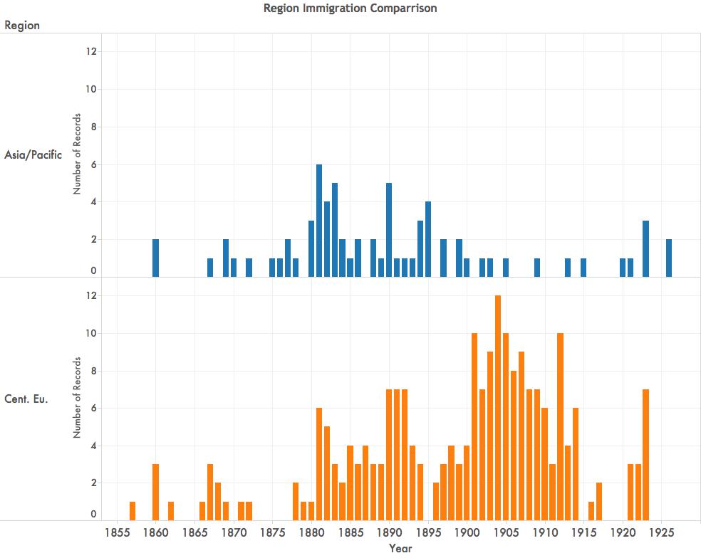
In the next figure, you can see a comparison between when Asian/Pacific peoples were immigrating into Atlanta, versus when Central Europeans were. Additionally, you can see that there were far more Central Europeans immigrating to Atlanta than there were Asians.
The visualizations are really wonderful in that they make the data much easier to mentally process and compare, and they will be easy to present in any venue. Further, we can arrange any data visualization into a kind of story that we want the data to tell.
Currently we are working to create more graphs like you see above, but also to incorporate some maps that show data such as average age of immigrants into Atlanta from various regions, countries, and cities.
While these visualizations are gorgeous, and not difficult to make, there are some issues that arise to complicate matters. For example, there is not a year of entry for absolutely every immigrant to Atlanta. In order to create the graphs, I have to omit whole people who may only be missing one piece of data. Further, I learned the hard way, that Tableau does not read the formulas that we make in Excel. I had a lot of loading issues and eventually found that Tableau is set up to do my computing. After several hours of trying to load, visiting the Tableau sub-reddit, and doing a lot of Googling, that I could subtract the Immigration year from the Naturalization year right in the graph.
Next, we are going to build out more visualizations, meet with the rest of the team to see what they are working on, and hopefully create a really robust and face-smackingly wonderful set of data that Marni can present in any venue easily as she works to collect and manage all this data.
High-quality visualization aims to convey the main goal and attract the attention of potential customers. Therefore, you need to use the highest quality images, pay attention to the library of stock photos, michael jackson silhouette, vector images, videos and music. This is an excellent service with quality content and low prices.
Studying history gives us context for understanding contemporary events and phenomena. With the help of this knowledge base, we can better understand the modern world and make more informed decisions. The same principle can be applied to communication with your favorite stars through the resource Only Celebs, click. One of its advantages is the opportunity to immerse yourself in their world, get access to exclusive content and hear their thoughts on current events. In addition, this resource creates an opportunity for interaction between fans and stars, which adds a special charm to communication and makes it more personal and interesting.
Although the methods of promotion will be quite different from the specifics of the product. For example, I paid attention to SoundCloud Promo for promoting my music on SoundCloud, I felt a real responsibility and interest in my success. Their team not only provided me with a high quality promotion service, but also valuable advice and support at every stage of my music career. They helped me discover new opportunities and gain more recognition on SoundCloud.
Gain exclusive access to millions of listeners by securing prime placement on curated playlists within the Deezer platform. Our service connects your tracks with the perfect playlists, ensuring your music reaches the right audience at the right time.
https://dragcast.net/deezer/buy-deezer-playlist-placement/