I have been on the job market since September.
The academic job market takes just short of forever, and is a HUGE commitment. As a result, I have become curious about other job markets and how they work. I essentially know exactly nothing about how to get a job outside academia, despite training for a PhD for the last 5 years. Correction. I knew nothing about the market ‘out there.’
In this blog, I take an industry professional’s resume, and turn it into a cute, easy to read infographic using picktochart, a mostly free online drag and drop application that creates a platform on which you can build an infographic.
What is an infographic?
Customer Magnetism explains it really well, with pictures. Pictures are essential to infographics, as ‘graphic’ is the central part to displaying the ‘info’.
So when Oscar Rieken, Lead Software Engineer and All-Around Awesome Person, asked if I could make his resume into and infographic, I said, “Of course I can. Just tell me what you want featured, and what colors you want.” And we were off. I even got his permission to write about it here!
After we established the rough parameters for what he wanted his resume to display, I set to work making different visualizations that we could choose from.

The above shows the way we decided to display Oscar’s skills, after one or two trials with other charts. Each bar displays languages he knows and the level, (1-5) at which he places himself in experience, with 5 being “nothing left to learn.”
We decided this way, on a basic blue/green color scheme that we used consistently all the way through the infographic.
All of Oscar’s Skills, AND Tools are displayed this way.
Next, and perhaps the most difficult, was deciding how best to display his work experience. Here are some trials we played with:
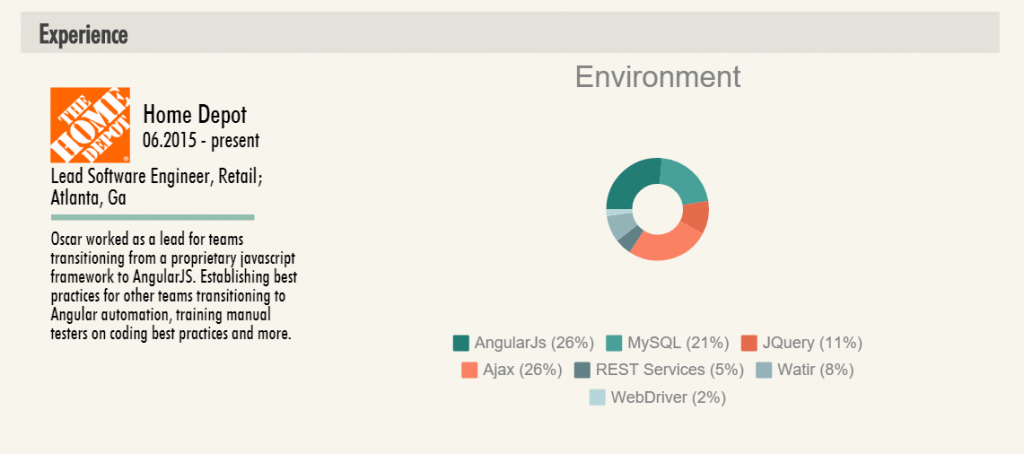
Here, we can see Oscar’s current place of employment, and the skills/tools he uses most at this position. But the circular chart is very difficult to read, and the key is bulky and strange.
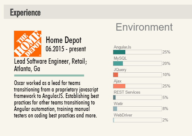
Next I tried displaying them on a similar chart that would visually match his skills and tools above. It looked better, but still didn’t necessarily warrant a display in an infographic.
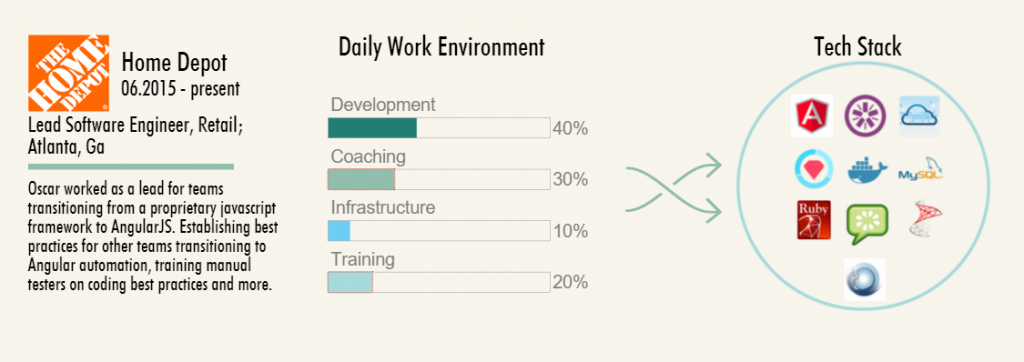
I asked him to split his skills and tools up into the way he spends his typical day. Oscar created a spreadsheet for me with data that indicated that, in his current job, he spends 40% of his day in development, 30% in coaching, and so on. Using powerpoint, I arranged his skills and tools by logo, and put them into a ‘tech stack’ inside a container, which here, is a circle. In earlier jobs, I used the shapes of the states and countries he worked in, which worked to meet Oscar’s visual tastes.

Here, you can see the skills and tools Oscar used when he worked in Brazil. Creating the graphic was incredibly easy, and I just used some simple formatting in PowerPoint to create a .jpg that I could then upload to piktochart and insert into the infographic.
It took a lot of work, and a fair amount of consulting to get this the way Oscar wanted. But eventually we completed it, and he was quite happy with it, especially after I added the little robots as accents. Oscar is really into robots.
Below, is the infographic in its entirety (with full permission).