Yesterday, I delivered a 1 hour workshop on building a digital portfolio. 11 people showed up, but three of them were Will, Taylor and Heidi, so I’m not sure 11 is cheating or not. I WAS excited to see them there – don’t get me wrong.
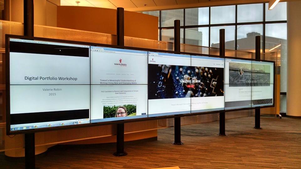
The Interact Wall in CURVE in action
Overall, the workshop was well received, though it felt a lot more like a class than a workshop. I spent the first 30 minutes talking through points which covered online presence, types of hosting, available apps, and potential content. I was really hoping people would have their own attempts at digital portfolios to share — but I think that might be a different kind of workshop all together.
We had a variety of people with different levels of knowledge in the group though – which I was really hoping for. Two people from career services showed up and provided some helpful tips, and a student from the art department had some really great questions about presenting an art-forward portfolio as opposed to the professional job-forward portfolio I have designed for myself.
If I do this again, which I might since many of you expressed interest, but couldn’t make the date/time, I would probably find other examples of portfolios online – both successful and unsuccessful and we would have a discussion about what works and what doesn’t. At this point, I’m unsure whether I focused too much on design, or not enough. I tend to forget that even though most of us spend an astonishing amount of time online, we often don’t soak up how the design works. Design, at this moment in Web 2.0 history, is minimalist with lots of white space, only little splashes of color, and lacking anything too flashy. This kind of design may be becoming naturalized for many users so that not only is the interface of the operating system invisible, but the very design of the site is also invisible. In fact, this is what we’re going for when we design (most of the time), so that means the design aesthetic is successful. But this then becomes problematic for people that don’t work in tech to break into this seemingly opaque world of design.
My overall aim was to make building a digital portfolio seem like a relatively easy, approachable task for people new to the idea. I was quite surprised to find that no one in the audience had a portfolio of their own – not even an attempt at one. So I decided to talk to that point and highlight the ease of the WYSYWG and the fact that my content was quite limited in terms of the way I showcase myself in a general way that could appeal to many kinds of potential employers.
If you have a desire to see this workshop and couldn’t make it – please leave me a comment below and we’ll see if I can’t get another one scheduled.