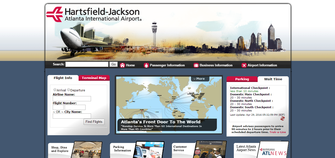
The homepage of the website of the Hartsfield-Jackson Atlanta International Airport. The layout is easy to follow, making the information easily accessible to visitors on the website. The display also shows what is believed to be the most useful or most accessed information (flight information, wait times, etc.)

Further down the homepage on the Atlanta airport website, links to other useful information can be found. I assume that these links are also accessed very often by visitors. The way I view the placement of the content on the homepage is that it is placed in regards to importance of the information and/or demand for the information.

One thing this website offers is tips for traveling. I am not quite sure how often one might want or need to access this page. However, the fact that it is on the website further shows the point of the purpose of the website being to inform its visitors.
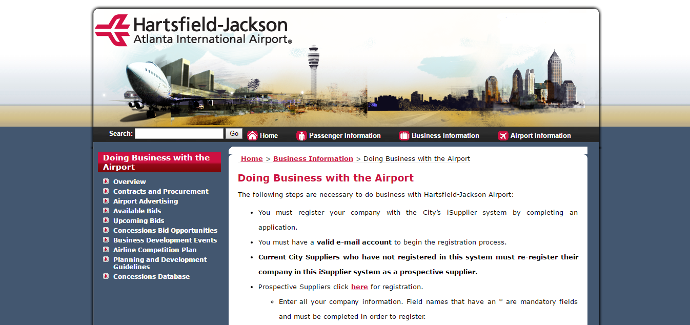
I found this page to be a little odd, simply because I wasn’t quite sure what kind of business one could do with an airport. Simple curiosity is what made this page useful to me. There is definitely an intended audience (group of viewers) for the page.

I assume this page is meant to give the page a more personal feel (for lack of a better tern). Instead of just travel information, wait time, food options, etc., the manager’s welcome note can found on the page as well. This gives the visitors the feeling that everything isn’t just technological, humans are actually behind the operations of an airport too.
Leave a Reply