A City Divided by Color

cropped-jygu-1noexxt.jpg

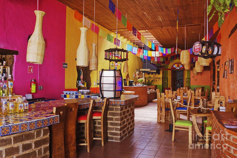
If you were to walk down Peachtree Street at night. You would be walking in a well lite area, surrounded my restaurants and businesses filled to capacity. The outside of these places would be vibrantly lit by their signs. All of these colors and lights would be flashing in your face. You could walk freely because you would not have to worry about tripping on an uneven sidewalk or being mugged unexpectedly. You would have no worries because Peachtree Street is a high-class area with upper-class residents and excited tourist. As you were walking down this grand street you would be mindful not to a venture to Auburn Ave which crosses parallel to Peachtree Street. If you did happen to mistakenly walk down this street, your surroundings would be dull boarded up buildings. There is very little light in this area and color is, even more scare. This street is known for its crime, poverty, and the dreaded minority. As you walk you would not see businesses full with people, you would instead see broken and uneven sidewalks lined with homeless individuals.

When comparing these two built environments, the two elements that mainly set them apart are color and lighting.

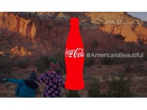
 The vibrant colors and lights that a person sees embedded in the exterior built environment of Peachtree Street when juxtaposed to the dull and dilapidated colors and lights of Auburn Street showcase the wealth and class disparity between both environments

This is the intersection were Auburn Ave and Peachtree Street collide. This picture was taking in the 1940's when both streets were equally in terms of economic and social status. (Just image the color hiding behind the black and white film.)

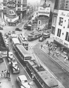
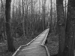
This is the intersection where Auburn Ave and Peachtree Street collide. This picture was taking in the 1940’s when both streets were equal regarding economic and social status. (Just image the color hiding behind the black and white film.)

Auburn Ave and Peachtree Street were once at the same social and economic level. Residents and users of the spaces were for the most part well of. Each of these built environments had the same basic elements. Both with building that were different shades brown, gray, or tan. With colorful billboards and store signs, along with bright lights to make the streets more vibrant. The only difference between the streets was that Auburn Ave was utilized by  minorities mainly African Americans and Peachtree Street were utilized by whites.

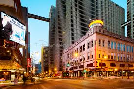
As time went on Auburn Avenues economic status dropped, and the billboards and bright signs started to come down as businesses began to close, and buildings became boarded up. As this happened, Peachtree Street continued to thrive and expand increasing its lights, bright colors, and flashy appearance annually.

n,
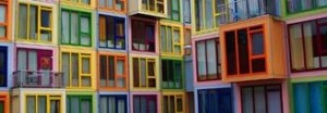
Color is a fundamental aspect of the very built environment. Because it reflects the viewpoints, dynamics, and status of the people in that particular built environment.

Every street in a city, including Atlanta,  has it a color scheme that is unique to its residents and those that are occupying the space. Which means that Peachtree Street/s color scheme compared to Auburn Ave’s color scheme would naturally be different. In an article written by a group of researchers found that color is reflective of the lives of people. In their study they talked about a scientist, named Green, who defined color in an unusual, yet remarkable way. He describes the local color as “all sights, sounds, smells and tastes, impressions of space and time, physical meetings and social interactions that individual experiences in space”(Zybaczynski). From his point of view, color effects, and reflects everything in a built environment.  His viewpoints refer back to Peachtree Street and Auburn Ave. For instance, the lack of color in Auburn Ave reflect the social and economic status of the people. That lack of color also affects them in numerous other ways.


mn
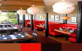
Color affects many elements of the people that it surrounds. The main aspect that color effects in people’s lives are their moods. Psychologist Jamie Hyodo studied this phenomenon in depth with a very detailed experiment. Him and his team showed colors to various groups of people and recorded how the different colors made the people react. His founding revealed that the same color can mean something different to various cultures, genders, and races. However, no matter the individual’s background, in general, cool colors (red, orange, yellow) make people feel pleasure. And, warm colors (blue, green, purple) make people feel excitement (Hyodo). All of these colors are rarely seen on Auburn Ave unless they are on some of the few businesses on the street or in the gratify on the abandoned buildings. However, these colors can be seen up and down Peachtree Street.

These finding, when combined with Greens statement, show that that the lack of color on Auburn Ave reflects its inhabitants the economic status, but also the affects the everyday well-being of the people living on that street. The vibrant colors of Peachtree Street reflect the status of those living on and being tourist on the street but also affects the overall experience of the street.

center of peachtree street
Peachtree Street


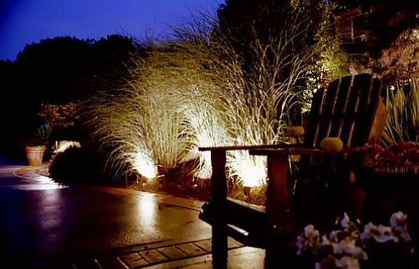
Much of the color showcased on these two streets is through lighting. Many signs have light bulbs in them so that they will visible at night. Peachtree Street has far more of these lights than Auburn Ave. There was an extensive experiment done on the effects of outdoor lighting on judgment and emotion. Various people were tested on their facial features and reaction from people exposed to a certain amount of light. The finding showed that subjects responded better with good lighting than made light. Moreover, their facial expressions revealed that when they experience more luminescence, they felt more positive(Fotios).

These findings show how the copious amounts of lights on Peachtree Street make people in the area more alert and feeling positive while the lack of light on Auburn Ave make the residents feel less alert and less happy.

It has been proven that color and lights have an effect on the general mood of the people in a built environment. Also that the color in those built environments reflects different aspects of the residents in those built environments. All of these aspects show how color and lighting showcases the differences between two built environments.

With that being said color and lighting are not the only factors that showcase this divide in social and economic status. There are number of other things can be looked at like family size, particular businesses in neighborhoods, birthrate and so on. However, color and lighting are the most obvious dividing factors between these two built environments.

If a person was to walk down to streets that were identical. One street had vibrant colors such as red, green, and bright blue and walked down another street that has dull colors that are only dark brown, gray, and darkish red tones. That would make them feel more down and less happy.

So it is no coincidence that the people in the colorless environment ,that are a lower economic and social level, and are proven to be least happy. So color reflects and affects emotion, which is exact representation of residents of both Peachtree Street and Auburn Street.

These findings are broader than Peachtree Street and Auburn Ave it can be seen throughout America. The US has one of the largest wealth disparity gap in the world. Subsequently, the color divide can be seen through the various cities in America.

In America, especially Atlanta places with vibrant colors are associated with higher class areas. Thus, color reflects economic status. Neighborhoods like Dunwoody, Buckhead, and Peachtree Street have vibrant colors. Moreover, areas with higher poverty rates like West End, College Park, and Auburn Ave have less color.

Color is everywhere in the world and is an essentially part of daily lives, even if we fail to notice it. Everyone deserves color even those  with low economic and social statuses.

cropped-jkjn-14unpbp.jpg

Work Cited 

Fotios,S. Lighting Research & Technology. May2015, Vol. 47 Issue 3, p301-315. 15p. 2 Black and White Photographs, 2 Diagrams, 5 Charts, 1 Graph.

Hyodo, Jamie. Advances in Consumer Research. 2011, Vol. 39, p858-867. 10p. 6 Charts. , Database: Business Source Complete

ZYBACZYNSKI, Veronica Maria. Urbanism. Architecture. Constructions / Urbanism. Arhitectura. Constructii , 2014, Vol. 5 Issue 4, p87-92, 6p. Publisher: National Research & Development Institute URBAN-INCERC.)


Working on Title of Analysis

Color Showcases the Class Disparity of Atlanta

Atlantas Class Disparity Reflexed the Colors Embedded in the Streets

The Joys of Color are Only for the Rich

The Color threaded through Atlanta Reflect the Class Disparity

Do the Colors Embedded in Atlanta Reflex Class Disparity?

A City Divided By Color 

Digital Description

GGC College

The Georgia Gwinnett College was founded in 2006. It was the 1st four-year college founded in Georgia in more than 100 years. The college is located in Lawrenceville Georgia in the center of Gwinnett county. There are 11,000 students enrolled in the school. These 11,00 students along with students who wish to enroll in the school access the GGC website to answer their questions and concerns. The website address is http://www.ggc.edu/.

The main campus of GGC

The site showcases all of the different things that the college has to offer. The five tabs are About GGC, Admissions, Academics, Student Life, and Athletics It uses these tabs to direct people to where they should go. The search tool is also used to help people navigate the site.

The sight uses an array of pictures of students as well as color to target its audience. The pictures that they use show diverse students with smiling faces to attract people to particular bits of information.

http://www.ggc.edu/student-life/

Color is also used to attract people to and away from certain things. The main color scheme of the website is green and white with a blue background. This color stays consistent throughout the entire website. The only variation in color is on the Athletics tab were the color green can be seen the prevalent.

http://www.grizzlyathletics.com/

The second variation in color is the color yellow that can be seen on the apply sign. This used to attract people to applying to the college.

http://www.ggc.edu/admissions/how-to-apply/?utm_source=Apply%20now%20CTA&utm_medium=Button&utm_content=Button&utm_campaign=Pre-web%20refresh%20CTA%20traffic

The website doesn’t make me feel any particular way because it is not meant to make you feel anyway. The colors are bright, not bright enough to lighten my mood. The colors also not dark enough to make me feel bad. The website is also meant to be more professional not to be flashy enough to attract my attention and make me happy. Yet, not so dull that that I get uninterested.

All in all, the GGC website a good website that allows its users to navigate through the site easily and find exactly what it is they are looking for. It is a great first impression for those thinking of enrolling and can be very helpful to students already enrolled.

A  happy GGC student
A happy GGC student

Digital Description: Field Notes

  • GGC.com
  • At first glace the website looks professional but simple enough that a person can navigate it easily
  • Off the bat I can tell the school colors are green and white, with a hint of blue.
  • As I navigate the site I see the
    • the president
    • different departments at the school diverse student: black, white,Asian, and so on
    • there is also an equal amount of women and men shown
    • there weren’t much older people unless they headed a department
  • The search bar at the top of the page is a very good one. I typed in president for example and all the information on the president of the university appeared.
  • the colors in this are pretty sable
  • green is the main color and blue is in the background.
    • the only time there is a various in color is when they want people apply to the college
      • when that is the case it is in yellow.
  • All in all, this is a great site. If someone wanted to find out information about ggc it would be easy for them to do so.

ALL: Annotated Bibliographies

ZYBACZYNSKI, Veronica Maria. Urbanism. Architecture. Constructions / Urbanism. Arhitectura. Constructii , 2014, Vol. 5 Issue 4, p87-92, 6p. Publisher: National Research & Development Institute URBAN-INCERC.

This article puts an emphasis on the importance of preserving color and the effects that it has on the local environment with local color being the most important aspect. Green defines local color as “all sights, sounds, smells and tastes, impressions of space and time, physical meetings and social interactions that individual experiences in space”. Essentially local color distinguishes one city from the other giving each city its own identity. The factors that help in this process are historical, culture, technological & economical, and social factors. The older and more complex the city the more of an identity it will have. The author suggested that the identity of a city can be seen through various characteristics like the color of streets, buildings, traffic signs, vegetation, and vehicles. This article does a good job of exampling the identity of a place but it would of been more effective if Green had pictures to example what it is saying. The article also ties in perfectly with the research of the effects of color and lighting that I am currently researching, by showing how color can positively affect the exterior built environment of a particular place.

A picture of an exterior built environment in Atlanta. The park has many different colors lighting top the night giving it a certain feel.


Hyodo, Jamie. Advances in Consumer Research. 2011, Vol. 39, p858-867. 10p. 6 Charts. , Database: Business Source Complete

The author begins by stating that color is clearly everywhere and depending on the variations in the color scheme it can have a different effect on a person’s mood. He then explains a very detailed experiment and calculation of the effect of color. Which emphasized that “cool colors lead to affective pleasure responses more strongly than the warm colors and warm colors lead to affective arousal responses more strongly than the cool colors.” The author then explains how the same color can mean something different to various cultures, genders, and races. But no matter the person’s background, in general, cool colors make people feel pleasure. And warm colors make people feel excitement. An example is then used to show how this happens, it’s exampled how stores and businesses use this to attract consumers. This article relates directly to the past source that I researched of the effects on color in the exterior built environment. This article did a wonderful job of exampling the different aspects of colors and its direct relation to mood, which connects to the research that I doing on color in a built environment.

This is a picture of a very colorful restaurant. Every aspect of the built environment has some sort of color in it. And from one place you can feel a particular mood.


Poore, Patricia. Old-House Interiors. Jun2012, Vol. 18 Issue 3, p58-61. 4p. , Database: MasterFILE Elite

The author focuses on the color schemes that people choose when they decide paint their homes. He gives a series of the do’s and don’ts in picking those colors. And suggests looking out for different aspects before picking the color scheme of a home. The most empathized suggestion is picking colors that blend well with the existing color scheme of the neighborhood so that it doesn’t clash. The author does a good job of explaining exactly how to choose between the various colors. The article also tells the person to consider 5 major elements with the color scheme, which are body, major trim, minor trim, sash, and accents. An array of pictures are used to show the reader exactly how to utilizes these five elements. These pictures capture many homes from different vantage points. Showing the color on the homes as well as the background of the homes. In all of these pictures the homes tie together perfectly with its background. This was well written and fully exampled the concept, of color and its effects on homes. This ties in hand in hand with the research that I am doing on color and relates directly to the two previous sources that I have annotated. It especially relates to the one that I did on the exterior built environment.

This buildings incorporation of color is simple yet bold at the same time, and all the different homes tie together.


Lighting Research & Technology. May2015, Vol. 47 Issue 3, p301-315. 15p. 2 Black and White Photographs, 2 Diagrams, 5 Charts, 1 Graph.

The various authors of this article highlight the effect of outdoor light on judgement and emotion. There was an experiment held where various aspects were tested from facial expressions to reaction time. In the findings of the equation the subjects responded much better when there were good lighting verses when there was ok or low lighting. This is a credible source that is organized in a way that makes it easier for the reader to understand the complex experiment. The various charts and graphs help the reader understand the qualitative data and the pictures help the reader understand the quantitative data. I chose this source because I wanted to see the effect of lighting on a built environment. This article focuses on the exterior environment which will correspond well with the interior build environment. In my other research that I have done so for I have focused on color but realized that color and lighting tie hand and hand. I will do more research on lighting in the coming annotated biography’s.

A picture of a backyard at night. The mood that a person feels in the same place at 6 in the evening vs 8 in the morning will vary.


Lighting Research & Technology. Apr2015, Vol. 47 Issue 2, p192-209. 18p. 1 Color Photograph, 5 Charts, 4 Graphs.

The article focuses on how varied lightening conditions can contribute to the productivity in the workforce. There was an experiment held to see how lighting effects affect visual perceptions which in turn affect mood, alertness, and comfort. The experiment shows that brighter light/ mornings can make subjects more alert than duller light/ evenings. The one picture and nine charts help the reader to better understand the dense text. Though this is a great source the text which is somewhat boring in very drawn out. The author should of just went straight to point, which would have made for an easier read. I chose this source for the same reason I chose source four which was on exterior lighting effects. The reason being is I have focused on color and recently realized that color and lighten go hand in hand. All in all, this is a well written article that does an effective job of explaining the experiment.

A bright office. According to the office the employees will be alert and in a good mood because of the light.


Exchange (19460406); Nov/Dec2015, Issue 226, p40-43, 4p

The article talks about how environmental factors affect children’s stress levels in classrooms. It focuses on temperature and physical space, but the most interesting effect is lighting. The thing that sets this article apart from others, that I have researched, is that it suggests that instead of brightening classrooms, classrooms should be at mid lighting. The authors says that “Too much lighting can cause overstimulation and distraction, while dim lighting can cause headaches”. This article is good in the fact that it is easy to read and is less dense then other readings like the source from my fifth annotated biography. Though good the article still has its flaws, a major one is that the article could of gave more scientific information to back its findings, instead of just simply stating the facts. This would have made the article seem more valid. I choose this article because I wanted to understand the effects of light in classrooms and other spaces, and it gave me a great understanding of just that.

This classroom is very bright. The article would suggest diming the lights a bit.


Jonker, Gerco. Colorful Living? 2006. Flicker, Zaandam.

A colorful apartment building in Europe.

This is a picture of a colorful apartment building in Europe. Every color in the rainbow can be seen on each of the individual complexes. The built environment of this location is extremely colorful and interestingly constructed. The photographer Gerco captured this picture at a perfect time of the day when the sun was shining on the colors of the building.  I choose this particular photo because it relates directly to my analysis of color in the built environment. This is perhaps the most extreme example of a splash of color in an exterior built environment because every inch of the building has color on it. Though this photo is great, there are a few small problems. If the picture were taken from a higher few looking down the viewer would be able to see more of the building as well as the exterior of the building. This photo relates directly to my other sources that I have read because they all have to do with color and lighting. On one of my previous annotated bibliographies, it talked about how color affects mood. When looking at this photo, it made me wonder what the residents of this apartment feel when the exit their buildings every day. Does it make them feel joy? Alternatively, are they annoyed by the color? All in all, this photo is great and made me question a lot and had me analyzing for some time.


Restaurant-Interior-Designs. Digital image. Designbuildideas. N.p., May 2013. Web. 17 Mar. 2016.

Colorful restaurant in the U.S.

This is a picture of the inside a local restaurant in America. The picture captures the various colors in the restaurant. The lighting in this restaurant is very bright and flows through the entire restaurant. The color scheme of the restaurant is red, white, and different shades of brown. This particular color scheme makes the restaurant have a warm feeling. I chose this particular picture because it showed how color can affect the feeling and mood of an interior built environment. This photo doesn’t have any flaws. Because it was taking at a great time of day. And was taking from a great corner in the restaurant. This relates directly to many other annotated biographies that I have done in the past. Particular the one that I did on the effect of color and lighting in a classroom. It showed that a room with mid lighting and a good array of color can make students feel better and have a good mood. This proves that this restaurant that has good lighting and a good color scheme can make its customers have a good mood. In conclusion, this photo was a great one that portrayed the color and lighting in this particular photo.

Digital image. Thompson Turner Construction. N.p.,Web. 20 Mar. 16

This classroom is very bright. The article would suggest diming the lights a bit.

This is a photo shows a bright and colorful classroom. The classroom is also very spacious and modeled for little children. I choose this particular photo because it relates directly to lighting and color on interior built environments. The photographer captured the various bright colors of the rainbow. As well as the extremely bright lighting of the classroom. This photo refers directly to many of the past annotated biographies that I have done in the past. Two, in particular, the one on the effects of bright color on mood. Moreover, the on effects of brightness on a learning environment. The bright colors must make the students in the classroom jubilant and alert. From what I learned to form the brightness source the extreme brightness of this classroom can be bad for the students, giving the heads or making them tired. All in all the photographer did an excellent job of capturing the essence of the room.

Wedel, Michel,Pieters. Marketing Science. Jan/Feb2015, Vol. 34 Issue 1, p134-143.

The red coca cola image is more important than the back ground.

This article focuses on the effect of color on an ad image. The authors conducted two experiments to see these exact effects. First the author conducts an experiment that manipulates the blur of a picture and its presence or absence of color in the ad image, during exposures that lasted 100 milliseconds (music). The experiment showed that blur didn’t affect the perception of the ad. The second study tried to see if color inversion of the background affected the perception of the ad. The experiment showed that it didn’t. These experiments provided that the color of the central object is more important than the background color. I choose this article because it relates to the built environment, in many built environments there are ads so that individuals can see. This article relates every source that I have accessed on and about color. From the sources that talk about color in mood to the ones that talk about in the built environment. Over all this particular source is a great one that completely examples its point. The only thing that could have been different was if the article itself had color in it to gets its point across.

Interior Built Environment

View from the outside of the student center.

The student center is located in the center of the Georgia State Campus. It is a three story building that was built with the student in mind. Everything from the water fountains to the eateries accommodate the many different kinds of students at the college.


The hallways are lined with colorful pictures and paintings that make the big building feel comfortable and homey. The building is very easy to navigate and has different signs to help a student find different destinations in the building. And if someone was to get lost there are many helpful staff members that are willing to assist. The building is also connected to many other GSU buildings on campus which make it very easy to find.

The student canter has many elements just for the betterment of students. There are places where people can rent electronics, study, and even color in coloring books and relax.  There are also comfortable chairs lining the halls, as well as outlets everywhere for charging laptops and phones. There are even portable chargers for many different kinds of phones for students to use.

There is also a ballroom were various events and parties are held. Many of the rooms in the center can be rented out for organizations and personal use.

All in all, every aspect of the Student Center was built with the Georgia State Student in mind. This can be seen from the exterior of the building that has various benches, emergency boxes, and statues to encourage students.

To the interior of the building with restaurants, lockers, and relaxing places for students. The various elements of the buildings are advertised on the GSU website and catalogs which all target the GSU student. Facility and staff are also welcomed in the building, though it is not as accommodating to them as it is to a student.

The student center is a great place for students to go relax, eat, and socialize which are all things that college kids love to do.