 Photo courtesy of Envision Presentations
Overview
The problem with bad PowerPoint (PPT) presentations is the user’s application of poor design and implementation. If we choose to use PowerPoint as our medium, then I feel like we must be able to do the best with what we are given. Here, I explain why users are the problem and how to fix these problems. I will be making several references to Mike Markel’s Exploiting Verbal-Visual Synergy in Presentation Slides. Also, I will conclude by explaining how to be considerate of our pitch presentations in order to convey our messages and ideas successfully next week.
We Are the Problem
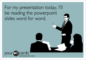

Photo courtesy of SomeEcards
An example of poor implementation and inappropriateness of use is the most common mistake that users/presenters make with PPT presentations: reading from the slides. As Chris Anderson stated in How to Give a Killer Presentation, “Don’t use a slide deck as a substitute for notes […] and don’t repeat out loud words that are on the slide.” If you look at a TED Talk in which the presenter uses a PPT (my favorite is My invention that made peace with lions), then you will notice that some things are better experienced visually with verbal comments and background information. The TED Talk video applies to Markel’s principle “Show what is best shown; say what is best said.”
My Problem
Although I argue that people are the problem, I think that space limitations of the medium are also a problem; however, there is a way around this. I have experienced space limitations in my PPT slides in my module presentation about modalities. For instance, I wanted to show the use of good spatial modes in a professional profile vs. the use of bad spatial modes in a different professional profile by providing examples of each one on the same slide. I wanted to have both pictures side-by-side so that I could verbally compare and contrast how different audiences would react; however, if I would have done that, then my audience (our class) would not have been able to see everything because the examples would have been too small.
My Solution
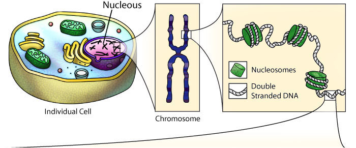
Photo courtesy of Center for BioMolecular Modeling
What I have learned is that whenever I feel like I have space limitations, I should use a diagram because it will allow me to eliminate visual clutter and highlight just what I need. The diagram above of an individual cell and its parts is a good example of drawing tools; it is an example of the tools that I should have applied to my module PPT presentation. As Markel explained, we should use one drawing or photo of our primary subject and use another to provide a close up of it; this way, “[we] would not have to worry about space limitations, poor figure-ground contrast, and visual clutter.”
Pitch Presentations
Obviously, the drawing tools that I have mentioned cannot best convey every PPT presentation’s purpose. So, here are a few things to consider when we are pitching our presentations to our clients this coming week:
- Analyze the audience and purpose of your presentation.
- Only use visuals when absolutely necessary; otherwise, they are distractions.
- Do not simply slap words on the screen; otherwise, a handout may be a better medium (Markel).
- Make fewer, better slides (i.e. less is more) (Markel).
- Use the assertion-evidence structure when convincing your client that your product is the way to go: making a claim in the form of a brief sentence in the title section of the PPT slide and inserting a graphic that validates your claim in the main content area (Markel).
Example of the assertion-evidence structure:
Photo courtesy of Penn State University
Karina, this is a phenomenal post. I think it’s important to applaud you first for your layout and organizational structure – in a post about poor design and implementation, you construct a design that clearly establishes your thesis, intentions, and evidence, all while holding the reader’s attention and encouraging them to continue reading. Great job!
I could probably write a very long comment singing on the praises of your post, but I’ll try to keep it short: I think the strongest and most convincing aspect of your argument is the inclusion of a solution. You do not merely express the issues you take with PowerPoint, or harp on the program’s limitations; you propose a solution to these issues and limitations. This demonstrates how much effort you put into the assignment, and that you have a clear understanding of the topic.
This was a thoughtful, carefully researched response that was truly persuasive and a pleasure to read. Can’t wait for your next post!
I agree with the majority of this blog, if not all of it. For the most part PP is an extremely useful tool, what it also is however, is extremely over used and used in capacities where better presentation modes would be better suited. Yes Power Point is limited in scope and range, but that is to its own advantage because its designs are best suited to certain things and any disadvantages generally come from not using it correctly.
I took a public speaking class early in my college career and 2 of the big things they emphasized were that people put too many bullet points per slide and read directly from the slides which got boring and repetitive really fast. One of the ways I have found personally to get around that is to design a PP entirely (or nearly entirely) in pictures, using them as cues for what I have in my notes to talk about (and I ALWAYS make sure I have something to mention that is not necessarily shown on slide). I do not necessarily agree with pictures being a distraction, only because having just text can be equally distracting in the sense that it is boring, finding the balance between the two is key to making a good presentation; what people seem to forget is that it is not the PP making the presentation, it is the SPEAKER. Be an interesting speaking and be enthusiastic about what your talk about and pictures are not nearly the distraction they can be ,nor will people be fixated on the text you have just for something to pay attention to.
As this post mentioned, display items for your standard presentation can occasionally be a problem. The suggestion made here to mitigate that is sound. I would also give out the possibility of just not trying to put text with a diagram and simply put the picture on an entirely other slide because, as I have said, if you are a good orator spending a few seconds on a slide with just a picture example/diagram will not be a detriment.