There remains a missing link between linking data to publish-ready graphics. Because many data visualization programs are designed for business use, they do not have the best customization and design options. A few updates could really boost productivity for us designers.
Working on the Tobacco e-Book Projects we chose Tableau as our data visualization software. Tableau became most appropriate predominately for its ease of use and modern graphic style. Excel charts, even with customization, are easy to spot as Excel generated. Since we are anticipating this e-book to be published, we required a more custom format.
Although Tableau provided a great start for our charts and graphs, we ran into several limitations regarding design. One such limitation was the lack of an ability to create templates. For this project, being an e-book, several graphs were needed, and a consistent style was needed. Unfortunately, each graph had to be manually adjusted. The font, font size, line spacing and a bunch of other variables were hand selected for each graph…very time consuming. To make matters worse, editing the spacing was never a precise move. I ended up placing a the previous graph onto whichever one I was editing and would “line up” the sides, and bottom of the graph. This was to have some approximation of consistency in line spacing throughout the e-book. It would have been a huge help to have been able to create a templates so that every font, every spacing attribute, color scheme and so-on, were already set.
The following parameters would need to be set in order to create a custom template.
- Graph Header
- X Axis Header
- X Axis Text
- X Axis Tick Marks Text
- Y Axis Header
- X Axis Text
- X Axis Tick Marks Text
- Legend Header
- Legend Body text
- Indicator Box Color
- Indicator Box Size 1
- Chart Line(s) Color
- Line Thickness
- Bar Chart Horizontal Spacing
- Spacing (by inch, point, pixel)
- Export Options
Is this post meant to be a big gripe-fest about how hard it was to do this project? Well, yes. Perhaps this post will make its way over to Seattle and land on the boss man’s desk over at Tableau HQ. Because in many cases I ended up just using Tableau as a reference for accuracy in scale and rebuilding the graphs in Adobe Illustrator. It would be great to have a data visualization program that had some real visualization capabilities. A merging of sorts of Illustrator and Tableau.
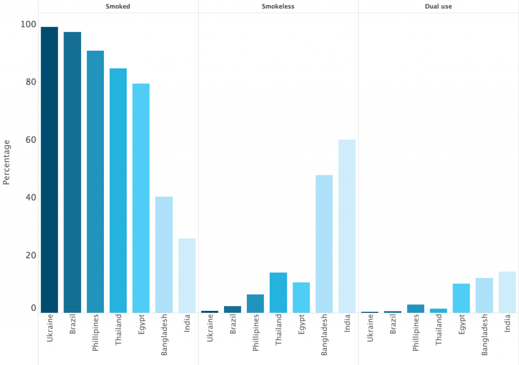
Before (Tableau generated)

After (recreated in Adobe Illustrator)

Before (Tableau Generated)

After (recreated in Adobe Illustrator)