Tableau seems to be gaining traction as the go-to platform for data visualization. It’s common enough around CURVE and online to warrant learning or at least becoming familiar with. It’s an easy to use data visualization software with features far above the visualization tools Excel has to offer, and it’s free to students. Some of the more interesting aspects of Tableau are it’s geographic component, useful for mapping, and its ability to host online dashboards, effectively creating interactive data visualizations for your website or blog.
In any case, at at some point your task will be taking existing data and formatting it into something pretty, or at least easy to understand. And if someone’s sending you data, it will most likely be from Excel; so it’s good to know how to Tableau reads Excel data. Believe me it’s not always cut and paste.
Some general rules, to think about:
- Don’t summarize your data in Excel, e.g. grand totals, let Tableau do that.
- Take a redundant row-based approach to the data. Don’t let the whole picture be summarized across one row. Instead, use multiple rows each listing only one piece of data each (I’ll explain below)
We were given a number of charts to recreate in Tableau and the essential problem was that the summarization was attempted in Excel, when it should have beeen left up to Tableau.
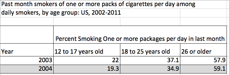
- Original Data Not Formatted for Tableau
The problem with the above is Tableau does not understand it. Tableau doesn’t know 22 is linked to 12-17 years old, that 37.1 is linked to 18-25 years old and so-on. Instead we need to be redundant and triple the amount of rows. As for the sentence “Past month smokers of one or more packs of cigarettes per day among daily smokers, by age group: US, 2002-2011” you can forget about it. Delete it. Here’s how we needed to format the data for Tableau.
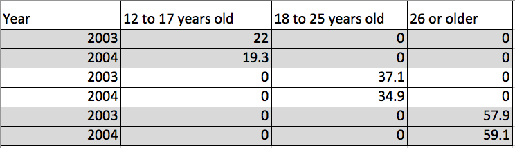
- Formatted for Tableau
Tableau loved this table! It said “Thank you” by generating a nice graph for us.
Now before I knew this was the issue with my data set I spent hours banging my head against the computer and cursing this easy to use software. It simply wasn’t making a graph for me. But once I realized my data needed to be formatted differently, I was able to find this tutorial explaining my exact problem rather quickly, Preparing Excel Files for Analysis. Now I’m a believer; don’t spend more than 5 minutes before you ask for help. If you want to jump in and start making graphs like me then by all means give it a whirl. But if you get stuck, don’t be like me and not tell anyone. Ask for help. It’s easy.