When we think about communities and ethnicities, most of us would agree that we’re striving for diverse communities which value community. But new studies on communities and diversity are showing something different; that people tend to clump together based on race. According to recent study featured on the on The Atlantic’s City Lab, people tend to value diversity less when their neighborhood is actually diverse. Interestingly enough, people will value diversity more when their own neighborhood is less diverse, according to this study as well. It’s not to say that these are iron clad laws of diversity. It’s no secret that this evidence was collected via a computer model, and we don’t actually live in computer models. But the outlook of these findings isn’t meant to be bleak. It could just be that when we look really close up at the make up of our communities, we find that people tend to stick to what they know, gravitating towards neighbors that look like them. Zooming out a bit we may see our cities as more diverse city, despite having less diverse neighborhoods.
So let’s put this to the test. How diverse are our cities really?
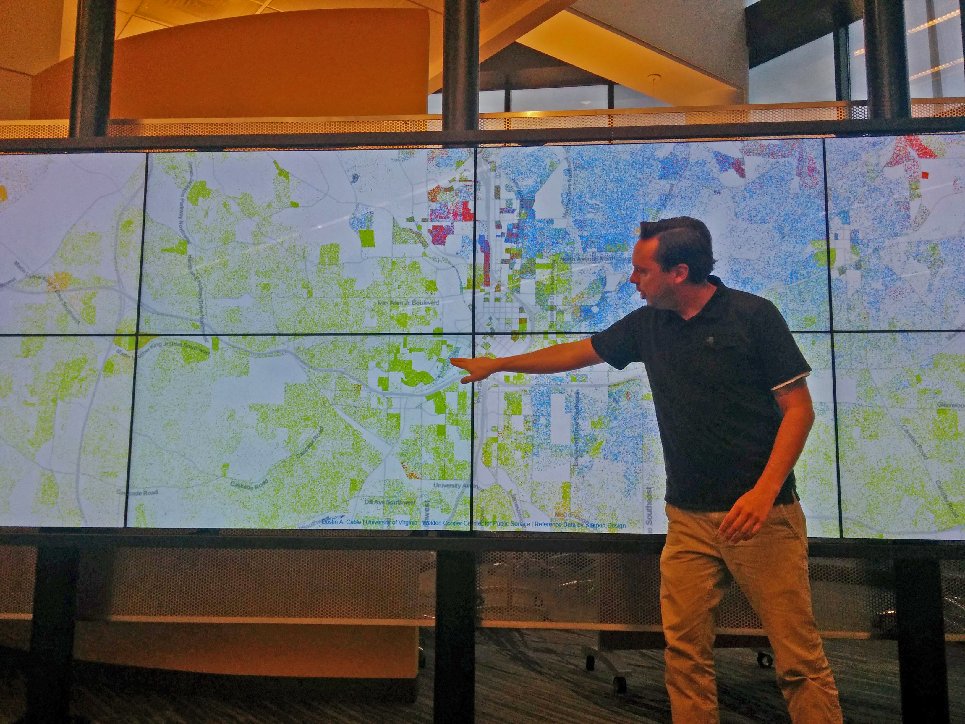 To find out I pulled up this map at CURVE. The map shows a total of 308,745,538 color coded dots. Each dot represents one person in living in the U.S. according to 2010 census data. The results aren’t surprising if you know an area well. Atlanta, for example, has far more blue dots (white people) on the north side of the city, and far more green dots (African American people) on the south and western sides of the city. When viewed on this scale it’s especially easy to see which neighborhoods are predominately green, blue, red (asian), or orange (hispanic). Buford Highway, for example, is decidedly orange. But could that be a good thing? Is de facto segregation in communities okay provided the greater city is more diverse? Maybe, but another thing is certainly clear by looking at maps. Income follows these racial lines closely as well.
The map below shows average household income based on census data. The lighter shades of yellow, blue and green represent higher income earners, while the darker shades of orange and red earn significantly less. Could it be that low income earners also like to be around other low income earners? I doubt it. And I think you’d be hard pressed to find any evidence to support such a claim. Instead, I think we need to think about where the education is, where the jobs are, and how citizens can better their conditions on their own. To this end I’d like to point you to one final news piece. It’s not a map, or anything pretty to look at, but an economic study featured in the New York Times (link to study), and a mayor’s rebuttal, released last year that showed Atlanta’s mobility index, how easily low-income citizens can become educated and transition into middle or upper classes, among the lowest in the nation.
