Reducing Car Trips in Atlanta (Annotated Bibliography Ten)

In this blog entry Darin Givens examines an interview with Jim Durrett of the Buckhead Community Improvement by the website Curbed Atlantic. In the entry Givens argues that unless the built environment in Atlanta is changed into something that is more bicycle and pedestrian friendly, then people will continue to rely on mostly cars, creating traffic. He also makes an interesting point about public transportation. He believes the reason why it seems the Metropolitan Atlanta Rapid Transit Authority (MARTA) is lackluster is because the design of the city is sprawling; in other words, everything is spread out, encouraging the use of cars and discouraging bicycling, walking, and public transportation. At the end of the blog entry Givens also touches upon telecommuting and how it isn’t an adequate solution because it doesn’t necessarily promote alternative transportation and smart growth.

Givens, Darin. “Atlurbanist.” Web log post. Reducing Car Trips in Atlanta The Quote in This… ATL Urbanist, May 2015. Web. 01 Apr. 2016

Digital Built Environment Description: Centers for Disease Control and Prevention (CDC)

The site I am describing is the www.CDC.gov, the website for the Centers for Disease Control and Prevention, which is situated in Atlanta, Georgia. The CDC itself was created in 1946 and its original purpose was to continue the work started by the World War II Malaria Control in War Areas program; a program created to help fight Malaria here in the United States. However, since then the scope of the CDC has expanded to encompass all diseases (Parascandola).

The color scheme of the website is blue and white, which provides a calming and reassuring effect on me. The colors also invoke in me the idea of cleanliness. These are the same kind of colors one would expect to see in a hospital, and I believe they serve the website well as opposed to a color like green, which would dredge up ideas of disease and death. The latter would give me the impression that the CDC is doing such a bad job at containing disease that even their own website has been infected.

The site is divided up into the categories: Outbreaks, News, CDC in Action, and About CDC. There are drop-down menus for the following topics: Diseases & Conditions, Healthy Living, Traveler’s Health, Emergency Preparedness, and More CDC Topics. The website makes use of a giant banner at the top of the page that focuses on what I presume the CDC believes is currently paramount—which is presently the Zika virus. All these topics are apparent on the front page and they indicate why one might visit the www.CDC.gov.

Here’s a one-minute clip showing the color and organization of the site.


pregnant

Here’s a picture of the banner the website uses.

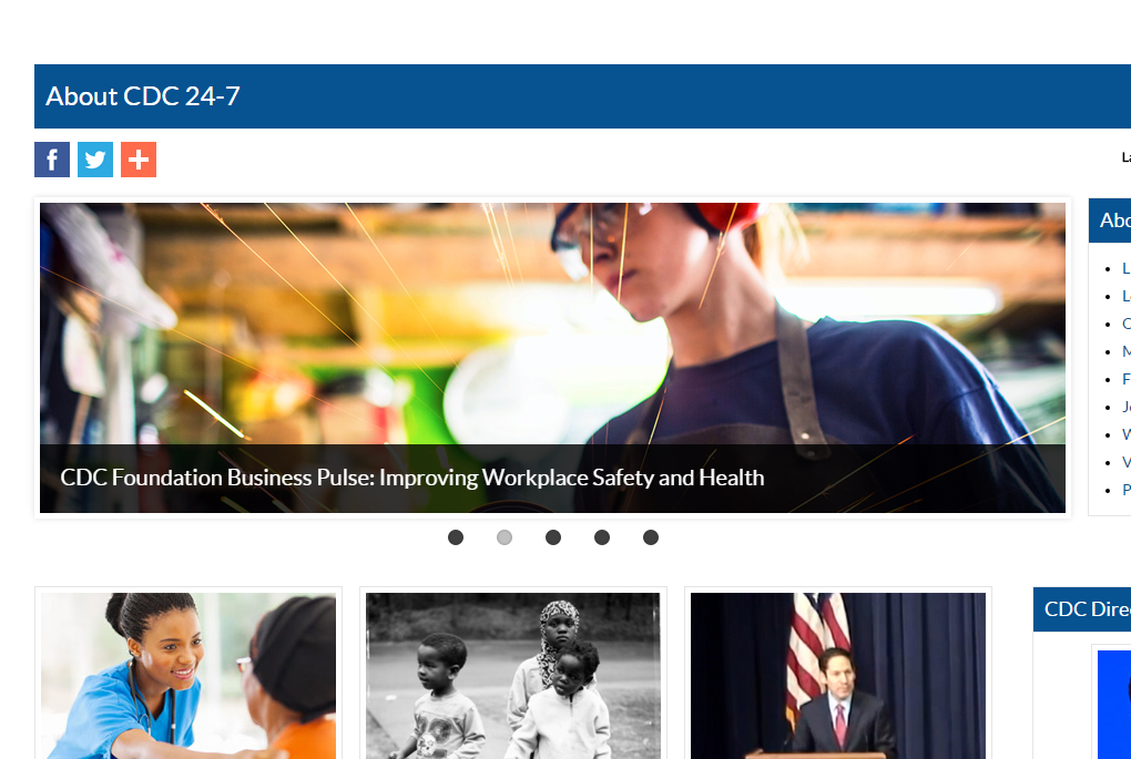
I also noticed that the designer of this website makes an attempt to demonstrate that this space is for all types of people and that the CDC is not discriminatory through their selection of pictures and options. For instance, the website uses pictures containing a diversity of people ranging from white, brown, black, adults, children, female, and male. These people are also shown engaging in a variety of activities. In one picture there’s the caption “Improving Workplace Safety and Health” with an attractive, skinny, and white woman wearing safety goggles, ear muffs, and an apron, with sparks flying up as she works on something that is just out of the picture. Then there’s a picture of a family of minorities in the outdoors with the caption, “Minority Health Month”. Lastly, in the upper-right corner of the website there is the option to change the language of the website to Spanish.

woman

Here’s a picture representing some of the diversity found on the site.

The site www.CDC.gov is welcoming, assessable, diverse, and provides information for a wide range of topics dealing with diseases, health, and natural disasters.


Parascandola, John. “From MCWA to CDC–origins of the Centers for Disease Control and Prevention.” Public Health Reports. U.S. National Library of Medicine, 1996. Web. 01 Apr. 2016.

Living in a Digital Built Environment (Annotated Bibliography Number Eight)

“Living in a Digital Built Environment.” Digital_Built_Environment. ARUP, n.d. Web. 25 Mar. 2016.

This article published by the company ARUP gives a brief description of how technology is being used to shape the built environment to provide a more comfortable and healthy space. The author of the article describes sensors that can detect pollution or monitor temperature, among other variables, which would trigger other technology that would appropriately respond. For instance, the article describes rooms or entire buildings that would automatically react to the presence of people, adjusting light and temperature when necessary. The article also describes stadiums with moving seating and dynamic sound, automatically adjusting itself to provide the spectators with the optimal experience. The author also mentions sensors that can monitor traffic flow, disseminating the information to motorists so they can plan and act accordingly. Finally, the article discusses a technology that can represent 3D models of cities, recording and predicting the patterns of people and providing an analysis of how a particular built environment may affect them, in terms of travel and where they are spending their money.

The Built Environment and Its Relationship to the Public’s Health (Annotated Bibliography Number Seven)

Perdue, Wendy Collins, Lesley A. Stone, and Lawrence O. Gostin. “The Built Environment and Its Relationship to the Public’s Health: The Legal Framework.” National Center for Biotechnology Information. American Journal of Public Health, Sept. 2003. Web. 25 Mar. 2016.

In this article titled The Built Environment and Its Relationship to the Public’s Health: The Legal Framework, written by Wendy Collins Perdue, JD, Lesley A. Stone, JD, and Lawrence O. Gostin, JD, LLD, there’s a discussion and some recommendations made in regard to the built environment, how it can affect health, and what one can do to influence how the built environment is. The paper gives some ways one can do this. Essentially, if one wants to become an effective advocate for a healthy built environment, then they should acquire evidence, get involved as early as possible during the building process, and be defender for the health of children and the downtrodden. According to the article, the latter is especially important because the health of the poor are more likely to be effected by the bad decisions of policy makers and builders than the affluent.

Better Online Living Through Content Moderation (Reading Summary Six)

In her article titled Better Online Living Through Content Moderation, Melissa King argues that content control features such as block lists, privacy settings, and trigger warnings should become more prevalent to protect people from harassment or ideas that they find offensive. Regardless of the reason, King writes that no person should be forced to receive content that they do not want. There are critics against this kind of content control and King tries to answer them while explaining to the audience why one ought to support more content control on the Internet.

According to King, there are critics who paint those who are in favor of stricter content control as being too sensitive while scoffing at the idea of a person developing Post Traumatic Stress Disorder (PTSD) from Internet harassment or an article sharing an opinion that the reader disagrees with or finds offensive. Regarding PTSD, King provides expert testimonial from a psychologist named Caleb Lack who believes one can develop PTSD from online bullying. Another argument that King charges critics with is the idea that one should not avoid what offends or irritates them; instead, one should confront what psychologically irritates them in an effort to develop a resistance to it. However, King believes this is a bad argument because a lack of controlled exposure to offensive content may lead to exacerbating a person’s PTSD. One other argument critics make against features like blocklists is that they come with a negative connotation that may damage the reputation of those who are stuck on them. For example, if an employer saw a potential employee’s name on the “misogynist blocklist”, then that might cost him the job (or cost him his job if he already has one) even though he may have been stuck on that list for merely expressing his belief that the gender wage gap is a myth. King believes this isn’t a good argument either because the architects of blocklists can exactly describe on their website the kinds of people who will be blocked. Finally, there is the argument that blockslists may infringe upon the freedom of expression of others, especially if they’re ratified by companies like Twitter or Facebook. In other words, let’s say a group of people are offended by X, and so they petition Facebook to have X blocked; if Facebook listens to and appeases the group, then no one is allowed to express X. King doesn’t buy this argument either because there is widespread online harassment in the form of bullying and threats of violence, some of it being so extreme that the victims of this harassment become afraid for their safety and lives, frightening them into silence.

Color Walking (Reading Summary Five)

In this short article titled Color Walking, the authors Phia Bennin and Brendan McMullan discuss an experiment created by William Burroughs in which he asked his students to select and focus on a color, and then to go outside for a walk. This resulted in a greater appreciation and noticeability for the selected color. McMullan and Bennin decide to conduct a similar experiment only this time they allow themselves the option of switching to different colors if they so wish. This second experiment resulted in the authors being lead down certain areas or to different colors, which in turn lead them somewhere else.  By the end of the day, all of the colors of the world became emphasized.

This is an interesting article. Personally, I don’t pay too much attention to color—or perhaps it’s more accurate for me to say that I do not normally make a habit of consciously paying attention to color. Unbeknownst to me, I may be subconsciously lead down certain roads or to certain areas in the same way Burroughs’ students, Bennin, and McMullan were lead to certain areas when they experimented on consciously focusing on color. The findings of these experiments make me wonder just how much influence color in the built environment has over where we travel. For instance, a person whose favorite color is blue may be more inclined to travel down roads or to destinations that have blue in them; and a person who hates the color red may be discouraged from traveling to areas where red is predominately featured. Another interesting thought is how this impacts the color-blind. A designer or team of designers may create a space with color in mind, purposely creating a welcoming (or unwelcoming) atmosphere; however, this may very well oppositely impact, or cause no impact, to a color-blind person since they perceive color differently.

Artifacts & Signage For King Plow Interior Site

IMG_0478


A rusted (apparently) metal sculpture in front of what looks like a metal door, a cog, and pipe. Notice the industrial style this setup gives off.


IMG_0488


This is a picture of the ceiling of the building, with all of its wooden beams and metal pipes. I think this looks really cool. It has an industrial and steampunk feel to it. A homage to what the building once was (a plow factory). The green light is a nice touch and serves to accentuate the style.


IMG_0498


A narrow corridor filled with artifacts from what the building once represented. A brief passage through the past.


IMG_0485


I took  this picture to show the basic setup of this space. When you first enter there’s this huge hallway that branches out (from the sides) into different rooms and studios. You can also see how shiny the floor is, which is something that stuck out to me when I first entered this space.


IMG_0479


Here’s a giant mechanical machine that I’m assuming was something that was used in the plow manufacturing process. It looks like somebody painted it, marrying the past with the present and adding color to a device that would otherwise appear cold.


IMG_0492


This is a picture of the King Plow sign behind some wooden beams, which can be found in the middle of the main hallway. I took the picture because I thought it looked cool. That rusted red color is all over the inside of this space in the form of bricks, metal, and signs, adding to the industrial style.


IMG_0476


Here’s another scene that stood out to me as really adding to the industrial style of the space.


IMG_0475

I feel like a broken record here but here is another scene displaying what the building once was, providing the observer with some history in the form of old photographs of the plow factory along with adding to the industrial feel of the space.

King Plow Arts Center (Interior Built Environment)

IMG_0492


According to the website for King Plow Arts Center (KPAC), KPAC is an art exhibit and work studio that is housed in a building that interestingly enough used to be a plow factory. The building now serves as a place where artists can create and display their art. When I was inside the building it was very quiet and I noticed it smelled like a library; that is to say it had that musty book smell. Additionally, and this may seem funny, but the other thing that stuck out to me was how shiny the floors are. During my visit, I only saw less than a handful of people and a number of paintings, pictures, sculptures, and machines in each of the rooms and hallways.


IMG_0479


When I first entered the building I found myself in a long hallway that branched off into these rooms and studios along the sides. The building made me feel safe and at peace. It had this laid back atmosphere while at the same having an air of formality like one would expect from a museum. I suppose the latter isn’t too surprising because in many ways this space does serve as a museum for what the building once was. The lighting of the building was surprisingly dim, complementing the dark colors of the space: green paint (and a few green lights), black paint, rusty reds in the form of bricks and signage, and brown wood; all of these things added to the relaxed atmosphere. The space had a distinct industrial style to it, with its exhibits of cogs, metal sculptures, mechanical machines, wooden work benches, and wooden beam ceilings. There are even black and white photos hanging on the walls of the building hearkening back to when it was still a plow factory. This building also home numerous paintings, beckoning and daring artists to create and display their own pieces.


IMG_0485

Smart Cities, Healthy Kids (Annotated Bibliography Six)

KidskanAdmin. “Smart Cities, Healthy Kids Looks at Built Environment and Kids.” YouTube. YouTube, 7 Sept. 2011. Web. 24 Feb. 2016.

This 4:35 video provides a sketch of a three-year long project that occurred in Saskatoon, Canada. The Smart Cities, Healthy Kids project investigated the impact of the built environment on children between the ages of 10 and 13. For instance, things like newer sidewalks, roads, the state of homes, playgrounds, and parks shaped the choices and physical activities of children, which in turn affected their health. The physical activity of the children was measured by a device that they wore around their waists called an accelerometer. Additionally, the researchers found differences between old grid-style neighborhoods and new curvilinear-style neighborhoods. Newer neighborhoods tended to be safer for crime and traffic while older neighbors typically had more destinations and activity areas.

I found this video very interesting and the study appears objective. More information about the study can be found at their website (http://smartcitieshealthykids.com/). I see this video (and study) as yet another indicator of the power of the built environment and why it’d be wise for us to use it to our advantage.

His & Hers: Designing for a Post-Gender Society (Annotated Bibliography Five)

Tick, Suzanne. “His & Hers.” Metropolis Magazine. Horace Havemeyer III, Mar. 2015. Web. 24 Feb. 2016.

In her article His & Hers: Designing for a Post-Gender Society Suzanne Tick argues that most architecture and interior décor is in accordance to Modernism; and Modernism is from the masculine perspective. Therefore, most architecture and interior décor is not accommodating to women and the transgendered. She contrasts this with what she believes we’re presently going through: the gender revolution! According to Tick, contemporary society is redefining what it means to be a man or a woman, and so architects should facilitate and promote this revolution by making their designs more universal or neutral.

While I do not agree with some of the content of the article it is nevertheless a different perspective, which I welcome. With respect to the article’s objectivity, I look at it as an opinion piece. However, the article does help me better understand how powerful the built environment is—and how it could be used to promote certain ideologies.