Under The Overpass (video download)
Here is a 19-second AVI video of the underside of the Downtown Connector (75/85). Unsurprisingly, there is a lot of concrete and the overpass is wide. I saw a lot of trash on the sidewalk. And there were a few homeless people living in the upper corners of the underpass.
Next to The Downtown Connector (video download)
Here is a 34-second AVI video of the side of the Downtown Connector (75/85). It was noisy with the bustling of cars, and I would sometimes get a whiff of gasoline. The video also contains some graffiti, more trash, and a broken chain link fence that I passed through. Don’t mind my babbling in the video. I thought my phone would be able to pick up my voice but I was wrong.
(click to enlarge)
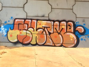
To get this picture of graffiti I had to climb up the slope of the overpass. It was taken at around 5:30 PM, so the sun was beginning to set, and its light accentuated the art. I’m not sure what it says but I think it looks neat. It serves as a nice contrast against the concrete.
(click to enlarge)
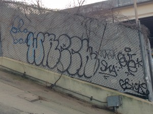
This is another piece of graffiti I found near the overpass. It’s not as welcoming as the first piece, but I thought it was interesting that it was done on a fence. The person who drew it may have been making a statement against order, establishment, etc.
(click to enlarge)
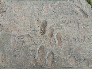
This is a picture of some foot prints and writing in the cement of a sidewalk near the Downtown Connector. I found this scene interesting for some same reason I found the aforementioned picture interesting. It can be seen as a statement against urban expansion, authority. Or it could have just been the mixture of clumsy people not watching where they’re going and those who wanted a few of their words (or names) immortalized.

(click to enlarge)
I took this picture to contrast all of the pictures I took of so-called insubordinate scenes. I found this sign near the footprints and as you can see it warns people that it is against the law to resell tickets (i.e. baseball) within 2,700 feet of Turner Field.
(click to enlarge)
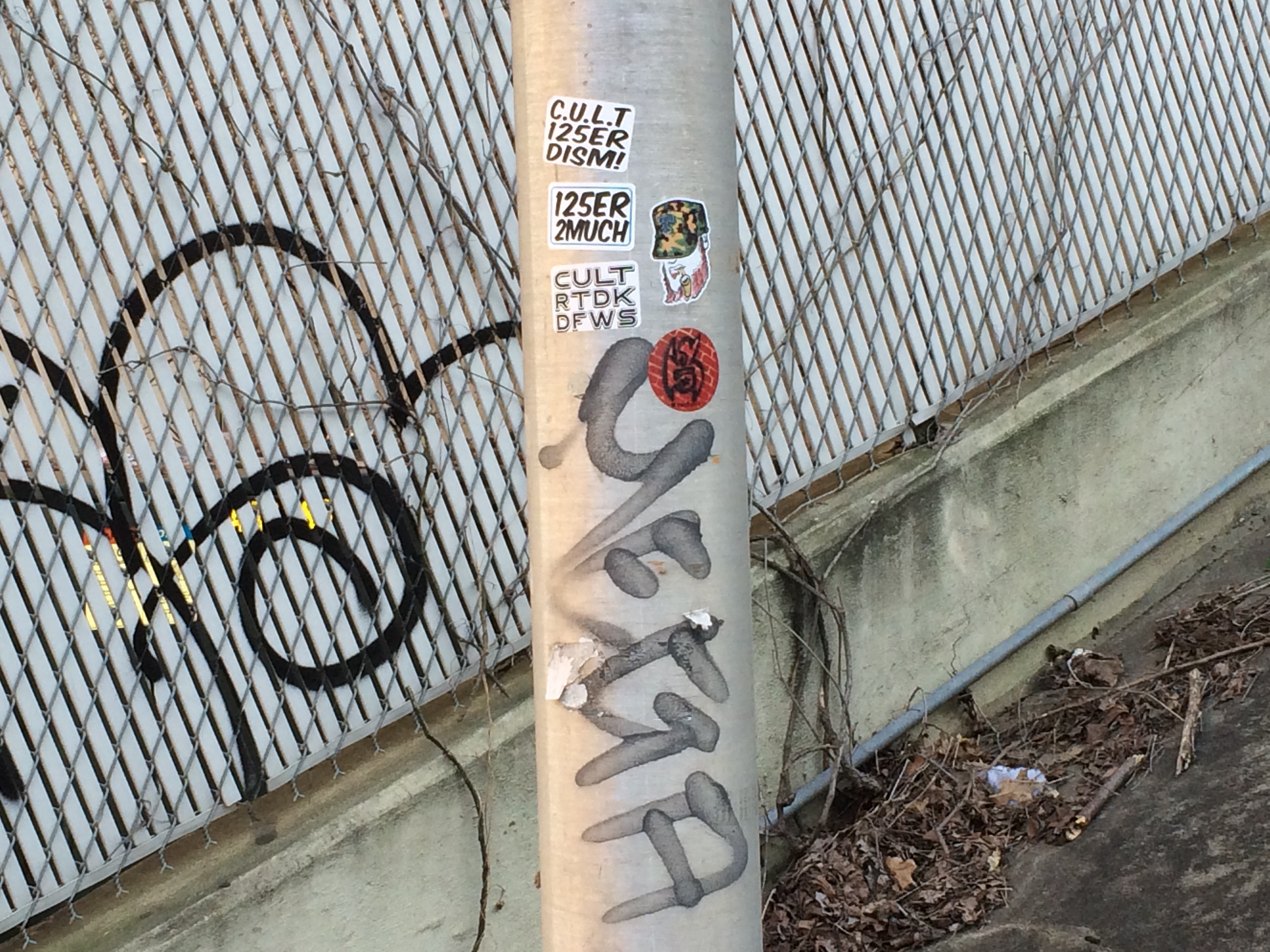
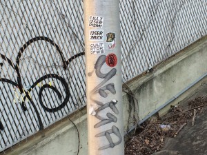
Here is a picture of some more graffiti on a street lamp near the Downtown Connector. There are also some stickers here that I don’t understand the meaning of. One of which is the head of man smoking a pipe, wearing a camo hat. Unlike the graffiti in my other pictures, I can actually read this one. It reads “mega”.
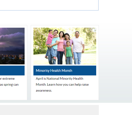 Here’s a picture of a family of non-whites outside, advertising National Minority Month. This gives me the impression that the CDC is interested in the health of minorities. To stretch it a little further, it seems to promote extended families as well.
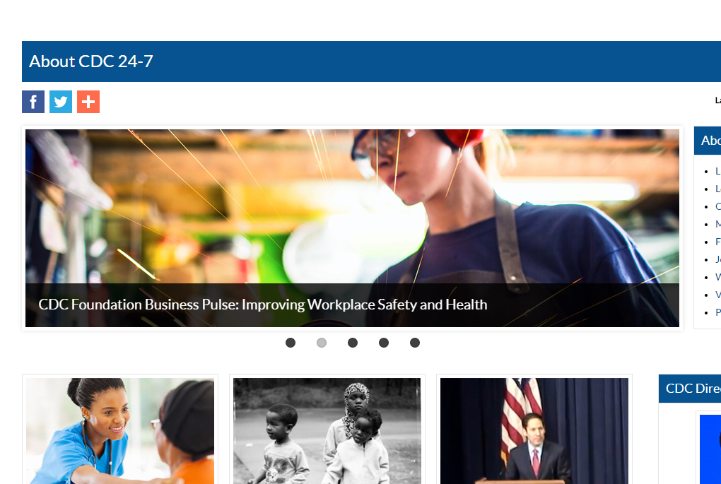
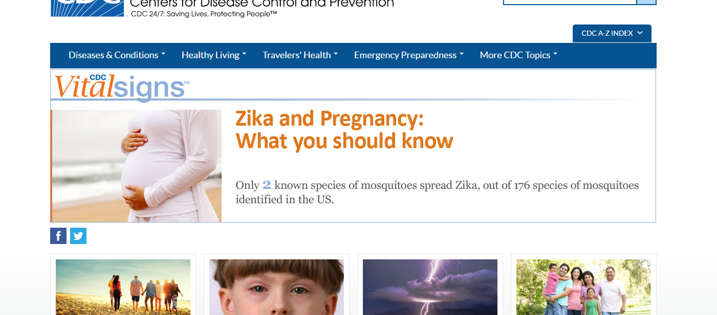 Here’s a picture of the main banner that is the center stage of the www.CDC.gov site. Easy to see and it features what I presume to be what the CDC believes is the most important. At the present moment that is the Zika virus and how it affects the unborn.