Category Archives: Mulitmodal Object Analysis

Urban Culture Symbolism

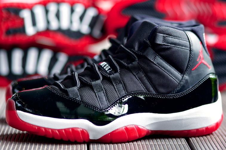
The bottom of the artifact is quite unique, compared to other objects of its kind. The bottom measures to thirteen inches long, and its outline resembles that its owner is relatively large. The bottom is made of a red-see through rubber material, while the red material forms the shape of a foot. The portion of rubber, where one would imagine the heel of the foot contains a separate black portion of rubber, which is shaped like a boomerang. Six inches above the boomerang shaped section is another section of black rubber, which is shaped like the pokemon Ditto. The inside of both black portions of rubber contains ridges that are a lot closer together than the red ridges surrounding them. While the surrounding ridges are separated by approximately half of an inch, the black rubber inside of the red ridges is less than one centimeter apart from one another. While the red ridges are wavy in shape, the black ridges are of a zigzag nature. If one were to run their finger down this particular rubber portion, aside from the occasional pieces of dirt one’s finger would encounter, one will feel a gritty rubber with the jagged touch of what could only be rocks stuck between the ridges.

Ditto-2

The object that serves as the subject of my analysis measures to a total of thirteen inches long and six inches high. The sole is divided into two parts, which the designers have said create a more flexible feel for the user of the object. Horizontal ridges begin at the toe of the shoe and transition around the entire artifact. The upper portion of the sole is an inch-and-a-half of white cushioning that when contrasted with the lower red portion and other materials of the artifact, make the artifact much more noticeable.

air-jordan-11-bred-gs-07

Looking downward on the object, the light reflects rather brightly above what seems to be a white foundation. The section of the shoe that covers what one can assume would rest a set of toes sits on a double-layered sole, and is made of black patent leather, which resembles the dress shoes of an army command sergeant major. Above the patent leather portion of the sneaker is a material with more texture than the black patent leather and possess six vertical slits on each side in order to hold the laces of the artifact. The black patent leather on top of the double-layered sole creates a red, black, and white combination that coordinates rather nicely with the Chicago Bulls of the National Basketball Association game jerseys.
The crisscross nature of small threads continues upward, only to end in a slightly larger bow. The small threads rest on the tongue of the object and in between one of the threads half way up rest letters that resemble the ancient Greek letters. On the tongue of the artifact, there is writing that if you look at from the perspective of a front view resembles Greek lettering, but if you turn it sideways reads, “Jumpman Jordan.” In between the words “Jumpman” and “Jordan” is the iconic Jordan symbol, which is also on the back of the sneaker.

shoe1

The Jumpman Jordan symbol, which is also the logo for the entire brand that surrounds that artifact, is a silhouette of the famous basketball player Michael Jordan. The symbol reflects what seems to be Jordan flying through the air palming a basketball over his head with his right hand in what appears to be an attempt to slam-dunk the basketball. His left hand is lowered behind his body with all five of Jordan’s fingers extended near his thigh. His legs are spread as if Jordan is attempting to do a split in the air. His left foot is pointed in forward, which one can only guess is the location of the basketball rim Jordan is attempting to slam the basketball in, and his right foot is pointing outward making Jordan’s posture a position only a well trained athlete could accomplish. The symbol sits perfectly on the back of the Air Jordan Retro 11!

Bred-XI-1

Music and sports have always proven to be areas in which African Americans found themselves able to advance past the societal stereo-types of America. During the 1980’s, hip-hop served as the voice of the African-American community. The lyrical messages of hip-hop along with street fashion combined to form a sound and aesthetic that many African Americans in urban communities came to identify with. The black youth of the 1980’s used hip-hop as a channel to articulate their feelings of isolation from the popular culture of the United States. Thus, the spirit of the hip-hop developed as an expression of the hardships of black urban life.

tumblr_m5kklwuaq01rwtmjqo1_500

Sneakers were an intricate part of urban culture in the 80’s. Early hip-hop artist used various sneaker brands to express their affiliations and status. The rap group Run-DMC hit song, “My Addidas,” landed the group a one million dollar deals with Addidas, a conservative German company. The French director Mathieu is quoted as saying that “ Run-DMC really made the world understand that the sneaker is to hip-hop what the crucifix is to Christians.” Other notable rappers adopted their own brands to express their own identities: Fresh Gordan’s “My Filas”; Heavy D and Nike; Busy Bee and Converse; and the Beastie Boys and Suede Addidas. However, with the emergence of a new African American basketball superstar, hip-hop culture would be introduced to a new brand that would give hip-hop a new face for years to come.

Various_Artists_Classic_Boom_Box_Hip_Hop-front-large

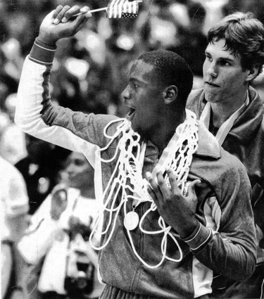
Michael Jordan was born February 17, 1963, in Brooklyn, New York. After moving to North Carolina and playing high school basketball, Jordan signed with The University of North Carolina at Chapel Hill on a basketball scholarship. During his junior season, which would prove to be his last as a collegiate athlete, Jordan led the North Carolina Tar Heels to a N.C.A.A championship. In the same year, Jordan would also help Team U.S.A win a gold-medal in the 1984 Olympic games.
Jordan decided to leave college a year early and enter the N.B.A draft. He was selected third overall by the Chicago Bulls. Jordan’s entrance into the N.B.A would allow him the ability to sign a shoe contract, and unknown to Jordan, change the shoe industry forever.

jordan-1984-olympic

Today’s Nike Inc. was founded on January 25, 1964, as Blue Ribbon Sports by Bill Bowerman and Phil Knight. Blue Ribbon Sports would officially become Nike Inc. on May 30, 1971. Before Nike signed Jordan in 1984, Nike was mainly a running shoe company, who’s target audience reflected that of their white audience At the time, Nike had set forth to capitalize on the running boom of the 1970’s, yet by the mid 80’s, because of mismanagement and structural problems, Nike was approaching the verge of failure. In 1984, the year they would sign the rookie Michael Jordan, they recorded their first drop in earnings.

billbowerman_philipknight

At the beginning of negotiations, neither Michael Jordan nor Nike Marketing Director Rob Strasser seemed the least bit excited about the partnership. Strasser felt that “unless it was possible to make one big marketing package—tie the brand, the product, the advertising, and the athlete into one personality—they should forget it.” Nike knew that signing Jordan would be a huge risk, because they realized that the success of their product would be tied exclusively to Jordan’s success as an N.B.A player.
Jordan sneaker of choice when playing basketball had always been Converse, and like many other young African American males of the 80’s, Jordan was also fond of Adidas. Jordan has been quoted as saying that he like many of his other contemporaries thought Adidas made the best product, and had he gotten a decent offer from either Converse or Adidas, he would have signed with them. Nike, which prided itself in taking chances, pledged to use its entire $500,000 dollar advertising budget on Jordan in addition to compensation for him also wearing the Nike shoes.

Jordan ended up signing with Nike for $2.5 million; however, because Nike realized that there success was tied in directly with Jordan’s success as a player, Nike inserted a clause into the contract, which stated that unless Jordan accomplished either Rookie of the Year honors, become an All-Star, or average 20 points per game, Nike had the right to terminate the contract. Needless to say, the contract was never severed. During Jordan’s Rookie season while wearing the Air Jordan 1, Jordan averaged 28.2 points per game, earned a spot on the All Star team, and on May 16, 1985, was named the 1985 N.B.A Rookie of the Year; thus, fulfilling his contractual obligations to Nike.

ban-mike-1

On October 18, 1984, the N.B.A officially banned the black and red Air Jordan 1’s, because the N.B.A claimed that they violated the uniform dress code policy. At the time, the N.B.A required its players to wear either primarily black or primarily white shoes. For violating this policy, Jordan was fined $5,000 a game, a tab that Nike was happy to pick up. A simple shoe violation wouldn’t be the only controversy Michael Jordan and Nike would be involved in.

Michael Jordan and Nike were redefining not only the shoe industry but also the way business is done in America in general. Never before had a company made an African American male the face of their corporation. A Newsweek article asserted that “The athletic-wear giant is one of a growing number of companies that have begun to use ads made not only with, but by, blacks. The reason isn’t hard to figure out: blacks have become a powerful consumer force. . . To reach them. . . marketers are striving for ads with an ‘authentic’ feel for black music, language, and lifestyles.”

spikelee

To capture this authentic feel for black music, language, and lifestyles, Nike’s advertising agency, Wieden and Kennedy, hired Spike Lee in 1986 to direct commercials staring Michael Jordan. The agency’s copywriter is noted to have developed an idea to pair Jordan and Lee, because of a character in Lee’s film She’s Gotta Have It (1986). In the film, the character Mars Blackmon refused to take off his Air Jordan’s, even while making love, because they were so important to his sense of identity as a young black man. Spike Lee was one of the most popular African American film directors of his generation. Lee is known for creating films such as Do the Right Thing and Mo Better Blues, which depicted the African American point of view at a time that many in the black communities felt that such a depiction was non-existent in America. The relationship developed into a 16-year relationship, which resulted in the “Mars and Mike” campaign ads that featured Mars Blackmon.Lee’s film’s countered what he himself referred to as the exploitation of African Americans with a “powerful social commentary.” Lee’s 1989 film, Do the Right Thing has been referred to as “the standard bearer for Hollywood on race relations.”

The design of the Air Jordan Retro 11 was a subtle cry for attention from an athlete who was known for being relatively conservative. It stands to reason that the color scheme was designed to match that of the Chicago Bulls team colors. Whether or not the Bulls wore their white home jerseys, black with red striped away jerseys, or red alternate jersey Jordan could wear this sneaker if he felt the need. But the color scheme seems to be the only normal aspect of the shoe, relative to sneakers of its day.The patent leather used on the bottom portion of the sneaker is a clear call for attention. Patent leather was rarely used at the time of this particular Air Jordan’s release, and when it was, it was reserved exclusively for women’s shoes. The use of the shiny material was extremely risky for the shoes success, but clearly neither Nike nor Jordan cared. They seemed to be challenging the way sneakers were designed during that time.

272970_366_45

Although, the shoe’s patent leather design made it quite noticeable, make no mistake, the shoe’s designer still had basketball in mind while designing the sneaker. The horizontal ridges in the rubber material at the bottom of the shoe allowed for maximum grip, which allowed Jordan to cut back and forth as he used his cross over dribble and raise off of the floor to implement his famous slam dunk. While the shoe’s sole is also extremely flexible to provide freedom of movement for Jordan’s foot, the sneaker still provided adequate ankle support for a professional basketball player. The sneaker, like most of its day, cam up to the middle of Jordan’s ankle, and was tied rather tightly to prevent, what one can deduce as a sprained ankle.

When this sneaker was released, Jordan was probably hesitant about the design, but gave the benefit of the doubt to Nike, because of previous success. By the time this sneaker released, Jordan was already a champion, all-star, and an overall success; therefore, the failure of such an eccentric shoe, relatively speaking, was far from his mind. If any other player, who had not been as established as Jordan, it stands to reason that this sneaker would not have done as well as it did. However, with that being said, the sneaker’s success is not due solely to Michael Jordan. The success of the Air Jordan Retro 11 is due to a synthesis of things: Michael Jordan’s success, Nike’s brilliant advertising, and hip hop culture.

Multimodal Project Analysis

This seemingly weightless object reflects an equivalent color as that of the golden glow from the rising sun. Measuring 24 cm long and 2 ½ cm wide, a long rectangular object feels smooth on one side and rough on the other. A closer look reveals that this aureate fabric is formed with a satin weave in which the threads of polyester intersect to purposely create a smooth, lustrous on the front surface and a dull, matte back.

057Side stitching is noticeable on each side of the fabric’s width but on each end of the fabric’s length exists frays. With one simple pull on one of these frays, the fabric will quickly and easily unravel, which discloses the object’s delicacy.


060Four tiny pin holes are visible on the fabric, two of which appear approximately 6 cm from each end indicating that these two tiny holes were created by the same pin. Metamorphosing the object to have the two pin holes from each end align, the fabric crosses and the object acquires a new form. When viewed from the top, which is above the pinholes and crossing fabric, the loop of the object creates a flowing loop with no sharp turns. Two equal lengths of fabric create an upside down “v” shape that dangles below the loop, pinholes, and crossing fabric.

According to Robert Friedel in his essay, Some Matters of Substance, “Everything is made from something [and] the making of anything requires that choices be made about the stuff that goes into it. There are a number of grounds for these choices, of which the following seem to be…important: Function, Style, Tradition, and Fashion.”

Visually, color is the initial feature that is noticed, which suggests it holds substantial significance in choosing this exclusive object. The fact that the color is solid implies there is relevance in the isolation. It is also important to note that the shade of the object is not yellow but gold whereby gold is often darker and glossier than compared to the primary color yellow. Additionally, the shade of gold reflects a sense of complexity and depth.

Considering the satin-weave, side stitching, and frays, it can be presumed that care and precision were significant when creating this object. The fact that the object is fabricated using a delicate technique and material suggests that this aureate object serves an aesthetic purpose and is intended to be worn. More specifically, the small size suggests that the object is not used for covering things up; therefore, reveals that there is an intentional purpose for display. Likewise, the pinholes further suggests intentional display and we can consequently determine that the object’s function may be used as a brooch.

The fact that the object has to be manipulated to obtain this shape suggests that the importance of the shape is only second to the set color. At this point we can safely say that the object’s material and function were deliberately manufactured to be a fashion instrument. The color and transformed shape juxtaposed with the object’s material and function, however, insinuates the object was purposely designed to be worn as a sign.

When we compared the shading difference between yellow and gold, we notice a similarity to the satin-weave material. Gold is a darker, glossier shade of yellow and the material is purposely threaded to create glossy front; thus, was the material selected specifically for the color? If so, this would indicate that the color holds a higher importance than originally judged.

Elements7180010

“For a variety of reasons people come to make associations between a material and various feelings, concerns, and attitudes. These associations are rarely stated, but they are quite significant to our understanding of the past and its influence on the present.” And as Friedel claims, “It is actually the question of the relationship between materials and values that is at the heart of this subject;” thus the reason for exploring the element gold in relation to the color of this object. Known as a precious metal, gold is highly valuable because of its chemical and physical properties in addition to its scarcity. History reminds us of wars about people and cultures dying to protect or obtain it or to expand beliefs/societies/land because of it. Do these experiences alter or attribute to the meaningful value placed on gold? But if we set aside the monetary and scientific worth to only consider gold’s obvious feature, its beauty, do we actually treasure its aesthetic value?

Manipulating the object’s shape arouses various speculations when we draw from the previous deductions. First and foremost, pinning the fabric together so that the four pinholes perfectly align, the shape is similar to that of the Ichthys yet without a profound, pointed loop and more fabric dangling below the pin.

christian_fish_symbol_gold
Image Credit: by Liz Aragon on sweetclipart.com

Derived from the Greek word for fish, the Ichthys is commonly known as the Christian Fish or Jesus Fish and an ancientpagan symbol used as a visual expression of identification with a specific group of people. However, the position of the pinholes suggest that, unlike that of the Ichthys, this particular object is to be represented vertically. Is there a connection and/or religious undertone to this object and the Ichthys? Jules Prown claims in his Essay, Style as Evidence, “The manifestations of identical elements of style…cannot be considered coincidence: clearly cultural preferences were being expressed. And stylistic shifts…mark a change in cultural values.” But perhaps the only correlation is the method of associating one’s self with a particular group through an “artistic sign.” Prown explains that an artistic sign is “does not pertain to things but a certain attitude toward things.”

Jacques Maquet explores the meaning of objects and what they stand for in his essay, Objects as Instruments, Objects as Signs. Maquet employs us to move beyond simply interpreting objects for their role and function by reading “objects as signs” for their connotative meaning, such as symbols, images, referents, and indicators. Given that “[The meaning of an object] is grounded in common human experiences and given by the group of people to whom the object is relevant,” Maquet believes that it is difficult to derive meaning from objects because meanings are not “culture-specific,” “inherent to the object, or ascribed by the designer” and thus meanings are implicit and always changing.

The gold color and transformed shape seem to be the two most notable physical features of this object; so should these characteristics be read together or separately in order to derive the correct association and meaning? Is color deemed as an actual object or a way to read an object just as Maquet suggests (i.e. referent)? What meanings and values are attached to this object, what group of people gathered the consensus to build these meanings and values, and what human experience grounded these meanings and values?

Kenneth Haltman describes signs as a complex interrelationship between objects and their meaning. He further explains that it is not only important to concern ourselves with what the object signifies but with how the object symbolically expresses meanings and values.

James Deetz’s, “In Small Things Forgotten,” placed significance on the historical analysis of objects in material culture studies. It is through the ‘small things forgotten’ that we can “fill in the cracks between large historical events and depict the intricacies of daily life.”

Today, the gold element is commonly associated with wealth in forms of currency (i.e. money and coins) and jewelry. In reflecting upon the past, it is apparent little has changed regarding what gold signifies but it is relevant to not on how gold signifies has transformed.

For example, Ancient Egyptians believed gold held a magical potency containing significant religious properties, mostly due to gold’s corrosion-resistance element. However, they revered gold as the “Flesh of the Gods” because of its color resemblance to the sun to which they credited to the powers of the sun god.

Elaborate death rituals, the most famous is the tomb, coffins, and death mask of King Tutankhamun, substantiates that Ancient Egyptians considered gold not only as a highly prized commodity but more importantly, as a symbol of eternal life.

History, it seems, continues to influence our present whereby gold is still viewed as a symbols of wealth (owned by both rich and poor), money (standard for many currencies), treasure (pirates & leprechauns), perfection (“golden mean,” “golden ratio,” and “golden rule”), and achievement (symbol for the highest medal or award).

A concept that is important to note is how Friedel centered his studies on the material in material culture. He emphasized the significance of the “first element” to which we should consider in order thoroughly study and comprehend things – “the matter of stuff that makes up a thing”—the material.  In essence, it is “not only the form [of the object] but also the [material itself which] conveys messages to us.” Therefore it would be erroneous, according to Friedel, to exclude the material itself, which is the satin-weave.

The satin-weave is a special weaving technique that has been used since ancient times and rumored to have derived from ancient China. Originally comprised of fine silk up until the invention of synthetic fibers such as polyester, the satin-weave is associated with romance and luxury. Likewise to the scarcity of gold, satin materials were limited to those of nobility, upper class, and church. Additionally, satin-weaving was viewed as a “treasured secret” but eventually this skill broadened and reached America by the late Renaissance. By the late 1800s, satin fabrics were no longer only worn by those of the upper class and was sewn into anything from bridal gowns to lingerie. In the 1920s, satin material became increasing popular and widely affordable due to the invention of artificial silk, or better known as synthetic fibers. The associations to satin that were once sacred are now viewed by some as “profane” due to the rising popularity of satin material and its public display of undergarments, lingerie, corsets, brassieres, and camisoles. According to fashion journals, on the other hand, popularity has begun to associate of satin to sensuousness and lustrous.

A conceptual context refers to the creator’s mind…the physical refers here to the association of the object out of its original, conceptual context as it moves from producer to consumer, out of the workshop and into its use context. In other words, after an object is created it moves into a new realm, both spatial and temporal, as it becomes associated with other objects and a social world of individuals who possess the object. In that sense the focus is not on the thing, the artifact, but on its makers and users as a window into social relations. It is as ‘things-in-motions’ within the context of the social place of the artisans and users that the analysis derives its meaning.

The ribbon, which we can now refer to since our analysis of it is complete, is not a sign “to be read but a story to be told or unfolded about the social impact of the actions of people and their manipulations of objects through space and time” (Rita P Wright, Technological Styles: Transforming a Natural Material into a Cultural Object). The following stages of the ribbon’s life is essential to explain, inform, and describe how the ribbon morphed into cultural object: conception, material selection, design, manufacture, distribution, use, and perception.

Strips of cloth, originally dubbed “bands,” were found from a Turkish archaeological site of Çatal Hüyük, which can be dated back to the 6th millennium. It is suggested that these “warp-faced plain weave bands” may have been used more for decorative purposes, “to ornament and trim garments.”  The silk ribbons began to appear during the 11th century and became a more frequent fashion accessory throughout the Middle Ages and Renaissance. However, it wasn’t until the 17th century, when French King Louis XIV became obsessed with ribbons. He adorned “ribbons of gold and silver to hats, sword handles, shoes, sleeves, around the knees, and even to the lower bodice front, where yards of ribbon loops emphasized the wearer’s masculinity.”


Multimodal Object Analysis

Pounce is a life-like, life-size sculpture of a panther cast with a sleek and muscular tone. Pounce is the representation of a beautiful and majestic panther, caught in the act of moving forward. The statue is dark in color, but it appears gray with the light of the sun. Its surface is smooth in the sense that it does not present ripples except on the neck, chest, and paws. In these three areas, there are ripples that indicate the presence of soft fur. For the rest, no other traces of fur are visible. The coat color is plain black without spots. The body measures in length more than four feet, and the long tail measures approximately twenty-five inches. The tail is perceptibly curved and points upwards; the definition of the muscles on both sides is clearly elaborated, as well as the strong lines defining the muscles of the legs; the face is not frontal, but slightly bent to the left. The same detailed precision is reserved for the paws. They are large and powerful, and the fur between the toes is incredibly well-modelled. The hind legs are larger and longer than those at the front. The ears of the statue are bent back in listening mode. The head is small compared to the rest of the body, and the eyes are rather big and deep-set, with the pupil not circular in shape, but drawn by two sharp lines. A tangle of fine lines building the underlying musculature suggests the pronounced jaw as well as the elaborateness of the upper part of the head. The nose is broad, outlined by a thin rectangle. At the rectangle’s base, there is a little oval representing the main part of the nose: the nostrils from which the animal is supposed to breathe. The nose is of a different color than the rest of the statue. While the statue is black or dark gray, the nose is clearly golden. The mouth is shut and characterized by a plain line that crosses the lower part of the face horizontally. The face has no visible whiskers. The base on which the statue stands is a simple rock of the same color as the rest of the statue; however, the base does not present a regular configuration because the outlines of the rock are jagged and irregular. The plaque at the base of the statue reads: “Donated by the Georgia State University Alumni Association on its 75th anniversary; Dedicated February 12, 2005. ‘Promoting Panther Pride.’” The plaque is black and the words are written in white. The logo of the university, a blue stylized paw, appears at the bottom right-hand corner of the plaque.

10744611_971506459530748_1006074211_n

panther-wallpapers-1

Pounce is not only a statue, but also the mascot of Georgia State University. This bronze reproduction seems ready to pounce on an enemy, hence the nickname “Pounce.” The smooth fur is a realistic detail as panthers are not animals with a thick fur, like wolves and polar bears for instance; the layer of fur that protects their bodies is rather thin as the one found here. Depicting a panther in the process of moving forward is a possible allusion to the path towards the brilliant future that awaits every student, while the base with its irregular edges may allude to a wild landscape in which Pounce is wandering. This detail suggests the idea that sometimes students need to act “wildly” in their academic career and break the rules to achieve successful results. As previously mentioned, the passers-by can notice that Pounce’s nose is of a bright yellow. Indeed, several generations of students have touched Pounce’s nose before their tests, because this gesture is believed to be a good luck charm. Rubbing Pounce’s nose has now evolved into a solid tradition. Although this convention is quite old now, students keep it alive, as evidenced by the different color of the nose. In the same way, the plaque would seem to promote a sense of devotion and attachment to the school, especially underlined by the last words in which “panther” becomes an attribute for “pride.” Furthermore, the plaque looks like a classroom blackboard and references to the academic institution in general. The fact that the Student Alumni Student Association collected the funds to build the statue is significant as this donation shows the profound dedication, enthusiasm, and pride that the alumni still feel toward their old university, an affection that led them to finance the building of a statue that may become, if it is not already, a relic. The statue finds its home on the main campus in the Unity Plaza, a small square situated in front of the Student Center. It proudly stands as a reminder of the greatness and achievements that students can reach in their academic path. It is interesting to notice that Pounce is frequently surrounded by a crowd of chatting students on their way to class. Some of them quickly rub its nose before going to take an exam. The sense familiarity with which students approach the statue shows that Pounce has become an integral part of Georgia State campus, as important as the library or the sports arena. There is only one statue reproducing Pounce on the entire campus; however, the presence of this symbol is crucial, as there are more prestigious campuses in the U.S. which do not put their mascots on display. Georgia Tech, for example, put up for sale a physical model of Buzz, the yellow jacket representing the school, but it does not seem to have a statue on the university ground. A possible explanation is that Georgia State University, having a commuter culture, has the need to enhance the school spirit and unity more than other colleges. Therefore, the usage of symbols becomes extremely important in this context in order to cultivate the institution’s traditions. For the same reason, the statue represents a realistic rather than a cartoonish panther. In fact, a realistic panther better conveys the seriousness of the academic environment and reflects the idea of solemnity and distinction that a cartoonish panther could not capture.

Pounce is not only an inanimate statue, but also a living mascot. Nowadays, mascots come in all shapes, sizes, and colors. They are present at every level – from non-athletic occasions to professional athletic events – and they usually have intimidating or aggressive traits that refer to the concept of competition and rivalry between schools. The panther was probably chosen because, although black panthers are not the biggest creatures in the animal kingdom, some larger animals fall victims to their powerful bodies and extraordinary fighting skills. Another thing to take into consideration is that the living mascot, although sometimes impersonated by a girl, is invariably portrayed as a male panther. The decision of having a male mascot is common to all the schools in the U.S., the reason however is not yet clear. It would be interesting to see a female mascot in the future. Usually, Pounce can be seen walk around campus and greeting students and parents during important events. He also attends athletic events, panther prowls, community projects, etc. Attendance at a variety of University-sponsored events is essential for the mascot to be an effective symbol. It has existed in its actual form since 2009. In the video below, Pounce accepts the ALS Ice Bucket Challenge and in turns challenges the following mascots: Hairy Dawg from UGA; Buzz from Georgia Tech; and Gus from Georgia Southern. When the ice bucket is poured on his head, Pounce limits himself to raising his arms and showing his muscles. “You have 24 hours,” he warns the opponents. The video shows the main characteristics of his personality, which reciprocate the ones of the inanimate statue: strength, combativeness, and intelligence.

https://www.youtube.com/watch?v=MHC6erQh5ng

Of course, there is a big difference between the statue and its embodiment. While the statue is an icon and a representation of the great history behind Georgia State, the mascot is more like a nice and funny animal entertaining freshmen and children. It represents a stylized panther with blue fur, visible white teeth, black whiskers, and a long tail. The mascot usually wears the men’s basketball or football uniform. The statue is the more serious and static symbol of the institution of Georgia State University. In the past, the logo mascot of Georgia State was an owl, and the students attending Georgia State were called the Owls. This is probably an allusion to the fact that originally the school offered only evening classes. The name was later changed into the Ramblers in 1946 and finally into the Panthers in 1956, which is the one still used today. The first panther-mascot, Urbie, was conceived in 1989: a blue feline, more massive and goofy than the current version, with a bright smile and marked whiskers. The final version, Pounce, was finally created in 1993 when Georgia State entered a new phase of growth and emerged as a major presence in Atlanta. A few years later, in 2005, the statue was financed by the Alumni Association and created by Atlanta artist Tom Sapp. The additional makeover dates to 2009.

10847076_993196184028442_71908407_n

download

The statue representing Pounce is so important in the university culture because it is a symbol of education, of the hard work the students have to endure, and of the hope to reach success and stability in life. Looking at the statue or rubbing its nose is at the same time a physical and a spiritual act as the person performing this action simultaneously sees a concrete artifact, the expectations for the future, the rich history of a prestigious institution, and the sense of being part of a larger community. The student is like a panther. Despite of being a solitary animal, the panther congregates with others of its species when the occasion demands it. Similarly, students at Georgia State proceed alone in their academic career, but they will find themselves working with many other people once the college adventure has ended.

Black,Silver, and Green: The Weight of Western Materialism on a Wrist

Cool to the touch, this object feels surprisingly heavy. The structure of titanium steel brings the object’s weight to approximately 5 ⅛ ounces. From afar the object looks like a mass of black but a closer inspection reveals a beautiful combination of ion black and luminous silver with a distinct amount of lime neon green. Laying flat across a surface, the object resembles the shape of a lollipop; A circular head with a thin body descending. The object measures four inches long with its circular head possessing a diameter of one and a half inches and the length of the body measures two and a half inches. The height of the circular head is half an inch high while the body stands at one fourth of an inch tall.


Peering from above, one notices a perfect circle . The circle’s interior reflects a luminous silver, the rim producing a bold ion black.  The diameter of the circle measures one and a half inches. A closer look into the interior one notices slow strenuous movement. In the direct center, two hands are ever rotating, reflecting a relative aspect of life; time. Identical to  one another, the hands are only distinguishable by height. The larger of the two measures almost a full centimeter while the smaller hand reaches only half centimeter. These hands resemble miniature blades missing only the hilt. Appearing razor sharp, the hands overlap one another with a fat rounded bottom. Ascending towards the top, the hand gradually thins out to a fine point as the tip of the hand reaches right below the rim of the perfect circle. These hands are painted a bright luminous silver. Yet the actual stem of the hands are coated in a whitish yellow tint. This beautiful silver reflects in the line, yet in the dark the hands continue to shine. This tint provides a secondary function other than aesthetics. When in the dark, this tint makes the hands visible to the human eye.


These hands are ever revolving in a beautiful luminous silver background.The silver service is embedded with tiny miniscule dots, each the size of the end of a paperclip. From afar, one would hardly notice these tiny indentations covering the entire interior of the circle as one might only notice a silver background. Though initially appearing as aesthetics this physicality provides the functionality of life to this object. Requiring no battery to operate, this object operates and fuels itself purely off solar-power. Hence this dot-embedded silver interior surface absorbs sunlight which transfers the light into energy to fuel itself.


Following these indentations outwards, one might find themselves peering into the rim of this perfect circle. The rim, the dividing line between the interior  and exterior of the object, remains a thin line, a circle, painted a distinct neon lime green. Found directly below this thin green circle, within the interior, remains silver markings, each just a thin silver line.Each no longer than an pencil’s eraser and no thicker than lead from a mechanical pencil, there are exactly three hundred of this razor thin thins. At each interval of twenty five, the line is emphasized as the size is doubled, around the length of a human’s eyelash. These tiny silver markings are found encircling the dividing area between the exterior and interior of the object, which I refer to as the steep. No more than a gradual height increase of one millimeter, this steep provides enough of a height increase to provide two primary functions. The first function of the steep is providing a home for the tiny silver markings. The two rotating hands do not measure  these markings as this responsibility is left to a third rotating hand which is activated by a button on the exterior right side of the circle measuring seconds and milliseconds.This silver rotating hand starts from the center of the object and extends directly to the rim ending where the silver markings begin. No thicker than a piece of hair, one would never notice this hand without a closer inspection.


The second function of the steep provides is protection. THis step provides a height increase making the primary circle not a two dimensional object, but a three dimensional circle. By the steep gradually extending outwards, a convex rounded piece of glass is able to be placed over the interior circle providing protection for the subdials, design and rotation hands.The glass appears thick when tapped against, almost providing similar security and protection similar to a window protecting a bank teller or car windows.

Following the twelve emphasized lines located on the rim inwards, twelve identical silver rectangles rest directly above or below these silver lines (depending on location in circle), resting directly on the interior border.  These small twelve silver rectangles represent the numerals one through twelve, despite having no numerical value present. These silver rectangles are thirty degrees apart from eachother, just like the emphasized silver lines resting on the steep. At every ninety degrees, the numerals divisible by three contain small silver squares instead of rectangles. These numerals possess squares instead of rectangles due to other aspects within the interior.


Located at the numeral three,directly to the left of the square is an adjacent square, twice the size of the original square discussed. WIthin this square is a numeral that changes everyday dependent on the day of the month. Changing everyday, this number is inscribed in silver writing. ABove that square reading the date is a description written in two lines. The first word, in all capital letters and silver inscription reads, “CITIZEN.” Below the CITIZEN, in italics and slightly smaller font, the inscription reads “Eco-Drive.” The top inscriptions reveals the brand of watch this object remains. The second description reveals the brand’s particular design.

As stated before these inscriptions lie on top of the date square with the inscription ”CITIZEN” directly above the “Eco-Drive” inscription. Now directly below the date square remains one more inscription. The same font, size, and color as the “Eco-Drive” inscription, just not italicized, the markings read “WR 100.” WR is an acronym for water-resistant meaning this object can withstand depths of 100 feet of water pressure.

Redirecting attention back to the centerpiece,  immediately left of the center point is another miniature circle.Above and below the center remains two more slightly larger circles. These circles within the overall circle are referred to as chronograph subdials when discussing the nature of this object.


The first chronograph subdial to be described remains the one directly adjacent, left of the center of the primary circle. This subdial remains the smallest of all the subdials. Almost impossible to measure with an average ruler, the diameter measures one fourth of a centimeter. This subdial does not fit the criteria of a perfect circle, such as the its larger brother and sister subdials, and the overall circle it rests within. The top right and bottom right corners of the  smallest subdial are overlapped by the remaining subdials in the primary circle; as the silver rim of the two largest subdials lay on top of the greyish matted black interior.


This subdial is divided into four parts by a white cross. These lines of the cross are painted razor thin , only enough to add to the design as these cross provides no functionality, only aesthetics. As each point remains a number in  numerical form. At the top, the number reads twenty four. Ninety degrees down, (moving clockwise) the number reads six. Another ninety degrees the number reads twelve, directly below the number twenty four, only divided by a thin white line.  The final and fourth point of the cross hold the number eighteen These numbers signify the hours in the day measuring society’s twenty four day in intervals of six hours.

Though the cross remains aesthetic the hours are monitored by a revolving hand. THough not as elegant and beautiful as the sword-like hands rotating in the primary analog face, this ever rotating needle is just as significant concerning the watch’s functionality. The needle begins at the miniscule black dot found directly in the center of the subdial, the size of the rounded end of a pin which extends to the rim of the dial. The hand extends far enough to cover the entirety of the white cross but not long enough to cover the number when it reaches such.

The remaining two subdials found directly above and below the centerpiece are designed similar but have a few distinct differences. SImilarities include that same needle. All subdials contain the same hand discussed in the previous paragraph. Another similarity includes the background of the subdials. All subdials possess the same color background, matted black.

Both subdials consist of the same design; a matted black background with a silver outline. Within this silver outline are tiny black dots encompassing the entire border. These black dots are the size of the end of a paperclip or the same size of the dots within the solar panel. Every forty-five degrees however, the black dots are replaced by a thin black line. Overall both silver borders contain 54 black minuscule dots, and six thin minuscule black lines.

The only difference between the two largest subdials remains the numerals within that circle. The top subdial adds the function of recording the hour in twenty minute intervals moving one hundred and twenty degrees once every twenty minutes. The top number reads sixty and moving clockwise, the next number located one hundred and twenty degrees away from the numeral sixty reads twenty, while the final numeral reads forty.

Now the subdial directly below the top subdial numerals are divided into intervals of ten. The top numeral reads sixty. Moving clockwise, at forty-five degrees, the numeral increases by ten each time reading ten, twenty, thirty, forty, and fifty, respectively. These numbers represent the seconds in a minute, as the hand in the middle is constantly rotating at a rapid pace.


Leaving the interior, the exterior of perfect circle contains three buttons on the right side of the object. The middle, slightly larger than the top and bottom button. The top and bottom button are simply black with the bottom outline in the same neon green button that push inwards. The top button starts and stops the stopwatch function of the object. The bottom button completely identical in appearance, provides users the option to set the stopwatch needle as a rotating second hands for traditional watch wearers who wish to have the traditional analog watch face.

The middle button provides the functionality of rotating the two primary rotating hands clockwise or counter-clockwise. Unlike the buttons surrounding this middle button, this does not push inwards, but can be extended outwards to rotate clockwise or counter clockwise. This button remains the size of a pencil’s eraser. Yet directly in the middle is a slight indentation that is colored the same neon lime green located around the rim of the watch. This indentation provides users the ability to pull the bottom slightly out to allow them to rotate the primary hands in the direction the user pleases.


The remaining aspect of the watch is the band. Painted a gloss black, each link is composed of three identical squares, each side measuring half a centimeter. The middle square, however i raised one fourth of a centimeter higher, so the links can stack on top one another ever continuing pattern. Starting from the top, following the eighth link, a solid black clasp, rectangular shaped. At the top of the clasp, engraved in capital bolded letters reads “CITIZEN”  Directly below the letters C and N, lie two silver flat half circles no larger than the tip of a baby’s thumbnail, are buttons to release the clasps allowing the clasp to extend outwards and allow user to place the band around their wrist. Following the links upwards, one reaches the back of the watch, a bright shining silver, directly in the middle engraved reads “CITIZEN” while the bottom following the border reads the numbers and letters “B632-S082846 201022374,” referring to the model and serial number of the object.


According to Wikipedia, wrist watches were invented sometime in the sixteenth century. Initially and for the better part of two hundred years wristwatches were only worn by women, with men generally sporting pocket watches. proceeding the industrial revolution, and following western society’s demand for colonization, and expansion, the majority of the world plunged into a constant warring state. It was soon strategized through the decades the need for an awareness of time to coordinate strategize and synchronized movement of troops, supplies and attacks. BY the the conclusion of WOrld War One, troops returning home continued sporting these wristwatches to where eventually wristwatches were fashionable for both men and women.


As we’ve progressed throughout the decades, western society continues to place a higher and stronger emphasis on  materialism, as it is one way to reflect personal and financial success in the eyes of many. Shiny, heavy, attractive objects are what people crave. Televisions, cars, jewelry, clothing and clothing accessories, the list continues infinitely. THis watch fit the description of all three adjectives. The targeted consumer for this object remains obviously the western society male. The association of cheap objects make most, including myself, think of unsturdy light, easily breakable objects. The heavy composition of this watch provides me the security that this item will hold up to the daily wear and tears; that the  purchasing price of this item was well worth its price. I feel well-compensated. The design is beautiful and intricate, fashionable and sleek. These features are the cornerstone of what western society thrives off of. Time is relative. So is personal preference. Yet we see how objects and people’s preference towards them is not being determined simply by opinion and personal preference anymore, but becoming more objective as society sets the an objective standard of what should be consumed and why. From advertisements to the standard of living we set for ourselves, and or attempting to live up to the American dream, whatever the reason, intentional or not, our society and our western culture  influences our relationship with objects.