Clark Atlanta University’s website (www.cau.edu) is a great online representation of the university: informative, appealing, and organized. The website is a place of pride for the university that wants to present itself in a positive light. A person can even go as far to say, the designer of the website was selling the school to prospective students and parents.
The colors used reflect the school’s colors. How they are used in the website are complementary to the text. For example, body text is black but links are red. The links are red to indicate that if clicked on, it will take you to another website page. The background is different shades of gray that complement the text on the pages. Menus are black with white text. This is to differentiate the gray background pages filled with information versus the menus that help navigate a person throughout the website. Titles and subtitles are bigger than other text. This style makes it easier for the viewer easier to read and understand that mass amount of information presented.
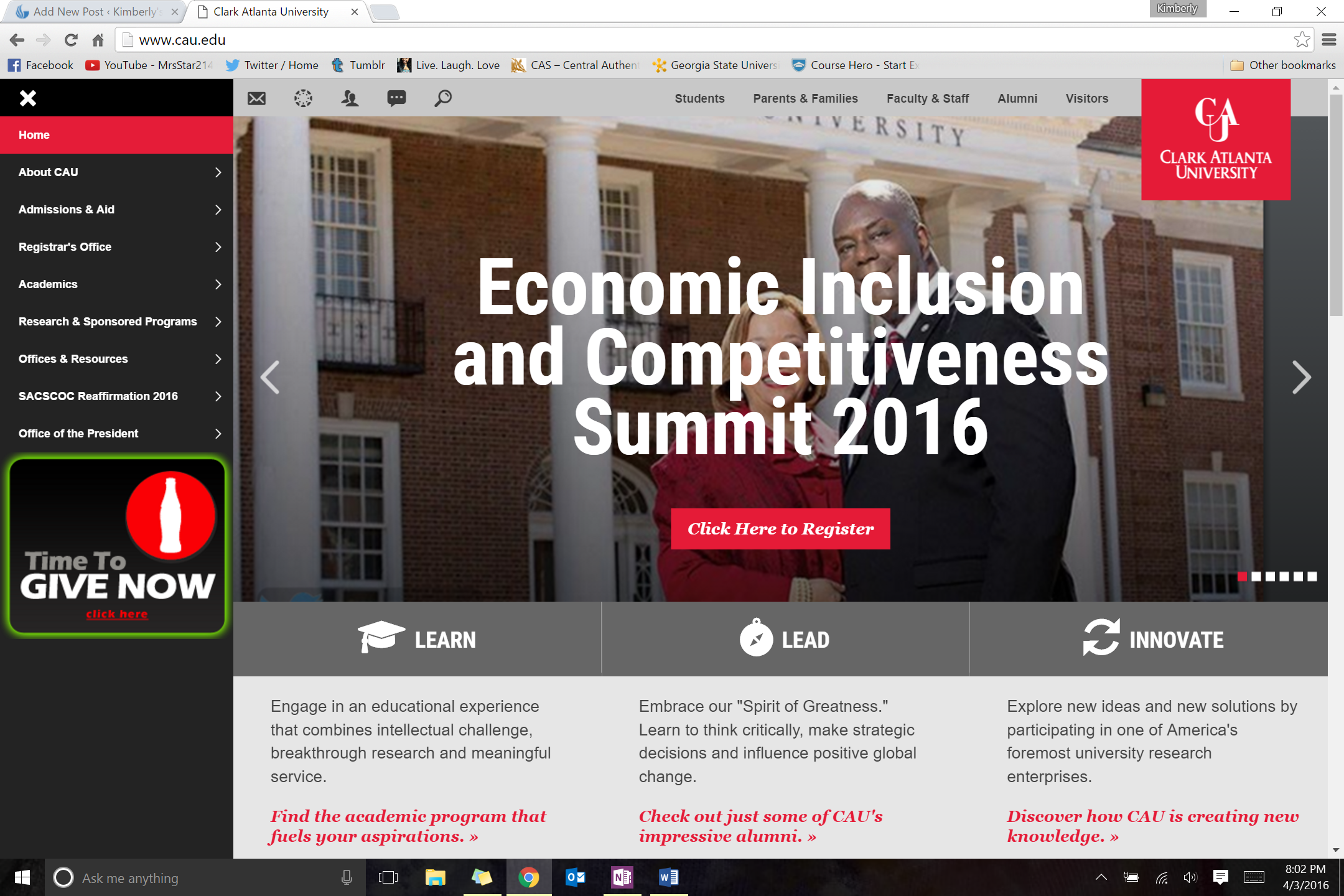
Opening Page
The very first page has a left side menu and menu bar at the top. There is a huge logo of Clark Atlanta University; it acts as a “home” button on each page. The rest of the space is accompanied with a moving slide show with pictures that present events or different actions that visitors might want to know more about. For example, one picture is about a current event Clark Atlanta is engaging in with The Coca Cola Company while another picture is of a graduating class with the words “Apply Now: Become Part of One of History’s Greatest Traditions” slapped right over it. There are three words that act as subtitles presented under the slideshow: “Learn, Lead, and Innovate” Underneath those titles are a few words and separate links that demonstrate how those words are instilled in Clark Atlanta University. If a person was to continue to scroll downwards, they will see a menu for university news, campus media, and links for social media.

Student promotion
Anyone who is searching the site can find what they need. For example, there is a specific page for parents. It has a testimony from another parent, telling the viewer the smart decision they made by allowing their child to attend their school. The page also include quick links that lead to things like a quick facts page, academics page, admissions page, and financial aid page. There are also pages for current students, alumni, visitors, and faculty & staff. At the very top in the menu bar there are links to those pages as well as links to email the university, a link for student email accounts, a link for searching the website all together, and a link for student accounts.

Parent Promotion
If a student was thinking about attending this school, the website would definitely help in making that decision because it would not be hard to find out important information like how to apply, financial aid services, and the different majors offered by the university. Overall, the website is not hard to navigate through and easy to understand. There are always links everywhere that a person could use. If they get stuck in one place, they can always click on the top right logo of the university and it will send them right back to the very beginning.