This siteI chose was Delta. This site targets most groups like families who are seen on the images on the website where they are most likely taking family vacations. They also target to business people who are frequent fliers and the site also even targets them by creating deals and cards set up for those types of people. This universal attraction of all groups is shown through the website by its extreme simplicity and easy maneuverability. The site has no obstacles and if anything has tabs to bypass any obstacles that might stand with having too much information on a site. The color scheme of the website also stands true for all the pages and links on Delta which is red, blue, and white. With everything following this color pattern. it makes everything look cohesive and well put together. The obvious use of the American flag colors also makes me feel like the company has a deep root in the US. This patriotic theme also makes me feel at peace and safe with their information and company as a whole. The tabs on the home page lead you to different pages along the site and all of them are tailored to the specific item you are searching for. And though the site seems to have a plethora of information, it is all well put together in different links so that card information won’t be muddled with information on the Delta charity. This distinguished labeling helps the audience maneuver the website and therefore makes it more approachable to other people who may be experiencing the site for the first time.
Jennifer's Blog
ENGLISH 1002
Category: Built Environment Descriptions (page 1 of 2)

When looking for more strict dates for flights, you’ll see this page of charts set up for different times and the options for both first class and main economy. The page also shows the options for nonstop or one stop flights and the subsequent connection airports. This page shows a clean and easily maneuverable page for people to go in and effectively choose flights.

When maneuvering the site, you’ll also see a more useful page where they tell you more detailed tabs on all the options you have on this site. Having this one-stop shop for all the info of Delta helps people be more efficient and lessens the amount of questions one might have when they might not see the options they have on the initial home page.

When searching for flexible flights, you’ll be greeted with this image. They show you all the possible days for departure as well as return flight options. This sliding scale helps the audience be able to effectively search for the best prices and the best days for them to go on their flights.

This image shows us the bottom of the page which is usually reserved for more guidance for the site as well as additional services that might not be present on the main tabs of the home page. The site proves to be sustainable and useful for other languages besides English. The bottom section also shows a wide range of categories for tech help and shows use of multimodality where they utilize not only email or phone but social media as well.

You can see the themes of color be utilized well on the homepage. This image is the first thing you’ll be greeted with when you first enter the domain which shows great pragmatism making sure that the homepage is functional and useful for the purpose of the site. This homepage shows us many functions of the site by labeling them clearly on the tabs.
I visited Dancing Goats Coffee Company which was located in Atlanta very near the Georgia Tech campus. They opened up in the restored Sears building. The company was founded in 1988 yet didn’t move to Atlanta until 1994. As soon as you enter the coffee shop, you can first see the emblem of their company all across various mediums like t-shirt merchandise and coffee cups to coffee drainers and makers. The main store front, though had lots of artifacts, was arranged to be very open, approachable, and cohesive. The overall color scheme of the coffee shop is easily identifiable with the main colors used in the shop being a bright orange, a cool teal, and the rest of the color was ranging from smooth grey to eggshell white. The singular usage of these colors makes the tone of the shop very cohesive and agreeable. There is no question to the tone or mood the shop hopes to set. And even though the outside room was arranged in a different manner, they still come together to create two distinct yet harmonious tone. The outside patio room was arranged more fluidly and organically and had the different color tone of warm reds and oranges while utilizing the natural texture of woods. Both rooms as well as the side sitting area of benches, still conveyed this familiar feeling making it easily maneuverable. The open space made you more open to move around and explore the different corners of the shop. And looking at the people in the coffee shop and the specific location of the coffee shop, you can see the main demographic is college students or young adults. This space was utilized as a safe and quiet place for people to get their work done in an appropriate space. And though the coffee shop doesn’t advertise to college students, you can see from the specific location and modern theme that the coffee shop naturally appeals to the nearby young adults. In the end, the whole coffee shop made me feel hip and modern. The colors made everything very agreeable and made the whole space genuine. Not only was the coffee great, but the environment they harbor was something ,as a college student, I flock towards.

Deeper inside the coffee shop you can see a seating area that portrays a very modern kitchen feel. There is even a movable ladder to get to the cupboards on top of the table. Even though the whole style of Dancing Goats is modern, it still makes you feel at home and comfortable. The shop is also very open and spacious which further promotes this feeling of comfort.

Even in the natural colors of the oranges and the color of the coffee bags, you can see the universal color theme still prevalent. On the wall you see a plaque that explains the name of Dancing Goats and shows the history behind coffee as a history as well as the coffee they produce and roast in house.
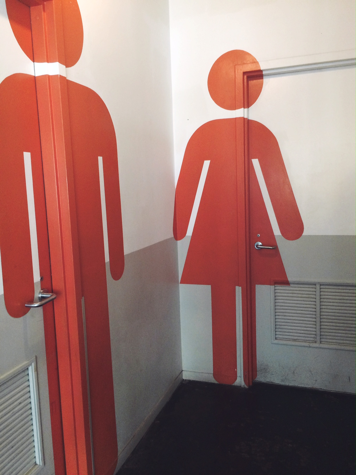
The restrooms show the general color theme Dancing Goats has with bright orange and teal blue. This art on the walls and doors shows a unique way to signify bathrooms and makes a different statement. We also see the very strict gender lines that this promotes with the separated and distinct genders portrayed on the majority of the wall.
© 2024 Jennifer's Blog
Theme by Anders Noren — Up ↑
Recent Comments