
Before beginning the lab, please watch the short video below. Mila is going to introduce discuss the main differences between this lab and the previous lab (Glacial-Interglacial Cycles), introduce the topic of radiative forcing, and then end the video by stating the three main questions you should be able to answer at the end of the lab.
This lab has 28 short-answer questions you will answer prior to the three big questions (i.e., research questions) Mila has noted above.
Section 1
As you learned in the previous lab (Glacial-Interglacial Cycles), we are currently in the interglacial part of an ice age. The glacial-interglacial cycle is triggered by changes in Earth’s orbit around the Sun, and, as a result, there is approximately 100,000 years between interglacials (or glacials). Changes in Earth’s orbit are not responsible for temperature changes over the past millennium (i.e., the past one thousand years), which is actually a relatively short period compared to the lengths of glacial periods and interglacial periods. This lab focuses on the causes of temperature changes in temperature over the past millennium. Finally, you are not alone if thought of this when you saw the word “millennium.”
At the end of this lab, you should be able to answer the following research questions:
-
How has the Sun caused changes in global and hemispheric temperatures over the past millennium?
-
How did global temperatures change during the 20th century?
-
What evidence exists for carbon dioxide as the main cause of global warming from the pre-industrial times to the present?
__________________________________________________________________________________________
Entering with the right mindset
Throughout this lab you will be asked to answer some questions. Those questions will come in three different varieties:
![]() Fact based question →This will be a question with a rather clear-cut answer. That answer will be based on information (1) presented by your instructor, (2) found in background sections, or (3) determined by you from data, graphs, pictures, etc. There is more of an expectation of you providing a certain answer for a question of this type as compared to questions of the other types.
Fact based question →This will be a question with a rather clear-cut answer. That answer will be based on information (1) presented by your instructor, (2) found in background sections, or (3) determined by you from data, graphs, pictures, etc. There is more of an expectation of you providing a certain answer for a question of this type as compared to questions of the other types.
![]() Synthesis based question → This will be a question that will require you to pull together ideas from different places in order to give a complete answer. There is still an expectation that your answer will match up to a certain response, but you should feel comfortable in expressing your understanding of how these different ideas fit together.
Synthesis based question → This will be a question that will require you to pull together ideas from different places in order to give a complete answer. There is still an expectation that your answer will match up to a certain response, but you should feel comfortable in expressing your understanding of how these different ideas fit together.
![]() Hypothesis based question → This will be a question which will require you to stretch your mind little bit. A question like this will ask you to speculate about why something is the way it is, for instance. There is not one certain answer to a question of this type. This is a more open- ended question where we will be more interested in the ideas that you propose and the justification (‘I think this because . . .’) that you provide.
Hypothesis based question → This will be a question which will require you to stretch your mind little bit. A question like this will ask you to speculate about why something is the way it is, for instance. There is not one certain answer to a question of this type. This is a more open- ended question where we will be more interested in the ideas that you propose and the justification (‘I think this because . . .’) that you provide.
__________________________________________________________________________________________
Section 2
Scientists are able to determine Earth’s past temperatures, and thus when glacial periods and interglacial periods occurred, by examining isotopes of oxygen and hydrogen trapped in ice cores. Isotopic fractions of the heavier oxygen-18 (18O) and deuterium (2H) in snowfall are temperature-dependent. These measurements of things other than temperature to estimate temperature are known as proxy measurements.
Let’s look again at the temperature estimates from the Vostok ice core that you examined in Lab 6 (Glacial-Interglacial Cycles). Open Vostok_Temperature_20K in Microsoft® Excel; the spreadsheet contains temperature anomalies back to the peak of the last glacial maximum (i.e., 20,000 years ago). Remember that an anomaly is just how far away a value is from the average value. Most scientists prefer to look at anomalies than absolute values.
- Select cells in rows 1 through 395 of columns A and B.
- Under the Insert tab, select Scatter.
- Select the X-Axis (i.e., the one with the big numbers) and right-click to select Format Axis. Check the box next to Values in reverse order.
- Position your cursor over the markers so that a box with words in it appears and then right click to Format Data Series. Add a line by going to Line Color and choosing Solid Line. Remove the markers by going to Marker Options and choosing None.
- The resulting chart shows temperature anomalies (in °C) over the past 20,000 years.
- Feel free to delete the title of the chart and the legend and make the chart much bigger.
![]() Q1: For approximately how many thousands of years has the Earth been in the peak of an interglacial period within the present ice age?
Q1: For approximately how many thousands of years has the Earth been in the peak of an interglacial period within the present ice age?
![]() Q2: How much higher has the average temperature during the peak of the interglacial period been compared to the average temperature during the last glacial maximum?
Q2: How much higher has the average temperature during the peak of the interglacial period been compared to the average temperature during the last glacial maximum?
As you can hopefully confirm through the chart you just made and your answer to Question 1, the last 10,000 to 11,000 years has been a relatively warm and somewhat stable period since the Last Glacial Maximum. This time period is known as the Holocene and is an interglacial period. Modern human societies have developed during this time, and the “invention” of agriculture (see below) during this interglacial period helped spur the development of human societies. In fact, some scientists argue that the past 8,000 years might be better labeled the anthropocene (anthropo means “human”), and you will see later in the lab that a more appropriate starting point for the anthropocene might be around 1850. Therefore, a new epoch in Earth’s history might have started less than 200 years ago.
The global population increased steadily from approximately 5 million people 10,000 years ago to approximately 550 million people in 1700 A.D. The population then increased exponentially to over 6 billion people in 2000 A.D. See the chart below.

When you plotted out the temperature anomalies from the Vostok ice core you may have noticed that the time resolution of the data presented to you was relatively coarse (i.e., an average time between temperature estimates of 50 years). For the entire ice core extending back to 422,000 years ago, the newer ice has a time step of several decades and the oldest ice has a time step of approximately 600 years. We have relatively good instrumental records of annual temperatures from thermometers across the globe that date back to approximately 1880. Other proxy records, besides ice-core data from Antarctica, are needed to determine global and hemispheric temperatures over the past millennium. The figure below shows the type of and starting year of data used in a temperature reconstruction from 500 to 1850.

![]() Q3: In which hemisphere do you think this temperature reconstruction was based?
Q3: In which hemisphere do you think this temperature reconstruction was based?
Just like in ice cores, 18O in coral, ocean and lake sediments, and speleothems (e.g., stalactites and stalagmites in caves) can be used to reconstruct past temperatures. The carbon isotopes in speleothems also are useful. With respect to coral, lower temperatures tend to cause the ocean coral skeletal rings, which is comprised of calcium carbonate (CaCO3), tend to have more 18O in its structure.


The most ubiquitous proxy is tree rings, and the dating and study of annual rings in trees is known as dendrochronology. Tree-ring records are precisely dated down to the year and can be well calibrated with the instrumental record. For trees in climates with a growing season and a dormant season, a tree ring is produced under the bark during the growing season. The bark is pushed out as a new layer of wood (i.e., tree ring) is added each year. Early wood (aka spring wood) is formed early in the growing season; this is the period when tree growth is fast. Growth is slower later in the season and the wood that results is denser (and darker) than early wood and is known as late wood (aka summer wood). In Lab 4 (the Carbon Cycle), you examined changes in net primary production in 2010; therefore, you basically saw when tree rings are formed for all locations across the globe.


Click the image below to open a file in Google Earth that shows the geographical locations of where tree-ring data have been collected. These data were provided by National Oceanic and Atmospheric Administration at this site.

![]() Q4: Why do you think most tree-ring sites are located in the middle and high latitudes and not in the tropics?
Q4: Why do you think most tree-ring sites are located in the middle and high latitudes and not in the tropics?
The image below shows reconstructed temperatures for the Northern Hemisphere – which is where most of the proxy data have been obtained – from 18 different studies. These reconstructions have used statistical approaches to estimating past temperatures. Most of reconstructions have time resolutions of either yearly (annual) or decadal resolutions. The smooth red line in the figure is based on borehole temperatures (i.e., temperatures obtained from holes drilled into Earth’s crust) and has a time resolution of a century and only spans 1500 to 2000. Please ignore that line.

![]() Q5: Based on all the reconstructed temperatures (i.e., all those lines you see in the graph above), what 150-yr period appears to be about as warm as 1950-2000?
Q5: Based on all the reconstructed temperatures (i.e., all those lines you see in the graph above), what 150-yr period appears to be about as warm as 1950-2000?
![]() Q6: Approximately how much warmer (e.g., 0.5° C, 1° C, 1.5° C, etc.) was the warmest 50-yr period than the coldest 50-yr period?
Q6: Approximately how much warmer (e.g., 0.5° C, 1° C, 1.5° C, etc.) was the warmest 50-yr period than the coldest 50-yr period?
![]() Q7: What do you think was the main factor that caused the temperature differences between the warmest and coldest 50-yr periods?
Q7: What do you think was the main factor that caused the temperature differences between the warmest and coldest 50-yr periods?
__________________________________________________________________________________________
Section 3
The Sun has been a major driver of the global surface temperature. In the previous labs, we assumed negligible changes in solar output so that we could explore how changes in greenhouse gases and albedo affect the global surface temperature and how changes in Earth’s orbit triggers glacial and interglacial periods. But the Sun’s output is constantly changing; therefore, Earth’s solar constant is constantly changing. If there were no changes in other variables, an increase in total solar irradiance (i.e., solar constant) would cause an increase in the global surface temperature. More solar radiation would be absorbed by Earth’s surface. Solar irradiance has only been measured directly via satellites since 1978, and you can clearly see the 11-yr solar cycle in the image below.

Scientists can estimate solar irradiance prior to 1978 by the number of sunspots on the Sun. But sunspots have only been observed routinely since 1749. Fortunately, 14C in tree rings and 10Be in ice allow researchers to reconstruct sunspot numbers and thus TSI over the past millennium. Increased TSI reduces 14C and 10Be production in the atmosphere. Cosmic rays (i.e., radiation originating outside our solar system) that reach the upper atmosphere produce 14C and 10Be. Atmospheric concentrations of 14C and 14Be are lower during sunspot maxima and higher during sunspot minima. Therefore, historical TSI values can be estimated by measuring the 14C in tree rings and 10Be in ice cores.
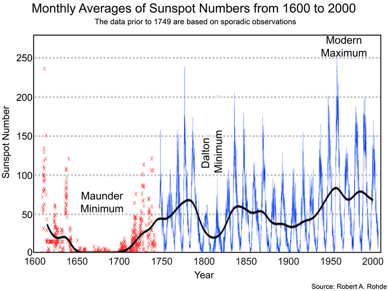


![]() Q8: Based on the reconstructed total solar irradiance from the six studies, would you rate the research community’s confidence in the past TSI as low, medium, or high?
Q8: Based on the reconstructed total solar irradiance from the six studies, would you rate the research community’s confidence in the past TSI as low, medium, or high?
In Lab 5 (Global Surface Temperature), you examined the role of greenhouse gases in determining Earth’s temperature. These gases basically trap longwave radiation and thus cause more energy to be absorbed by Earth’s surface. Carbon dioxide (CO2) has consistently been the most abundant of the well-mixed greenhouse gases (i.e., greenhouse gases that are well mixed throughout the atmosphere). You already have learned how greenhouse-gas concentrations are reconstructed: from concentrations of the gases trapped inside bubble in ice cores. Historical concentrations of CO2 are preserved in bubbles in ice cores, such as ice cores from the Law Dome in Antarctica (see image below on left). CO2 concentrations have been measured at Mauna Loa since 1958 (see image below in middle). Combing the two records gives us a detailed record of CO2 concentrations that goes back at least 1,000 years (see image below on right).


![]() Q9: What century had much higher CO2 concentrations than the other centuries and why?
Q9: What century had much higher CO2 concentrations than the other centuries and why?
Along with the increase in CO2 concentrations there was an increase in emissions of anthropogenic aerosols. One of those aerosols, sulphate aerosols, increases Earth’s albedo by making the atmosphere more reflective. Chemical reactions in the atmosphere involving SO2 can produce sulphate aerosols. Sulphate aerosols reduce the amount of absorbed of solar radiation absorbed by Earth’s surface in two ways: (1) the aerosols are reflective; and (2) the aerosols make clouds more reflective. Fossil-fuel combustion, and the subsequent release of greenhouse gases and SO2 into the atmosphere, began increasing rapidly after 1850 (i.e., during the Industrial Revolution).


![]() Q10: During what century do you think anthropogenic sulphate aerosols scattered and reflected the most incoming solar radiation?
Q10: During what century do you think anthropogenic sulphate aerosols scattered and reflected the most incoming solar radiation?
In addition to temperature reconstructions from proxy records, past temperatures also can be simulated with global climate models (GCMs). GCMs need information on solar radiation, volcanic activity (i.e., the injection of particles into the atmosphere and the subsequent cooling of Earth’s surface), and greenhouse gases. Some models also include information on aerosols, land-use/land-cover, and Earth’s orbit. These models are much more complicated than the global energy-balance model you worked with in Lab 5 (Global Surface Temperature), and they produce temperature estimates at multiple times for all parts of the globe.
![]() Q11: Based on the reconstructed temperatures you saw and changes in solar irradiance and CO2 concentrations over the past millennium, what century do you expect to have the largest simulated temperatures from the GCMs?
Q11: Based on the reconstructed temperatures you saw and changes in solar irradiance and CO2 concentrations over the past millennium, what century do you expect to have the largest simulated temperatures from the GCMs?
There were three distinct climatic periods associated with changes in solar irradiance during the past millennium: the Medieval Climate Anomaly (aka Medieval Maximum) (~950 to ~1250), the Little Ice Age (~1450 to ~1850), and the 20th century (aka Modern Maximum). The figure below shows those three climatic periods as well as the reconstructed and simulated temperatures for the Northern Hemisphere that indicate the start and end of the periods. The red and blue lines are the mean simulated temperatures from GCMs and the grey areas show where reconstructed temperatures, which you viewed earlier, overlap. Focus on the dark grey areas (i.e., areas where there is a lot of overlap among reconstructions) for the reconstructed temperatures and the thicker blue and red lines for the simulated temperatures from the GCMs.

![]() Q12: What are two possible reasons for why the 20th century was the warmest century over the past millennium?
Q12: What are two possible reasons for why the 20th century was the warmest century over the past millennium?
![]() Q13: If the 20th century did not have such high amounts of SO2 emissions, how do you think the simulated temperatures would have differed from the temperatures in the above figure?
Q13: If the 20th century did not have such high amounts of SO2 emissions, how do you think the simulated temperatures would have differed from the temperatures in the above figure?
__________________________________________________________________________________________
Section 4
You are now going to focus on global temperatures during the 20th century, which probably was the warmest century of the past millennium. Click NASA_Global_Temperatures to open the file in Microsoft® Excel. This file contains annual global temperatures (in °C) from 1900-2000. The data were extracted from the NASA GISS dataset.
- Select cells in rows 1 through 102 of columns A, B, and C.
- Under the Insert tab, select Line and then choose one of the 2-D lines.
- The resulting chart shows the annual global temperature from 1900-2000.
- The line corresponding to the smoothed temperatures is easier to interpret when trying to answer the following questions.
![]() Q14: During what two long periods (i.e., decades) did temperatures increase?
Q14: During what two long periods (i.e., decades) did temperatures increase?
![]() Q15: During what long period did temperatures not increase?
Q15: During what long period did temperatures not increase?
So there were several interesting temperature periods in the 20th century, and either solar radiation, greenhouse gases, Earth’s albedo, or a combination of those factors played a role in causing those periods. Click the images below to view changes in temperature along with changes in solar irradiance, CO2 concentrations, and anthropogenic SO2 emissions from 1900 to 2000.


![]() Q16: What are the two most plausible reasons for why 1980-2000 was a warmer period than 1900-1920?
Q16: What are the two most plausible reasons for why 1980-2000 was a warmer period than 1900-1920?
![]() Q17: Why do you think there was not any global warming for approximately four decades (i.e., 1940 to 1980)?
Q17: Why do you think there was not any global warming for approximately four decades (i.e., 1940 to 1980)?
As you hopefully noticed, the period from 1947-1976 is unique in that both solar irradiance and CO2 concentrations increased, yet global warming did not occur. One possible explanation was that increased concentrations of sulphate aerosols over this time period counteracted the warming. NASA has a nice article on the subject of sulphate aerosols and temperature. The two effects of sulphate aerosols were noted earlier in the lab and the image below also was shown earlier.
![]() Q18: What is one way that sulphate aerosols increase Earth’s albedo?
Q18: What is one way that sulphate aerosols increase Earth’s albedo?
Click SO2Emissions_1947-1976 to view the data in Microsoft® Excel. These data are estimated anthropogenic SO2 emissions for the Northern Hemisphere (NH) and Southern Hemisphere (SH).
- Select cells in rows 1 through 31 in columns A, B, and C
- Under the Insert tab, select Line and then choose one of the 2-D line
- The resulting chart shows SO2 emissions for the two hemispheres from 1947-1976
![]() Q19: Which hemisphere had a substantially larger increase in SO2 emissions from 1947 to 1976?
Q19: Which hemisphere had a substantially larger increase in SO2 emissions from 1947 to 1976?
![]() Q20: Based on the above findings for SO2 emissions and the resulting concentrations of sulphate aerosols, which hemisphere is most likely to have not experienced warming from 1947-1976?
Q20: Based on the above findings for SO2 emissions and the resulting concentrations of sulphate aerosols, which hemisphere is most likely to have not experienced warming from 1947-1976?
Click Temperatures_1947-1976 to open the file in Microsoft® Excel. This file contains annual values of temperatures anomalies for the Northern Hemisphere and Southern Hemisphere. Remember that an anomaly is just how far away a value is from the average value.
- Select cells in rows 1 through 31 in columns A, B, and C
- Under the Insert tab, select Line and then choose one of the 2-D line
- The resulting chart shows hemispheric temperature anomalies from 1947-1976
- Right-click each line and “Add trendline …” — Select Linear for each line
![]() Q21: How did the two hemispheres differ with respect to changes in temperature from 1947-1976?
Q21: How did the two hemispheres differ with respect to changes in temperature from 1947-1976?
![]() Q22: Do you think the increase in concentrations of sulphate aerosols from 1947-1976 is a valid reason for the lack of global warming over that period? Explain why.
Q22: Do you think the increase in concentrations of sulphate aerosols from 1947-1976 is a valid reason for the lack of global warming over that period? Explain why.
Let’s now zoom back out and examine changes in global SO2 emissions from 1900 to 2000 (see figure below).

![]() Q23: What environmental situation that was discussed in the Air Pollution lab resulted in a decrease in SO2 emissions, and thus concentrations of sulphate aerosols, in the 1980s and 1990s? Feel free to search the Web.
Q23: What environmental situation that was discussed in the Air Pollution lab resulted in a decrease in SO2 emissions, and thus concentrations of sulphate aerosols, in the 1980s and 1990s? Feel free to search the Web.
__________________________________________________________________________________________
Section 5
Based entirely on observed temperatures, you noticed a global warming of approximately 0.6° C from 1900 to 2000. There is much more uncertainty about global temperatures in the 18th and 19th centuries due to a lack of temperature measurements back then. But the reconstructed temperatures indicate that the amount of global warming from 1750 to the present (or 2011) was close to 1° C. There are various drivers, both anthropogenic and natural, of the alteration of Earth’s energy budget since pre-industrial times that led to the rise in Earth’s temperature.
![]() Q24: What do you think was the primary cause of the increase in temperature from 1750 to 2011?
Q24: What do you think was the primary cause of the increase in temperature from 1750 to 2011?
The image below shows radiative forcings of atmospheric drivers from 1750 to 2011. A radiative forcing is the change in energy flux from a beginning year (e.g., 1750) to an ending year (e.g., 2011) caused by changes in an atmospheric driver. The unit of a radiative forcing is the familiar W m-2. A positive radiative forcing leads to surface warming, while a negative radiative forcing leads to surface cooling. For gases and aerosols emitted by human activities, the emitted compound is shown on the left in the image below. For both human and natural activities, the resulting atmospheric drivers are shown next. The radiative forcings of the drivers are shown with bars. The letters in the “Level of confidence” column stand for the following: VH = Very High; H = High; M = Moderate; and L = Low. For example, the emission of halocarbons leads to changes in concentrations of O3, CFCs, and HCFCs, and the radiative forcings of these three atmospheric drivers are shown as different colors. There is a high confidence in the radiative forcings associated with halocarbon emissions.

![]() Q25: What gas was the largest contributor to total radiative forcing from 1750 to 2011?
Q25: What gas was the largest contributor to total radiative forcing from 1750 to 2011?
CO2, which has the largest radiative forcing of all emitted compounds and thus has been the main driver of global warming, is just one of the multiple greenhouse gases classified as well-mixed greenhouse gases (WMGHGs). WMGHGs typically have long atmospheric lifetimes (i.e., at least 100 years) and thus become well-mixed throughout the atmosphere globally. This is why scientists can get accurate readings of background concentrations of CO2 from an island in the middle of the Pacific Ocean and from ice cores in Antarctica. The image below shows the radiative forcings only for the WMGHGs.

Notice that halocarbons produce changes in stratospheric ozone (O3), chlorofluorocarbons (CFCs), and hydrochlorofluorocarbons (HCFCs) as atmospheric drivers. The effects of the increasing concentrations of CFCs and HCFCs is an increase in radiative forcing and thus cause a warming of Earth’s surface. The loss of stratospheric O3, on the other hand, has resulted in a negative radiative forcing.
![]() Q26: What do you remember from Lab 2 (Stratospheric Ozone) about the effects of CFCs and HCFCs on the ozone layer?
Q26: What do you remember from Lab 2 (Stratospheric Ozone) about the effects of CFCs and HCFCs on the ozone layer?
There has been a fair amount of attention placed on sulphate aerosols in this lab, but there do exist other aerosols that can disrupt Earth’s energy balance. You visualized global concentrations of aerosols (i.e., particulates) in Labs 3 and 4 (The Troposphere and Air Pollution). The other aerosols we are concerned with in terms of influencing Earth’s temperature are mineral dust, nitrate, organic carbon, and black carbon. All these aerosols have extremely short lifetimes (i.e. up to one week) in the troposphere. Mineral dust is a large aerosol, and it originates from wind erosion of soil and from cement manufacturing. You viewed an image of mineral dust from the Sahara Desert in Lab 3. Nitrate aerosols result from the oxidation of NOx, and the primary source of NOx is fossil-fuel combustion. Nitrate aerosols reflect/scatter solar radiation just like sulphate aerosols do. Organic carbon and black carbon, which are collectively known as carbonaceous aerosols, result from the combustion of fossil fuels, biofuels, and biomass; these are small aerosols similar to sulphate aerosols and nitrate aerosols. Black carbon, which as its names implies is a dark substance, emitted in the middle and high latitudes can get deposited on snow and ice (see the first two images below) and thus decrease the albedo of snow and ice.


Note that the direct effect of sulphate aerosols is the radiative forcing represented by the brown bar, while the indirect effect (i.e., cloud adjustments due to aerosols) is the forcing represented by the light-grey bar.
![]() Q27: Why do black carbon and the direct effect of sulphate aerosols have opposite radiative forcings?
Q27: Why do black carbon and the direct effect of sulphate aerosols have opposite radiative forcings?
Let’s look at the big picture again, but this time with a more simplified graphic of radiative forcing. The graphic below summarizes the information you saw in the previous radiative-forcing graphics. Positive forcings came from the following: (1) increasing concentrations of greenhouse gases in the troposphere; (2) increasing concentrations of water vapor, which is a greenhouse gas, in the stratospheric from the oxidation of methane in the stratosphere; (3) a decrease in surface albedo from black carbon being deposited on snow and ice from black carbon; and (4) an increase in the greenhouse effect from the occurrence of cirrus clouds produced from jet contrails. Negative forcing came from the following: (1) decreasing concentrations of stratospheric ozone; (2) an increase in surface albedo from land-use change, which is mostly deforestation (e.g., forests have an albedo 0.15 while grasslands and croplands have albedos of 0.25); and (3) the direct and indirect of aerosols in the atmosphere, which are the most negative forcings.

![]() Q28: What four greenhouse gases had the largest positive radiative forcings among all the forcing agents?
Q28: What four greenhouse gases had the largest positive radiative forcings among all the forcing agents?
Since 1750 the net effect of human activities on the climate system is the addition of approximate 2.3 W m-2 of energy. As you hopefully listed in your response to Q28, the major contributors to increased energy have been increased concentrations of CO2, CH4, halocarbons (which also have damaged the ozone layer), and tropospheric O3. The increased energy has disrupted Earth’s energy balance and thus has contributed largely to an increase in global temperature of approximately 1° C.
__________________________________________________________________________________________
Section 6
Before the next lab, write for yourself a one-sentence response to each of the following big questions of this lab.
How has the Sun caused changes in global and hemispheric temperatures over the past millennium?
How did global temperatures change during the 20th century?
What evidence exists for carbon dioxide as the main cause of global warming from the pre-industrial times to the present?