Before beginning the lab, please watch the short video below. Mila is going to introduce the carbon cycle, show you how to use Google Earth in this lab, and then end her video by reminding you of the three main questions you should be able to answer at the end of the lab.
This lab has 25 short-answer questions you will answer prior to the three big questions (i.e., research questions) Mila has noted above.
Section 1
You learned in the troposphere lab that carbon dioxide (CO2) makes up about 0.04% of the atmosphere. You will see in later labs just how important this relatively small concentration of CO2 is with expect to Earth’s energy balance, but for now we need to focus on the cycle in which atmospheric CO2 is involved. As you have hopefully deduced by looking at the title of the lab, the name of the cycle is the carbon cycle. Carbon is constantly being moved around the Earth through the processes that make up the Carbon Cycle. This lab is concerned with the different processes comprising the carbon cycle, but its importance goes beyond just becoming familiar with the various ways that carbon is transformed and transported around the globe. That is because the lab also is focused on how human activity can influence those processes – and potentially influence the weather and climate on the planet.
By the end of this lab, you should be able to answer the following research questions:
-
How can carbon be transferred between the atmosphere and Earth’s other spheres?
-
How would you best describe general changes in the anthropogenic emissions of CO2 and the uptake of carbon by the atmosphere, oceans, and terrestrial biosphere from 1959 to 2014?
-
How has the uptake of CO2 affected the oceans and terrestrial biosphere?
__________________________________________________________________________________________
Entering with the right mindset
Throughout this lab you will be asked to answer some questions. Those questions will come in three different varieties:
![]() Fact-based question →This will be a question with a rather clear-cut answer. That answer will be based on information (1) presented by your instructor, (2) found in background sections, or (3) determined by you from data, graphs, pictures, etc. There is more of an expectation of you providing a certain answer for a question of this type as compared to questions of the other types.
Fact-based question →This will be a question with a rather clear-cut answer. That answer will be based on information (1) presented by your instructor, (2) found in background sections, or (3) determined by you from data, graphs, pictures, etc. There is more of an expectation of you providing a certain answer for a question of this type as compared to questions of the other types.
![]() Synthesis-based question → This will be a question that will require you to pull together ideas from different places in order to give a complete answer. There is still an expectation that your answer will match up to a certain response, but you should feel comfortable in expressing your understanding of how these different ideas fit together.
Synthesis-based question → This will be a question that will require you to pull together ideas from different places in order to give a complete answer. There is still an expectation that your answer will match up to a certain response, but you should feel comfortable in expressing your understanding of how these different ideas fit together.
![]() Hypothesis-based question → This will be a question which will require you to stretch your mind little bit. A question like this will ask you to speculate about why something is the way it is, for instance. There is not one certain answer to a question of this type. This is a more open- ended question where we will be more interested in the ideas that you propose and the justification (‘I think this because . . .’) that you provide.
Hypothesis-based question → This will be a question which will require you to stretch your mind little bit. A question like this will ask you to speculate about why something is the way it is, for instance. There is not one certain answer to a question of this type. This is a more open- ended question where we will be more interested in the ideas that you propose and the justification (‘I think this because . . .’) that you provide.
__________________________________________________________________________________________
Section 2
In any matter cycle, the substance at the heart of that cycle (e.g., water, nitrogen, and carbon) is converted to different physical and chemical forms and moved from one part of the Earth to another. As you move through the Carbon Cycle lab, you will see how carbon moves through the different ‘spheres’ into which scientists divide the planet: the biosphere (global set of ecosystems where living things are found), the lithosphere (the rocky upper layers of the Earth), the hydrosphere (combination of all sources of water on under and over the Earth’s surface), and the atmosphere (layers of gases above the Earth). In the biosphere, carbon is found in the form of organic compounds trapped in living organisms and in the soil; in the lithosphere, it is held in carbonate rocks and other materials like coal; and in the hydrosphere it dissolves in the water to form carbonic acid. Practically all the carbon in the Earth’s atmosphere exists in the form of carbon dioxide (CO2) and methane (CH4).
The picture below shows the global carbon budget for 2010. This is a way of tabulating the amount of carbon (in billions of tons) that is released by carbon sources and absorbed by carbon sinks. Ideally, the Earth would have a ‘balanced spreadsheet’ where those two amounts were equal; as you examine the picture you should consider whether this was the case in 2010.
![]() Q1: Identify two sources of carbon in the picture. Identify two sinks.
Q1: Identify two sources of carbon in the picture. Identify two sinks.
![]() Q2: Where did the 9 petagrams of carbon emitted into the atmosphere by anthropogenic activities in 2010 end up going?
Q2: Where did the 9 petagrams of carbon emitted into the atmosphere by anthropogenic activities in 2010 end up going?
__________________________________________________________________________________________
Section 3
So let’s follow a carbon atom through one portion of the carbon cycle. Look at the picture below that focuses on that portion: the exchange of carbon between the atmosphere and the biosphere.
As noted above, most of the carbon atoms in the atmosphere are nestled in between two oxygen atoms in the form of CO2. Green plants can take in that CO2, combine it with water (H2O) and make carbohydrates (literally, hydrated carbon) through the process of photosynthesis. It is through that process that plants grow and gain mass. While it may be hard to imagine that plants get their mass from water and an invisible gas in the air, the time-lapse photograph of wheat-grass growing may make that more believable.
![]() Q3: From where is the wheat-grass getting the carbon that is enabling it to grow?
Q3: From where is the wheat-grass getting the carbon that is enabling it to grow?
Now, there are a lot of ways that this carbon in the carbohydrates can be released back into the atmosphere. Both plants and the animals who eat them can break the carbohydrates (mostly the sugar glucose) back down into water and carbon dioxide, getting some useful energy out of the process, and releasing the CO2 through respiration. Also, fungi and bacteria can break down the carbon compounds in dead plants and animals and convert the carbon to CO2 if oxygen is present. Finally, combustion (which is really the same process as respiration, except that it involves burning fuels instead of foods) can oxidize the organic (carbon-containing) materials in plants back to CO2. One form of combustion that you ran across in a previous lab (The Troposphere) was slash and burn, which is used to clear out large areas of forest for agriculture and is thus a major cause of deforestation.
Go to Amazon Deforestation to watch a time series of deforestation in western Brazil.
![]() Q4: People have concerns about the use of slash and burn partly because it affects the carbon cycle in multiple ways. What are two of those ways? Think about the process of slashing and burning and the change it makes to the landscape.
Q4: People have concerns about the use of slash and burn partly because it affects the carbon cycle in multiple ways. What are two of those ways? Think about the process of slashing and burning and the change it makes to the landscape.
__________________________________________________________________________________________
Section 4
Next, let’s focus on the other half of the larger carbon cycle: the exchange of carbon between the atmosphere and the hydrosphere. Take a look at the picture below that focuses on the processes involved in this exchange.
It should make sense that, since oceans cover 70% of the Earth’s surface, we would want to concentrate on how carbon moves between the atmosphere and the oceans. You can see from the picture above that some of the same processes – photosynthesis and respiration – are part of the exchange between these two parts of the global ecosystem. There is another mechanism by which the oceans can act as both a carbon sink and a carbon source: the water in the ocean can absorb carbon dioxide (leading to acidification of the ocean water) and, like a soda going flat, release it through the agitation caused by ocean currents.
![]() Q5: How did the amount of carbon absorbed by the hydrosphere compare to the amount carbon released by the hydrosphere in 2010?
Q5: How did the amount of carbon absorbed by the hydrosphere compare to the amount carbon released by the hydrosphere in 2010?
__________________________________________________________________________________________
Section 5
There is one last portion of the carbon cycle on which we want to focus. Before we do so, though, it is important for us to remember that the carbon cycle represents a global system, so even though we have looked at the cycle in manageable portions, we have to remember that the processes in each portion are interrelated and any change in one process produces changes in the others.
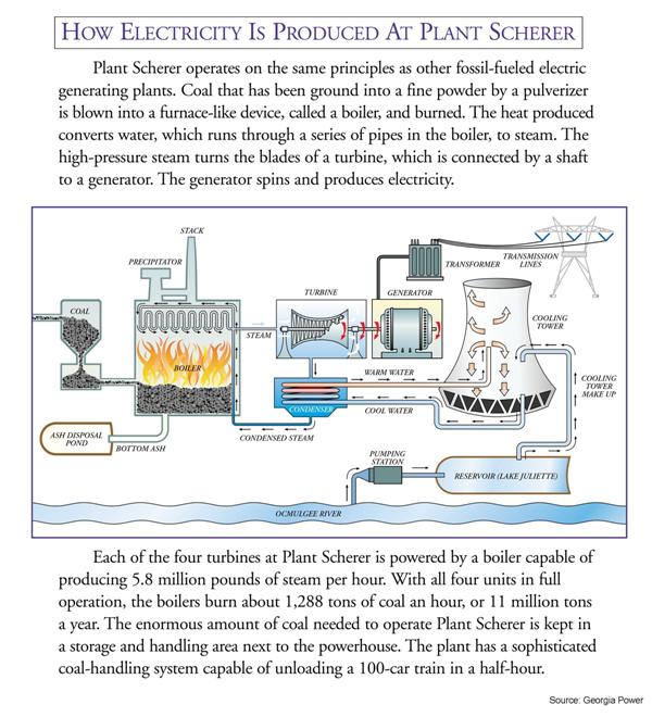
All right, so with that reminder in place, we can direct our attention to how carbon is exchanged between the lithosphere and the atmosphere. In the Prezi for this lab, we saw one video that talked about “young fast carbon”. This is the kind of carbon that is found in living plants among other things, and we call it that because it can easily move into and out of the carbon cycle. The video also talked about “old slow carbon”, which is the kind found in fossil fuels. It is labeled this way because this kind of carbon has been trapped in a form (natural gas, oil, and coal) that makes it more unlikely that the carbon will enter the carbon cycle. Well, more unlikely until humans started to pull it out of the Earth and burn it for electricity production. When that combustion of fossil fuels takes place, carbon with hydrogen atoms attached to it (hydrocarbons) is transformed to carbon with oxygen attached to it (carbon monoxide and carbon dioxide). The image on the left below shows the percentage of carbon dioxide from the combustion of various fossil fuels. The image in the middle is of Plant Bowen, a coal-burning power plant near Cartersville, GA; it should be familiar to you as the background of the Prezi. Finally, the image on the right is a schematic of Plant Scherer which is southeast of Atlanta.
![]() Q6: Which form of fossil fuel contributed the most to carbon dioxide production?
Q6: Which form of fossil fuel contributed the most to carbon dioxide production?
![]() Q7: In the Plant Bowen picture, the cooling towers are highlighted. Many people incorrectly link the presence of cooling towers to the presence of nuclear power plants, but all large-scale power plants have them. What is it that is coming out of the cooling towers? (Hint: This has an important relationship to the matter cycle you considered in the Troposphere lab.)
Q7: In the Plant Bowen picture, the cooling towers are highlighted. Many people incorrectly link the presence of cooling towers to the presence of nuclear power plants, but all large-scale power plants have them. What is it that is coming out of the cooling towers? (Hint: This has an important relationship to the matter cycle you considered in the Troposphere lab.)
Before moving on to the next section of this lab, it is important to put together the separate pieces of the carbon cycle that were discussed above. To that end, take a look at the picture of the 2010 global carbon budget that is found below and that also opened this section.
Notice that the anthropogenic (human as source) emissions of carbon is greater than the uptake of carbon by the biosphere and hydrosphere. Man’s activities such as fossil-fuel combustion and deforestation released nine petagrams (where a petagram is 1,000,000,000,000,000 or 1015 grams) of carbon to the atmosphere in 2010. [Approximately 90% of those anthropogenic carbon emissions came from burning fossil fuels.] Out of those 9 petagrams, three were taken up by plants for use in photosynthesis; two of the 9 petagrams were absorbed by the ocean. If you do some tough math, you realize that that left 4 petagrams unaccounted for – i.e. there was a net addition of 4 petagrams of carbon in the form of carbon dioxide to the atmosphere. Another way of saying that is that the amount of carbon in the lithosphere (in the form of fossil fuels) is decreasing, and the amount of carbon in the atmosphere (in the form of CO2), biosphere and hydrosphere is increasing. Something for us to think about.
![]() Q8: What do you think would be the effect on life on this planet if the kind of net release of carbon described above for 2010 were to continue for the next 50 years?
Q8: What do you think would be the effect on life on this planet if the kind of net release of carbon described above for 2010 were to continue for the next 50 years?
__________________________________________________________________________________________
Section 6
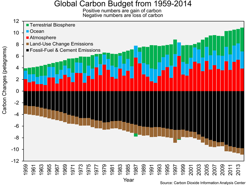
The carbon cycle graphic you explored in Section 2 only shows data from 2010. As has been in the case in previous labs, we are interested in changes over time – in this case, changes in the global carbon budget. Researchers have been able to estimate the following for each year from 1959 to 2014: (1) carbon emissions from fossil-fuel combustion and cement production, (2) carbon emissions from land-use change (i.e. converting forest to agriculture, as in slash-and-burn farming), (3) uptake of carbon by the atmosphere, (4) uptake of carbon by the oceans, and (5) uptake of carbon by the terrestrial biosphere. The graphic below shows changes in those five processes from 1959 to 2014. Anthropogenic emissions of carbon (fossil-fuel combustion, cement production, and land-use change) have negative values since those processes represent a loss of carbon from a particular sphere (i.e., the burning of fossil fuels releases carbon from the lithosphere, which is acting as a carbon source). A positive value indicates that a sphere (e.g., atmosphere, hydrosphere, and biosphere) has gained carbon (i.e. that sphere is acting as a carbon sink). The atmospheric, ocean, and terrestrial biosphere can have positive or negative values since they can act as sources or sinks. You might be wondering why we are not working with data more recent than 2014. The Carbon Dioxide Information Analysis Center (CDIAC), which provides us with most of the data in this lab, was shut down in 2016.
You hopefully noticed that there has been an increasing trend in carbon emissions and carbon uptake over time. The increasing amounts of emitted carbon has to go somewhere, and it has been accumulating in the atmosphere, terrestrial biosphere, and oceans.
Now, you are going to use Microsoft® Excel to examine two aspects of the bar-chart figure showing increasing emissions and uptake of carbon over time. Click CarbonEmissions_1959-2014 to open the Excel file of interest. This file contains annual emissions of carbon (in petagrams) from 1959 to 2014 from fossil-fuel combustion and land-use change (primarily slash and burn). Do the following to create a line graph from the data in that file:
- Select cells in rows 4 through 60 of columns A, B, and C.
- Under the Insert tab, select Line and then choose the first 2-D line.
- The resulting chart shows annual emissions of carbon fossil-fuel combustion and land-use change
![]() Q9: How does the trend in fossil-fuel emissions differ from the trend in land-use change emissions?
Q9: How does the trend in fossil-fuel emissions differ from the trend in land-use change emissions?
![]() Q10: For the source that had the largest increase over the period (1959-2014), what do you think was responsible for that increase?
Q10: For the source that had the largest increase over the period (1959-2014), what do you think was responsible for that increase?
The Excel data allowed us to look at trends in emissions and uptake of carbon from various sources and sinks over time. We would like to zoom in on one of those sources – fossil fuel combustion – and try to pinpoint places where the emissions from that source changed the most over time. Maps of fossil-fuel carbon emissions were developed by the now-defunct CDIAC for all years from 1781 to 2010. Click Carbon Emissions 1950-2010 to open the file in Google™ Earth see how carbon emissions have changed from 1950 to 2010. Look at country-level CO2 emissions in 2014 to answer Q12.
![]() Q11: From what regions/countries was most of the carbon emitted in 1950?
Q11: From what regions/countries was most of the carbon emitted in 1950?
![]() Q12: What countries were the top two emitters in 2014? These two countries remained the largest emitters in 2020.
Q12: What countries were the top two emitters in 2014? These two countries remained the largest emitters in 2020.
Next, let’s focus on the changes in the carbon sinks over time. The graphic below shows the annual uptake of carbon (in petagrams) by the atmosphere, oceans, and terrestrial biosphere from 1959 to 2014. These are the same data as shown in the bar-charts figure.
![]() Q13: What has been the general trend in the amount of carbon taken up by the atmosphere, oceans, and terrestrial biosphere over the last 50+ years? Do not focus on specific years. You want to see generally how the values changed from 1959 to 2014.
Q13: What has been the general trend in the amount of carbon taken up by the atmosphere, oceans, and terrestrial biosphere over the last 50+ years? Do not focus on specific years. You want to see generally how the values changed from 1959 to 2014.
![]() Q14: How did carbon uptake during 2005-2014 differ from carbon uptake during 1959-1968? Where has more and more of the carbon been going?
Q14: How did carbon uptake during 2005-2014 differ from carbon uptake during 1959-1968? Where has more and more of the carbon been going?
Section 7
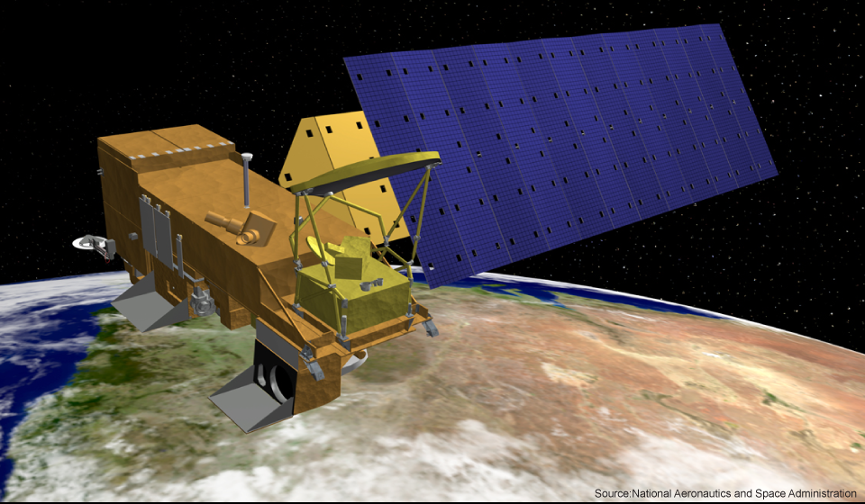
Click CO2_2010 to open the file in Google™ Earth and see changes in monthly CO2 concentrations in 2010. These data were derived from two sensors (the Atmospheric Infrared Sounder and the Advanced Microwave Sounding Unit-A) on-board NASA’s Aqua satellite.
In the Google™ Earth file turn the globe so that you can see both North and South America at the same time. Replay the animation in order to answer the question below.
![]() Q15: Based on the differences in CO2 concentrations between the Northern Hemisphere and the Southern Hemisphere and changes in CO2 concentrations throughout the year, would you classify CO2 as a well-mixed gas or poorly-mixed gas? Look at the range in concentrations, 371 ppm to 414 ppm, across the globe over an entire year. One of the terms in bold above makes an appearance again in Lab 9.
Q15: Based on the differences in CO2 concentrations between the Northern Hemisphere and the Southern Hemisphere and changes in CO2 concentrations throughout the year, would you classify CO2 as a well-mixed gas or poorly-mixed gas? Look at the range in concentrations, 371 ppm to 414 ppm, across the globe over an entire year. One of the terms in bold above makes an appearance again in Lab 9.
__________________________________________________________________________________________
Section 8
In the Troposphere Lab, we learned about the Clean Air Act in the United States in which different sets of regulations controlling various pollutants in the air were passed in 1970, 1977, and 1990. As part of understanding the impact of that Act, you looked at the effect on the levels of PM10, NOx, and SO2 emissions, and you should have noticed a decrease in pollutant emissions. Regarding the sources of the pollutants, you learned the following in Lab 4 (Air Pollution): (1) industrial processes (e.g., smokestacks on factories) has been largest source of PM10; (2) motor vehicles has been the largest source of NOx; and (3) electricity production (i.e., power plants) has been the largest source of SO2.
![]() Q16: Why didn’t CO2 emissions decrease from 1970 to 2010 like SO2 and NOx emissions did?
Q16: Why didn’t CO2 emissions decrease from 1970 to 2010 like SO2 and NOx emissions did?
__________________________________________________________________________________________
Section 9
In the first few parts of this lab, the emphasis has been on human activity – mostly the burning of fossil fuels – as an additional source of carbon that gets emitted into the atmosphere. As with any system in nature, the other parts of the system can respond to such a stress on the system’s equilibrium. For example, one response from the parts of the carbon cycle system to the increased CO2 levels from fossil fuel combustion could be increased absorption of CO2 by green plants to drive photosynthesis.
Given the importance of this process, let’s turn our attention to the terrestrial biosphere as a carbon sink. As shown top picture below, the terrestrial biosphere absorbs approximately three petagrams of carbon annually. When you see the two words “terrestrial biosphere” you should think of forests. There are three general types of forests across the globe: (1) tropical forests, which are predominantly evergreen broadleaf forests, (2) temperate forests, which have varying types of trees as a result of yearly variations in the temperature, and (3) boreal forests, which are predominantly evergreen needleleaf forests. Click MODIS Land Cover to open the file in Google™ Earth and including location of these different types of forests. The land-cover information was derived from data from the MODIS (MODerate resolution Imaging Spectroradiometer) instrument on NASA’s Terra satellite.
![]() Q17: Identify one place across the globe where there is a (1) tropical forest, (2) temperate forest, and (3) boreal forest?
Q17: Identify one place across the globe where there is a (1) tropical forest, (2) temperate forest, and (3) boreal forest?
- Tropical forest:
- Temperate forest:
- Boreal forest:
![]() Q18: Which of the three forests do you think is the largest carbon sink and why?
Q18: Which of the three forests do you think is the largest carbon sink and why?
In Part 1 of this lab, you learned that green plants within the terrestrial biosphere can act both as a carbon sink – as they turn CO2 and water into carbohydrates through photosynthesis – and as a carbon source – as they respire CO2 produced by the metabolism of carbohydrates when the plants need energy. What is really important to know is how much more carbon is taken up by photosynthesis than released through respiration. This is known as net primary production (NPP). Positive values of NPP indicate that more carbon was absorbed by photosynthesis than was released by respiration (i.e., that the terrestrial biosphere was acting as a carbon sink); negative values indicate the opposite situation.
NPP changes over time and space. We can explore these changes for one year by clicking on NPP_2010 to open this file in Google™ Earth and watching the animation of the variation of the NPP values for different places over that year. The data come from NASA’s MODIS instrument. Values range from near 0 grams of carbon per square meter per day to 6.5 grams per square meter per day.
![]() Q19: Which forests have large positive values of NPP during each month (i.e., what forests have a green color year-round)?
Q19: Which forests have large positive values of NPP during each month (i.e., what forests have a green color year-round)?
![]() Q20: Why do these forests have little seasonal differences in NPP?
Q20: Why do these forests have little seasonal differences in NPP?
After viewing NPP values for each month of 2010, you should now revisit your response to Question 18.
![]() Q21: Which of the three forests do you think is the largest carbon sink and why?
Q21: Which of the three forests do you think is the largest carbon sink and why?
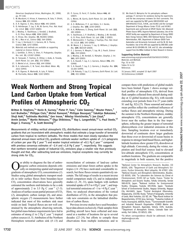
Scientists are still trying to figure out which of the three forest types is the largest carbon sink. The three images below provide recent information on the terrestrial biosphere carbon sink. The first two images are the first pages from two articles from the journal Science, while the third image is a portion of Table 1 from the second Science article.
Notice how the estimate in the table (2.41 Pg) above nearly matches the 3 Pg in the the diagram above and shown below.
![]() Q22: Which of the three forests appears to be the largest carbon sink, especially for the 1990-1999 period?
Q22: Which of the three forests appears to be the largest carbon sink, especially for the 1990-1999 period?
![]() Q23: Why do you think it is likely the carbon uptake in tropical forest areas decreased from 1990-1999 to 2000-2007? Hint: Think about what you learned earlier that involved Brazil.
Q23: Why do you think it is likely the carbon uptake in tropical forest areas decreased from 1990-1999 to 2000-2007? Hint: Think about what you learned earlier that involved Brazil.
________________________________________________________________________
Section 10
As with the terrestrial biosphere, the oceans (the largest component of the hydrosphere) can function as either a carbon source or a carbon sink. Look at the image below as a reminder of the different processes by which the ocean can act as a carbon sink and a carbon source.
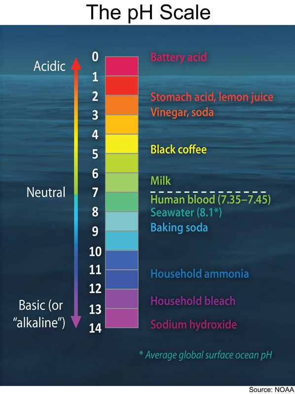
Typically, the oceans take up approximately two petagrams of carbon each year. More specifically, the oceans have taken up half of all the CO2 emitted by human activities since pre-industrial times. With the increased production of CO2 by humans over the past two centuries, more and more carbon has been added to the oceans. When CO2 enters the ocean, a complex series of reactions occur in which the carbon dioxide is transformed into carbonic acid (by reacting with the water), the carbonic acid breaks apart into hydrogen ions and bicarbonate ions (which are found in baking soda), and some percentage of the hydrogen ions combine with carbonate ions (which are found in washing soda) to form additional bicarbonate ions. While it is not important to remember all the parts of that complex series of reactions, it is valuable to understand one of its effects: the removal of carbonate ions that it makes it more difficult for marine organisms (known as calcifiers) to grow shells.
![]() Q24: What other effects do you think anthropogenic CO2 emissions are having on marine organisms besides the impact on calcifiers described above?
Q24: What other effects do you think anthropogenic CO2 emissions are having on marine organisms besides the impact on calcifiers described above?
As a result of data collected in Hawaii, we are better able to understand the effects of the increasing amounts of CO2 that the oceans are absorbing. Scientists working on the Hawaii Ocean Time-series (HOT) program have been making repeated observations of the hydrography, chemistry, and biology of the water column at a station north of Oahu, Hawaii USA. since October 1988. As you have seen earlier in this lab, measurements of atmospheric CO2 concentrations at Mauna Loa, Hawaii have been made since 1958. Click HOT_MaunaLoa to open the file in Google™ Earth and see the location of the HOT measurements relative to the Mauna Loa station. The image below shows changes in atmospheric CO2 concentrations and the amount of dissolved CO2 in the middle of the Pacific Ocean (i.e., Hawaii). As atmospheric CO2 concentrations increase the amount of CO2 dissolved in seawater also increases.
As noted above, changes in the amount of CO2 in seawater also will affect the pH of the water as well as the availability of carbonate ions. The image on the left below shows changes in seawater pH and the concentration of carbonate ions near Hawaii. The same pH diagram you saw in Lab 3 is shown again below.
![]() Q25: What effect did the increased absorption of CO2 by the oceans have on the pH? Did the pH level ever get to the point where the ocean water was acidic?
Q25: What effect did the increased absorption of CO2 by the oceans have on the pH? Did the pH level ever get to the point where the ocean water was acidic?
__________________________________________________________________________________________
Section 11
Before the next lab, write for yourself a one-sentence response to each of the following big questions of this lab.
How can carbon be transferred between the atmosphere and Earth’s other spheres?
How would you best describe general changes in the anthropogenic emissions of CO2 and the uptake of carbon by the atmosphere, oceans, and terrestrial biosphere from 1959 to 2014?
How has the uptake of CO2 affected the oceans and terrestrial biosphere?


