Apr
2016
AtlantaEats.com -Digital Reading Summary
Home Page
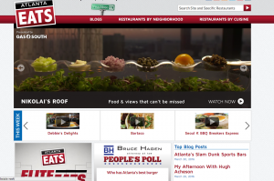
- This is the first page that appears, once you have typed in the the url. The home page consist of bold colors such as reds and whites with bold black trimming. The layout is in visual layers. First layer of the website is slides showing various cuisines and food styles. Next layer another is of multiple videos showing how the different cuisines are prepared, cooked and eaten throughout metro-Atlanta area. The final layer is social media. In this final layer multiple compartments are displaying friendly poll surveys and top article pieces mentioned in twitter post.
Drop Down Menu
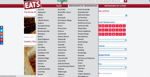
2. When observing the page moving my cursor over the different tabs, a drop down menu appears. In this drop down menu there are a list of all the place in metro Atlanta that Atlanta Eats has reviewed. The range of places spand from Luckie-Marietta:street which is located just south of Georgia State’s class building Aderhold all the way to Athens- Home of the University of Georgia.
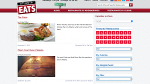
3. After browsing through all the different locations I choose Luckie-Marrietta district Due to its proximity to Georgia State. The next web page popped up with the with the various places that had been interviewed by the food review site. Some of the choices were Palm which is a restaurants that serves hard meals as well as Mac’s Coal Oven pizzeria.
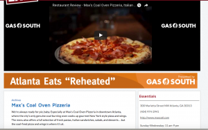
4. Next once clinking the name of the restaurant it brings it to a link that shows a video about what the restaurant has on their menu and also the atmosphere of the restaurants and the type of people that attend. The link page also consist of others ads on the from company like GAS South which in returns bring more revenue to the overall site.

Article of the Week
5. The final article was the article of the week. This article is located on the side page and the page linked to a piece that talked about the best cuisine of the week.The article describes the taste and the overall quality of the actual food.
Full Summary
The website has an overall hardy look with bold colors and appetizing meals on the home page. The home page immediately encompasses what the television show is about. Initially the subject of food is brought the page. The homepage faintly resembling the layers of a cake. This cake-like structure contained vital information within each of the layers. The layers’ placement of being first visual and providing the site visitor with a “Taste” of what foods are reviewed on AtlantaEats.com. Additionally, the secondary layer explains in depth the various dishes prepared and their ingredients. The final layer is combination of social media platforms and also advertising. The look of the home page transitions into the following links that direct the visitor to the section of the page where they can find restaurants in their areas that were reviewed. Once the cursor is placed over the link the once black word highlights red and page is clicked. This now directs you to the individual restaurants review page revealing the specialty dishes on each page as well as more general information about the reviewed website. Also in the margins of the screen there are multiple tabs leading to links with articles on various culinary pieces with trendy headlines also in bold black lettering and the same hardy colors matching the homepage background. The overall look and designed of the website sets the view for how Atlanta food and culture are experienced through metro-Atlanta.