
This map, created by National Geographic in 1935, is one of my favorites from my collection because it shows the world in a different way than you are used to seeing it. Rather than using a Mercator projection, which would drastically distort area at the higher latitudes, this map uses a compromise projection that intentionally leave out parts of the ocean to make the two hemispheres appear to curve away at the edges. Another thing I love about this map is the inclusion of extra little bits of information that I’ve posted in separate pictures.

This is a zoomed in photo of the western hemisphere as shown on the larger map. I especially like this representation of the western world because it emphasizes that sheer size of the Pacific Ocean. With most maps centered on the Prime Meridian, the Pacific Ocean is often broken in half, making it difficult to grasp its true size.

This zoomed in photo of the eastern world stands as a complement to the last picture. What I most like about this is the indication of topography. On this map darker shades of tan represent higher elevations. It is especially clear along India’s northern edges how this coloration works. It is easy too overlook the role of topography in world events when looking at a normal map. Adding some representation of elevation can help emphasize the importance mountains often play in our world.

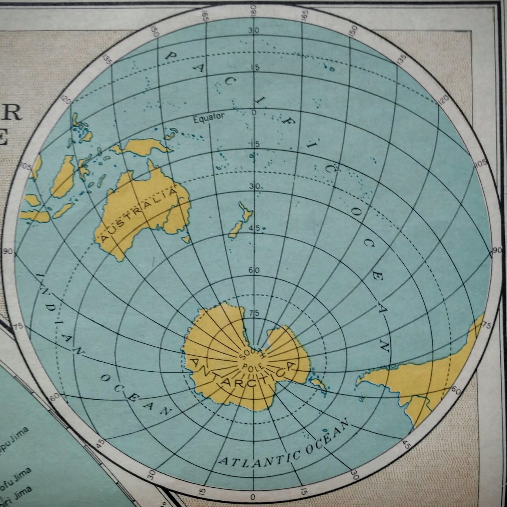
These two photos together represent the land and water hemispheres of the world. The land hemisphere being mostly the northern part of the world centered near 0 degrees of longitude, and the water hemisphere being mostly the southern part of the world centered near 180 degrees longitude. This distinction of water versus land hemisphere is especially important to understanding global systems. This is especially true when talking about climate systems. Fundamentally the climate systems of these two halves of the world are different because of the varied impact of continentality on each. As such, when talking about things like climate change the discussion often has to be specifically target to one half or the other, with both responding to changes differently.
